Train Tracker Devlog 02
It’s been about 6 weeks since the last train tracker devlog.
I’ve been making an iOS app that automatically detects what train you’re riding (in Tokyo) and shows the current/next station in a Live Activity, all without needing to open the app.
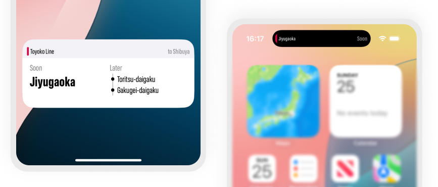
I’m finally on the cusp of the release of version 1.0 of Eki Live, the christened name of the previous working title Train Tracker. At the end of the last post, I detailed what I thought was next on my TODO list.
- Improve the algorithm to determine the correct railway faster, handle transfers, and off-board seamlessly.
- Improve the design of the Live Activity.
- Remove the debug screens and rework the in-app UI for onboarding, settings, and simple monitoring.
- Create branding and add all the required info for the App Store.
I did indeed finish ~all of~ most of these TODOs, but like usual it took a lot longer than I expected. Let’s start with the easy stuff first.
Home UI
The UI for Eki Live is nowhere near as expansive as humble Eki Bright, which has a screen for each resource like station, timetable, railway, bookmarks, nearby station, search, etc. Eki Live is really just one screen, and in the ethos of the app, most users will rarely see it; the app is intended to function as an automatically appearing and disappearing Live Activity.
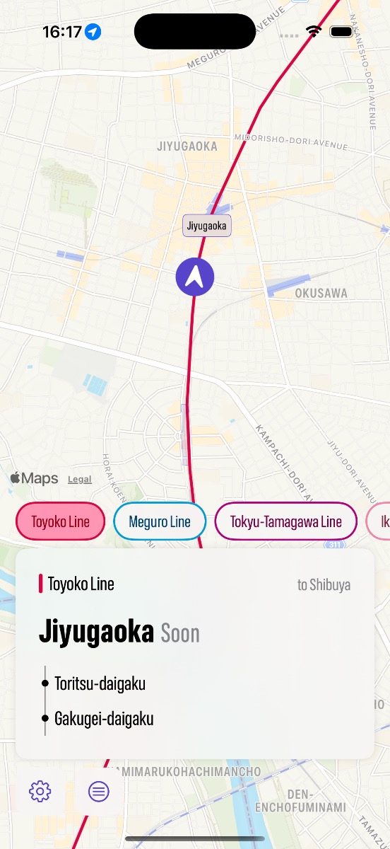
However, there are a few required visuals and functions:
- The current railway, direction, focus station, and later stations: a larger, more detailed reflection of the data shown in the Live Activity.
- A map with the user’s current location: a confirmation for users that they are where they think they are.
- A list of other selectable railway candidates: in the dense railway environment of Tokyo, more often than not there are railways that run parallel for stretches of track. Eki Live defaults to the top ranked candidate based on an algorithmic score that improves with more data, but I wanted to give users the ability to override or lock-in the top candidate at will.
- Menu: there are a few functions I wanted to include even if they are rarely used. A permissions checkup screen since Location Services permissions are imperative. A way to reset the algorithm in case it encounters a situation I can’t handle automatically yet. Eventually some other options too like a snooze button or list of alerts.
My previous custom debug screens became outdated and I integrated the debug visuals into a “show stats” option that anyone can enable.
I fell into the trap of over-optimizing the UI because honestly it’s one of my favorite parts of iOS development. I had to keep reminding myself that most users wouldn’t and shouldn’t see this home screen if I had done the rest of my job properly.
Onboarding
Eki Live doesn’t work like a normal app, so I spent more time than I usually do on an onboarding flow when the user opens the app for the first time.
I’m not sure whether I’ve struck the right balance of over-explaining vs. under-explaining, perhaps the former. The main concern was that I need the user to understand the value proposition of the app and why I need such intrusive Location Services permissions. Otherwise, they won’t allow background permissions, the app won’t start up, and they will forget about it and go on with their life.
English support
I was very on the fence about supporting English for the version 1 release, or really at all. Sure, I have English in the underlying station data, but I never got around to fully supporting English in Eki Bright because there just too many screens and too many layout edge cases to deal with for a non-target audience.
For Eki Live, however, I decided that since my UI footprint was low and some of my beta testers preferred English, I would take a day to do a spike and see how much work it would add.
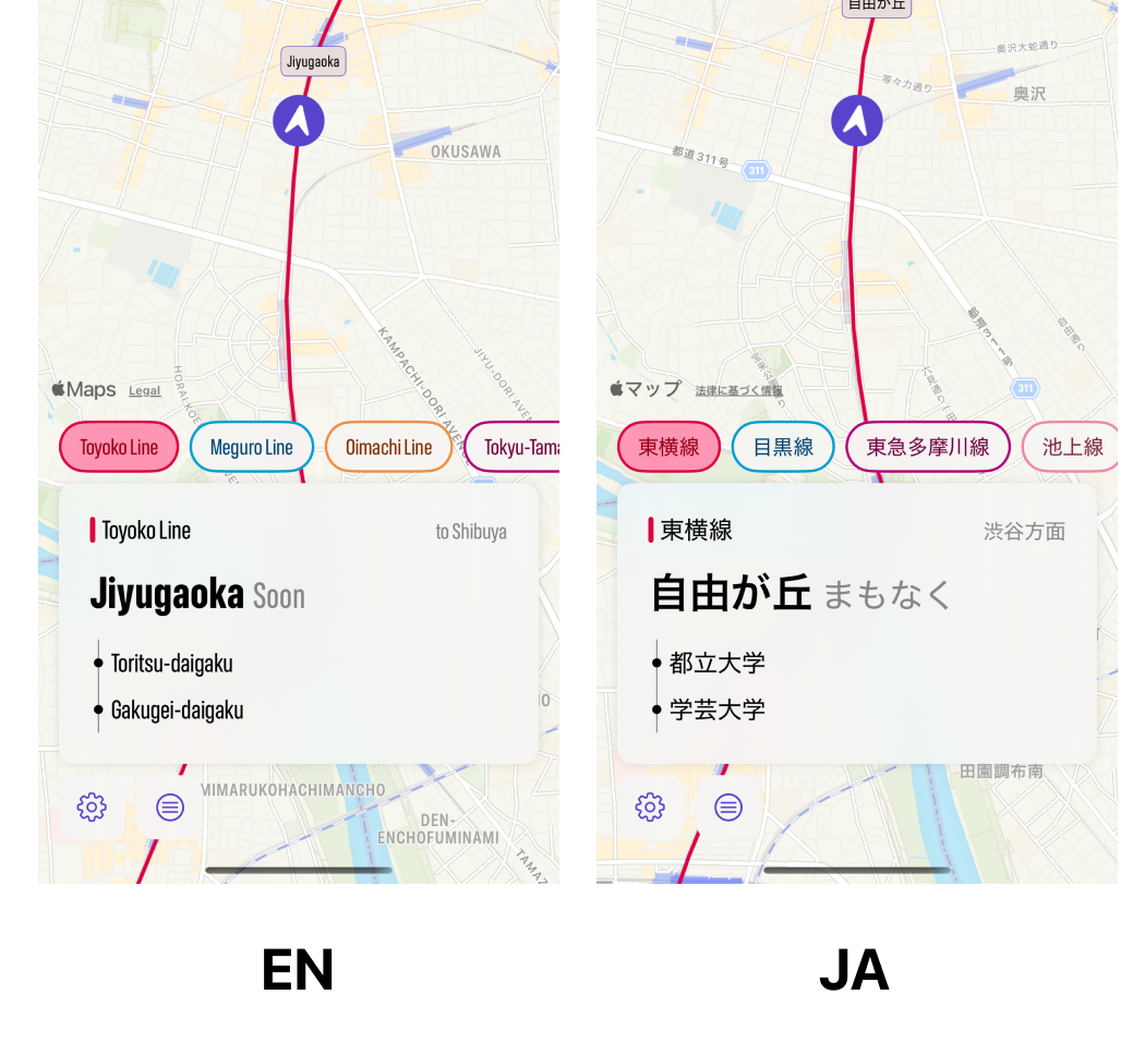
There were a few tough points (Info.plist strings, lots of onboarding string, app extension strings), but the main breakthrough was simply using the compressed width system font. This got the width of the romaji station names down to near the width of the kanji versions. The amount of layout tweaks was minimal.
I think English support makes more sense in Eki Live because in theory I could target overseas tourists as potential users. By design, Eki Bright doesn’t make sense as an app for tourists.
Algorithm improvements
After finishing all the above essentials for app release, I pushed a Test Flight v0.1, send it out to some beta testers, and then went out and took a few train rides.
It was still a little exciting when, after riding about a stop and a half, the Live Activity would suddenly pop up showing the next station. However, with my critic hat on, I was becoming less bullish:
- It didn’t feel magical having to wait so long for Eki Live to finally conclude I was on a train and appear in my Dynamic Island, especially for short rides.
- It didn’t feel magical that the app couldn’t differentiate between the Yamanote Line and the Keihin-Tohoku Line, even after they’d split at Shinagawa.
- It didn’t feel magical that the app couldn’t differentiate between the local-like Keihin-Tohoku Line and the express-like Tokaido Line.
I was at a crossroads in early May: do I release the app as-is or do I improve the train tracking algorithm?
At first, it wasn’t a decision I actively made. While I waited for Test Flight review I wanted to do a spike to get a feel for how much work it would take to improve the algorithm.
At that time I was using only station locations as my main data source for determining which railway and direction the user was riding. In one way this was a strength because it meant I could more easily expand the scope of the app in the future to support all of Japan or even other countries.
Using only station locations was a weakness for accuracy and immediacy though. Although it’s much more difficult to obtain and maintain, having the full outline of the geopoints that make up a railway as it traverses between stations would in theory enable boosts in both detection accuracy and immediacy.
The easiest way to understand the limitations of using only station data is by looking at the eastern railway corridor between around Yohohama station and Tsurumi station:
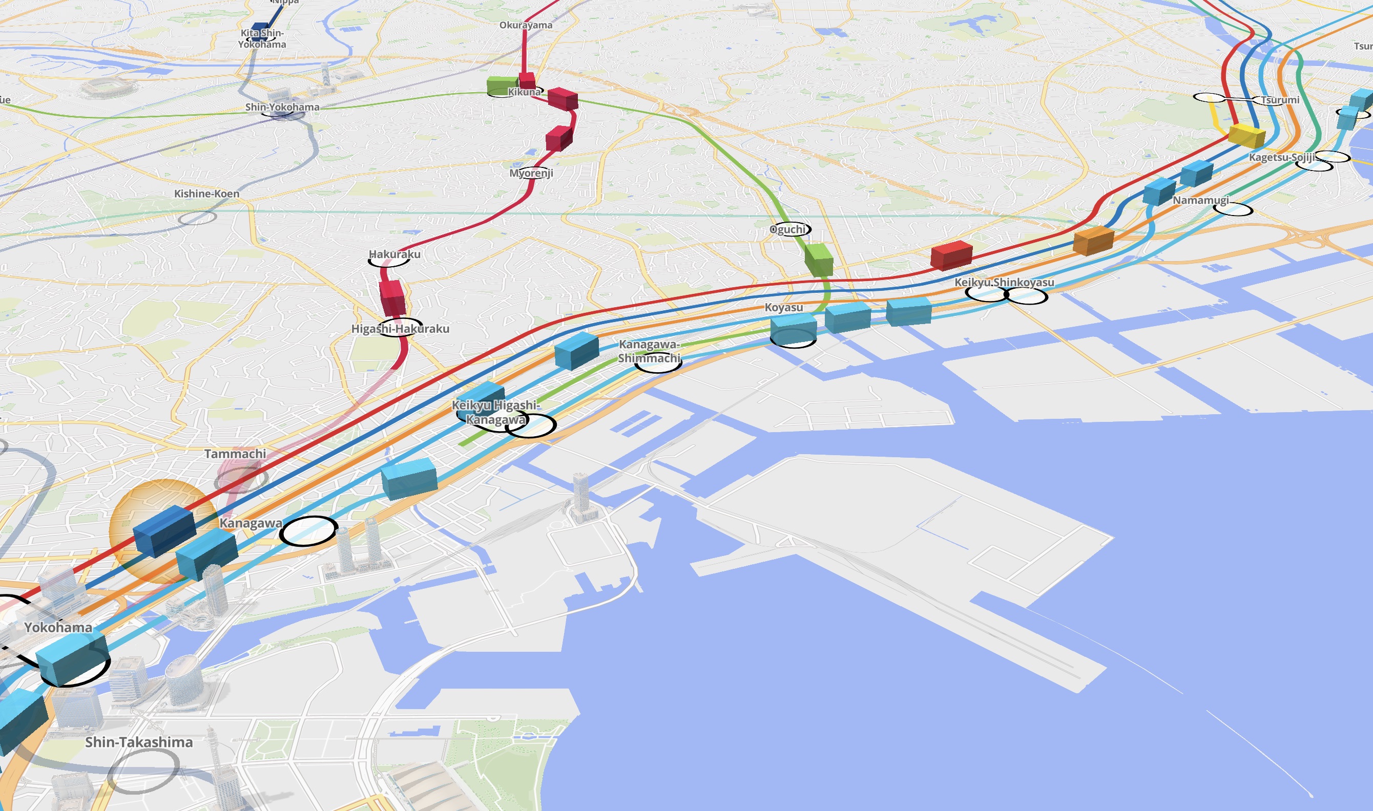
For this stretch, there are 8 or so railways that run parallel for some portion before branching off. The Tokaido is the most express, only stopping at Yokohama and Kawasaki (further north of Tsurumi). Without supplementing the station data with additional data showing the relationships between the stations and railways, it would be impossible to determine the Tokaido was even in the list of candidates for trains the user is aboard.
I realized that having the railway geopoint data wouldn’t solve all the problems with the algorithm, but it could raise the limit of possibility for speed and accuracy of the algorithm.
The problem was that I didn’t immediately have a source of data for all railway geopoints. I started looking for options.
The obvious first attempt was using the railway geopoint data included in the existing dataset I was using. However, this data was optimized for another use case and after a couple hours of combing through a multi-megabyte JSON file, I was stumped at how to parse it into the simple format I needed: ordered geopoints associated by railway.
The most promising second option was Open Street Maps (OSM). It checked a lot of boxes: the data was free, continuously updated, open to updating from anyone, included all data in Japan and much of the rest of the world, included stations, railways, and railway geopoints, and had a robust query language and tooling.
I did a spike and got pretty far in transforming the data into the format I needed from OSM. I spent days writing custom fetch queries and building tooling to evaluate the results.
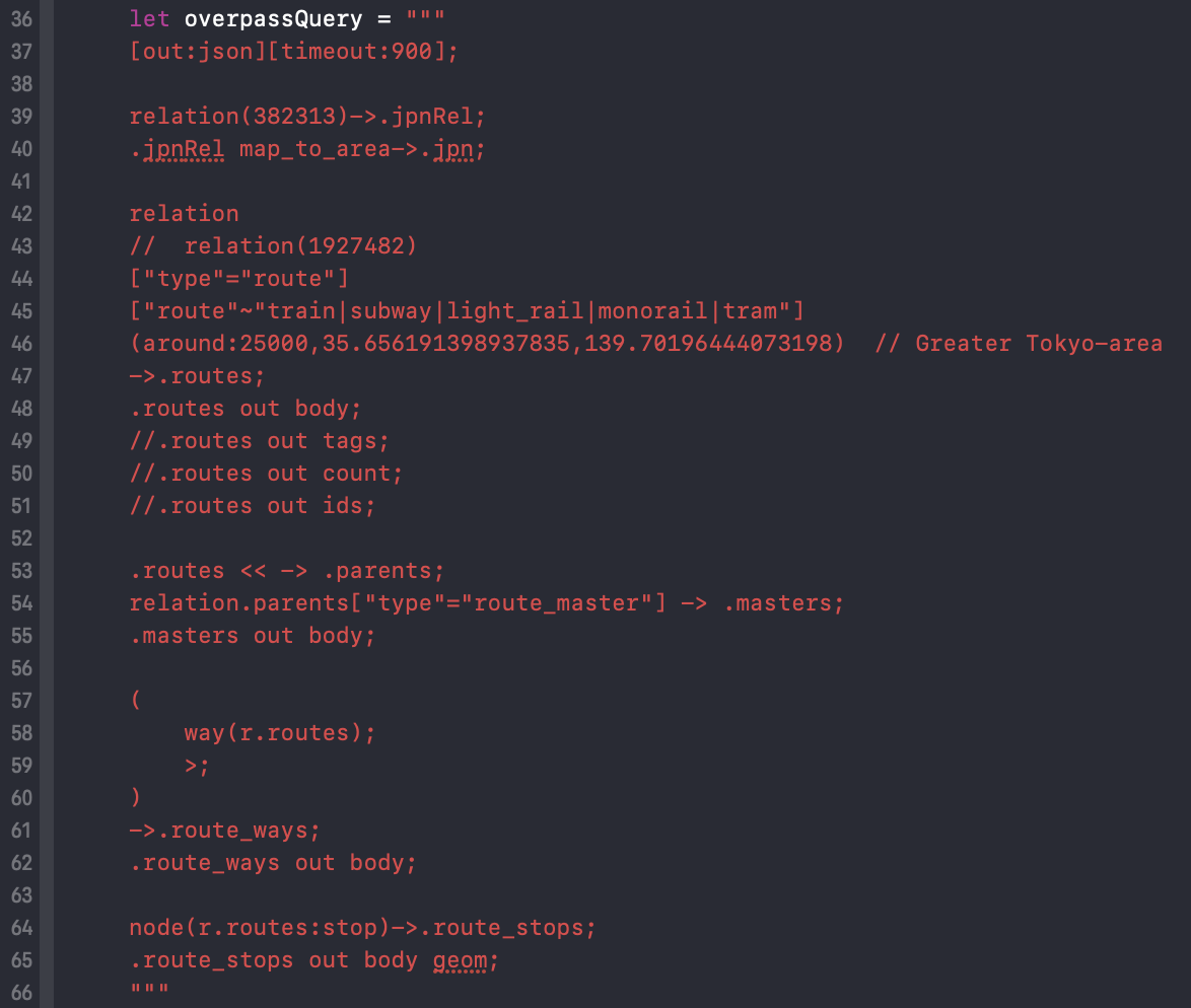
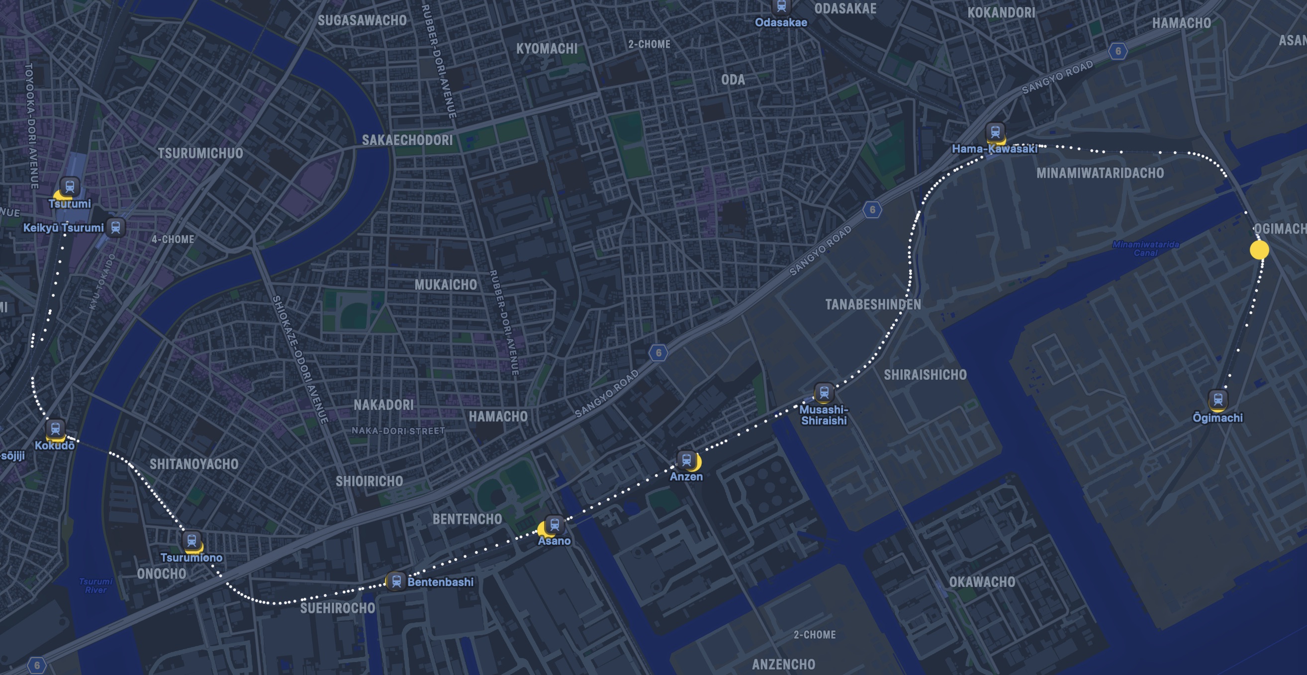
I built a SwiftUI Preview to show random railways in the parsed OSM database to help me spot check the data:
In the end, the data was just too raw for my use case. Station and railway names and colors were completely non-standardized across the dataset. The accuracy of railway geopoints would have to be crosschecked one-by-one. I realized it would take weeks or months of manual work to get to the point where the data could be trusted enough to rebuild as the foundation of the app.
And I hadn’t even started rewriting the algorithm yet.
I was about to give up when I made one last attempt at parsing the data from my original source. With some LLM help, I finally cracked the parser and with a few revisions and some more custom tooling, I finally had a reliable source of railway geopoint data to use in the algorithm.
My idea for the new algorithm was to expand on the scoring system I had started before. My hypothesis was that by combining all the data I had into a score at a single point in time, then weighting those scores over time, I could manage the complexity and use real data to tweak the scoring system to continuously improve it.
In reality, I still don’t feel confident I have a handle on the complexity yet.
On a positive note, by this point I’d been collecting data from the app for over a month and had a couple dozen trips worth of data I could play back to evaluate the algorithm as I was redeveloping it. This time, I created a macOS app that gave me both greater playback control and more insight into the algorithm.
I was still having trouble keeping all the edge cases in my head. Especially how unreliable GPS data is. I’d usually get new coordinates from Core Location once per second, but not always. I’d usually get coordinates within 20 meters of accuracy for above ground lines, but not always, and not when I needed them the most (at station boundaries). I had to make a lot of conflicting decisions about how to fill in gaps in the sensor data. I had to make peace again with using only the sensor data I already had.
At this point, I started to feel the weight of the decision-by-indecision to not ship V1 of Eki Live in early May. I had spent weeks getting the railway geopoint data and maybe a week on the new algorithm, but it still wasn’t obviously better than the existing algorithm I’d threw together in a couple days (that version itself being an evolution of other approaches).
I used this panic and sunk cost fallacy indulgence to power through a couple more days of algorithm tweaking. Hour after hour tweaking constants and watching my ghost trains cruise along the same paths I’d see 1000 times at 10x speed.
There wasn’t one particular breakthrough insight, but soon enough I did finally feel confident enough that I was ready to integrate the new algorithm, sand off the rough edges, and ship another beta.
App Store Marketing
The last piece of the puzzled I’d been putting off was the app icon, marketing images, and App Store copy.
I’d re-learned a couple lessons from previous app icon attempts: an app icon can always can be visually simpler and more distinct and unique.
I had sketched out a quick idea for an app icon in Procreate and used it for the early Test Flight builds.
It wasn’t quite bold enough. Too much white space.
I riffed on it using vector tools in Figma and ended up with something I like and feels right on my iOS home screen. I like it enough that I might redo Eki Bright’s icon with a variant of the idea.
Similarly for the App Store marketing images, I wanted to go a little more splashy than plain screenshots of the app. There is certainly room for improvement, but I’m hoping a lot of the appeal hits by the third image.
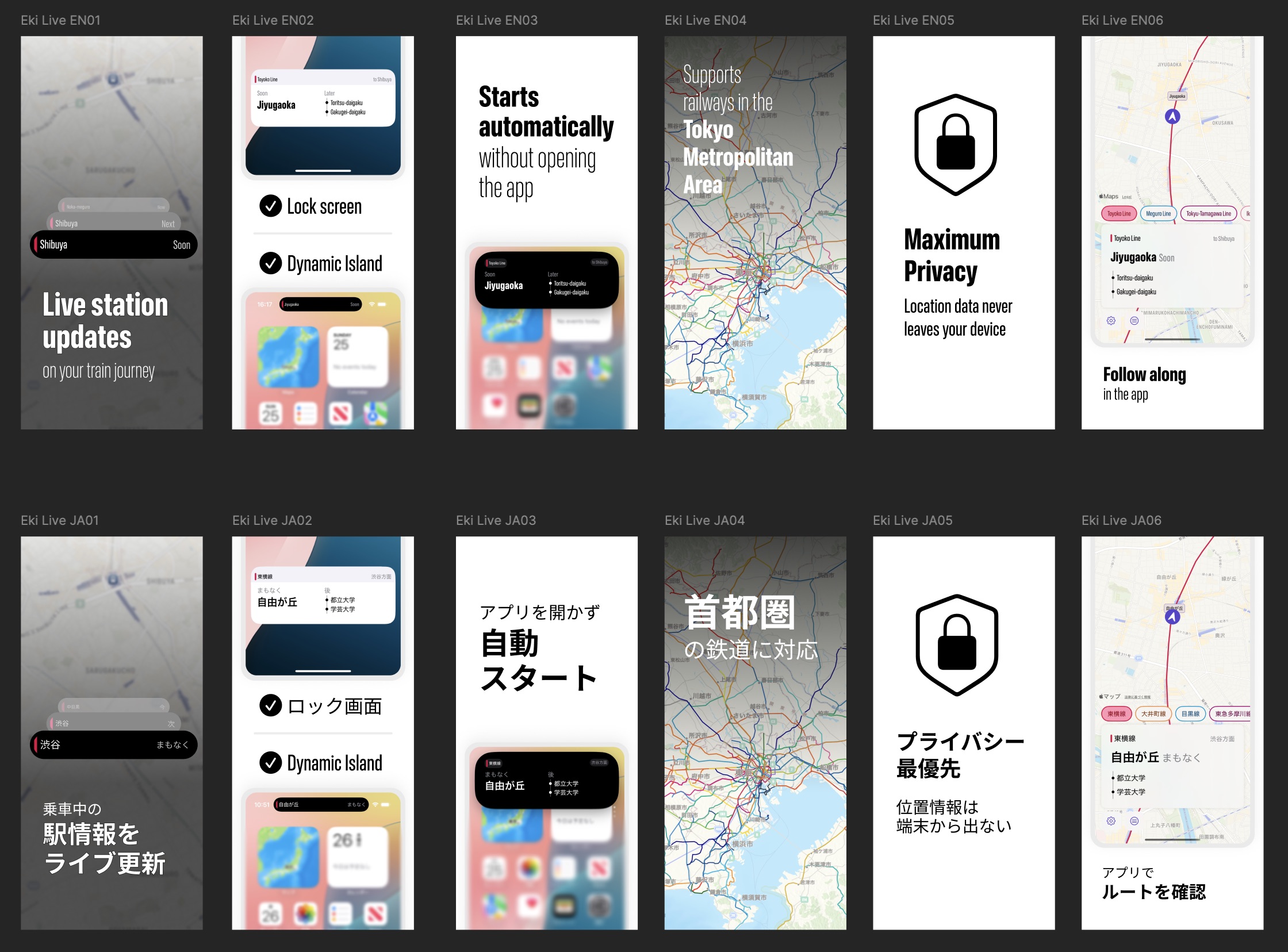
I went a little lighter on the App Store description than I previously had, and with a few last checks, Eki Live version 1.0 was ready to ship.
Submission and review
My last bit of panic was realizing that I hadn’t yet got Eki Live through App Store review yet. Each Test Flight review had taken ~3 days but had passed.
I was specifically worried because the main user value of Eki Live is that you don’t have to remember to open the app in order for it to start tracking and appear as a Live Activity. This functionality was disallowed by the ActivityKit APIs until iOS 17.2, when the server-driven push-to-start Live Activity API was released. Push-to-start is my workaround for starting a Live Activity in the background. Although there’s no rule against it in the App Store review guidelines (as far as I know), I was still concerned that Apple would view it as going against the spirit of the API.
In any case, it was something I should have de-risked earlier in the month before I started rewriting the tracking algorithm. I could have submitted an early build even if I wasn’t planning on releasing it yet.
Luckily, App Store approved v1 with little fanfare. For now, Eki Live remains in app review’s good graces.
External Marketing
I’m planning to get more serious about marketing for this app.
For a while, I’ve been thinking about ways to leverage video-based social media (e.g. TikTok, Instagram Reels) as a free-to-play passive advertising channel for my apps, but couldn’t quite figure out the right video format.
While out riding the trains doing a testing run, I was watching Eki Live while periodically looking out the train window onto the sunny Kanagawa suburban countryside. An idea hit that, hey, aren’t there lots of ASMR-like videos on social media of people just riding trains? Hadn’t I already spent hours upon hours staring somewhat mesmerized at Eki Live’s interface slowly ticking by?
I spent a short morning coding up a debug-only accessible interface mod for the Eki Live in-app UI. It displays a live camera feed on the top third of the window, hides some UI, and can start/stop a screen recording using ReplayKit.
Afterwards, I hopped back on a mostly empty afternoon train out to Ofuna and recorded some videos that look like this:
I’m not sure whether these will hit, but I will keep iterating and with some luck have a new passive stream of new users at top of funnel.
Next steps
There’s plenty more on the horizon for Eki Live, but I’m hoping to first get some positive feedback on the direction before investing more development (and research) time. I realize that filling that top of the funnel with effective marketing will be critical in getting enough signal to make a call on whether or not to continue.
If/when I do proceed, my next steps will be:
- Improving the ability for the algorithm to detect train alighting and transfers.
- Letting users receive alerts when they approach stations of their choice.
- Allowing users who don’t want to allow background location permissions to still use the app in a streamlined way.
- Enabling support for snoozing background tracking for arbitrary periods (e.g. if taking a vacation, going on a road trip).
- Improving the ability for the algorithm to track in underground trains or other low-signal areas.
- Add unique visualization of the journey on the map within the app.
- Add static timetable support and arrival time estimates.
- Add express train support.
Final thoughts
As an indie dev with near infinite freedom, I almost feel like it’s my obligation to take moonshots and experiment in ways that bigger companies can’t.
Starting from the first prototype station departure Widgets of Eki Bright, the timetable lists, the DIY routing feature, and now the live automatic station tracking of Eki Live, I know I’m following this thread somewhere. Whether it’ll be this idea or the next one that lands, my optimism is only growing.
For all who’ve been following along on this journey, thanks for reading. Eki Live v1.0 will be available in the App Store soon.