Eki Bright - Design of Station Detail
I’ve done a few nice-sized releases of Eki Bright since my first launch in August.
Eki Bright is my solo-developed iOS app for viewing station timetables for the Tokyo-area train network.
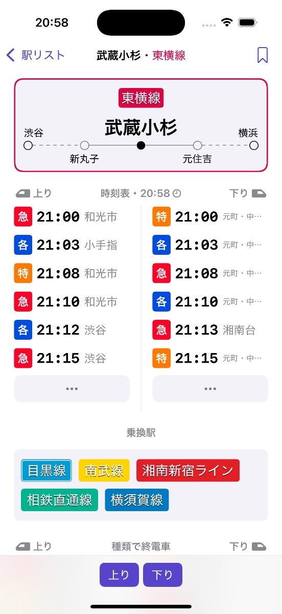
In this post, I want to share some of the design decisions for a screen I added in v1.2 and v1.3: the station detail screen.
Background
The first release of Eki Bright had 4 screens: home, station timetable, train timetable, and station search (disregarding the about screen, nearby screen, and widgets).
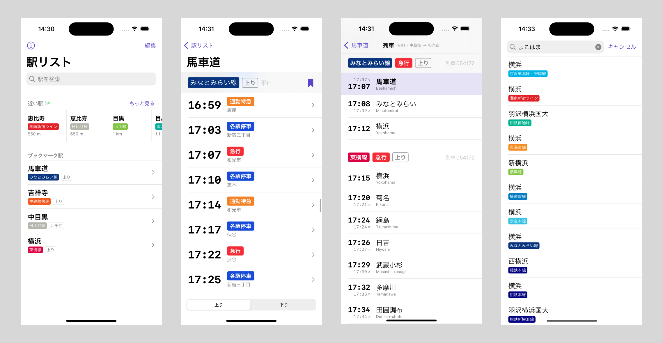
In all honesty, even the “nearby stations” section of the home screen and the train timetables screens were superfluous to my original concept for the app. Even station search by text was only required to populate your station bookmarks.
However, as most projects go, the scope started to naturally increase as I found myself out and about using the prototype and missing features.
The problem with the station timetable screen
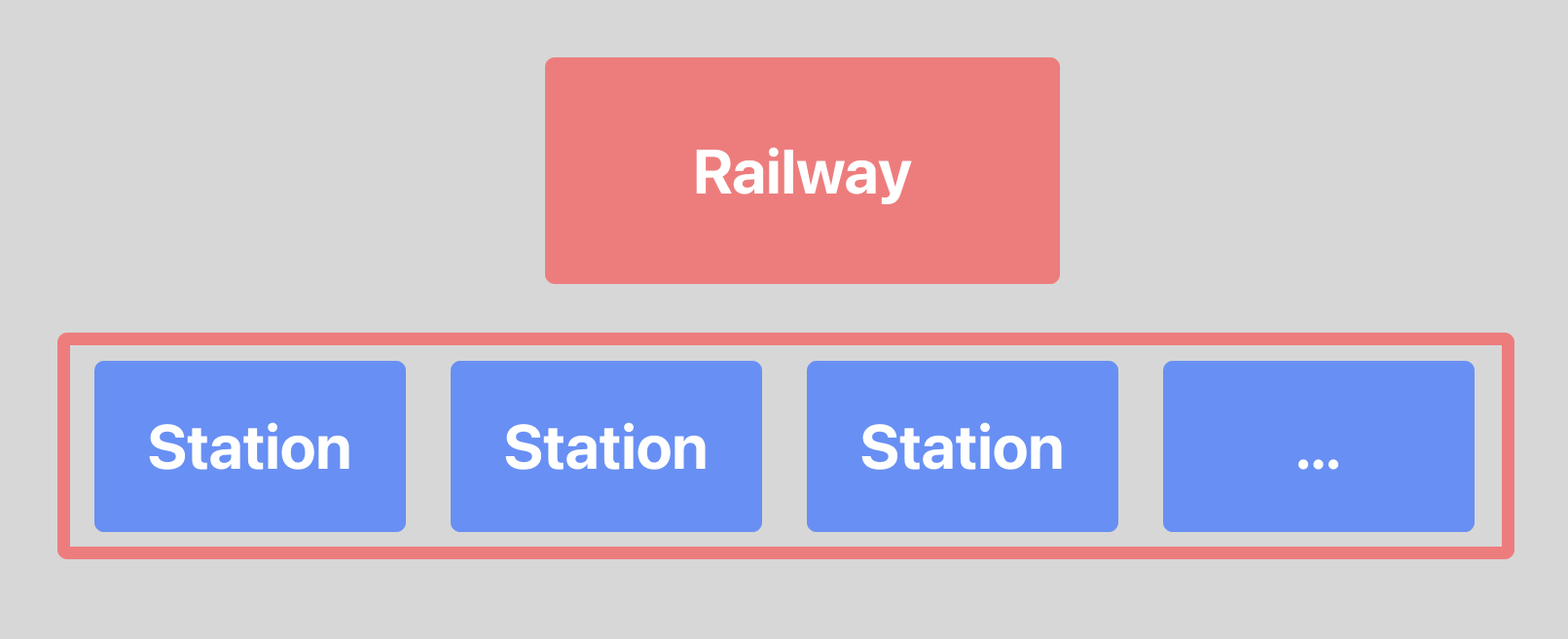
A Station is the core model concept in the app. A Railway connects an ordered group of stations.
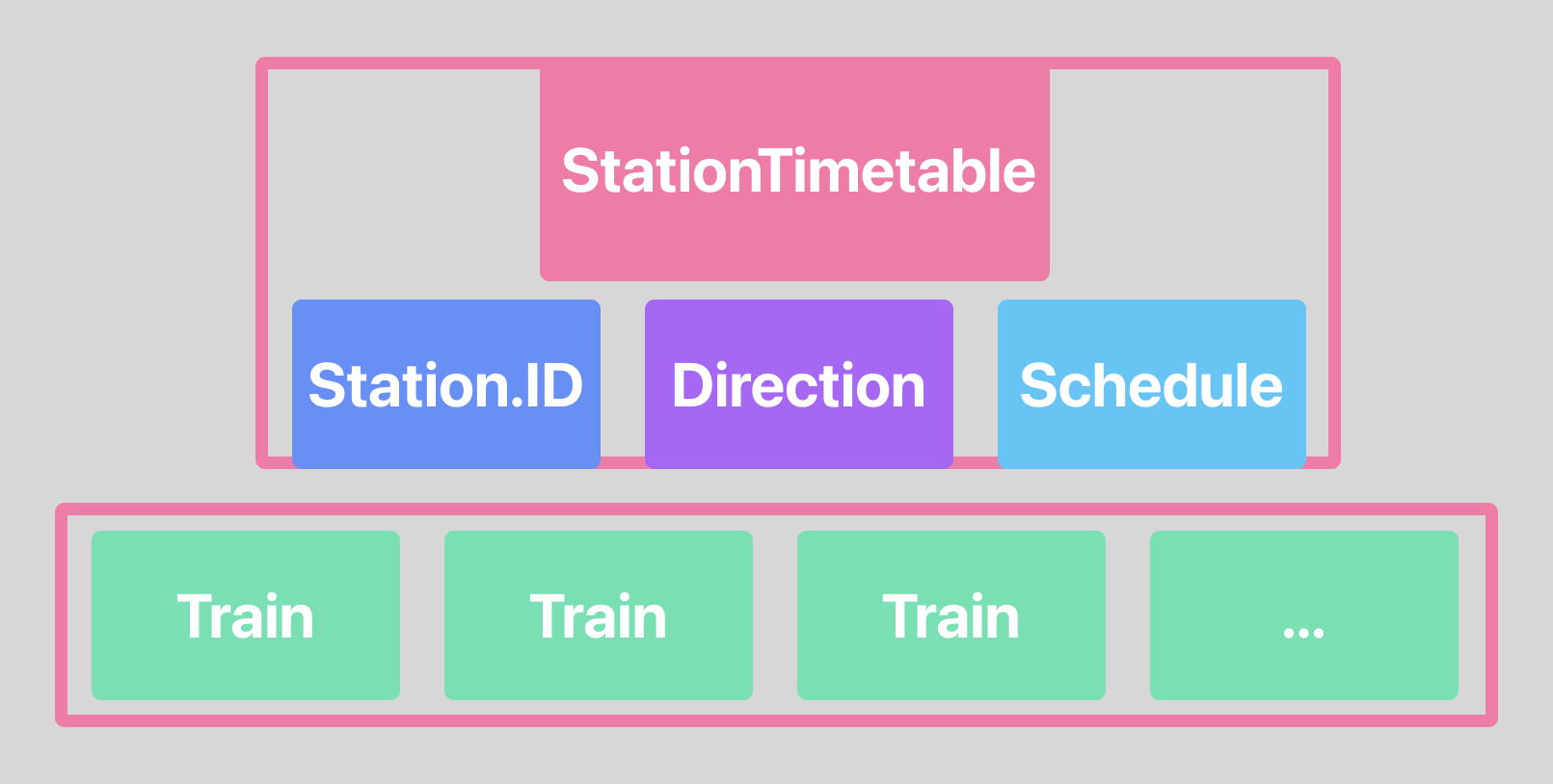
A StationTimetable shows when a Train departs a Station going in one Direction on a particular Schedule.
I already had a simple station timetable screen whose focus was on departure times.
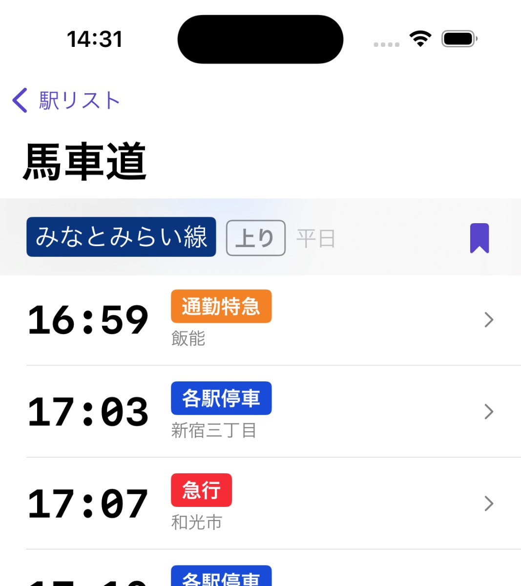
The station timetable screen was built as the logical next step to choosing a StationBookmark. A StationBookmark stores both the Station a user often departs from and the Direction they’re headed. For example, I often depart from Bashamichi station going inbound towards Yokohama on a weekday schedule.
Without that second piece of data – the Direction – there’s not enough information yet to show a timetable. Not a problem for bookmarks, but a big problem for nearby stations and searched stations.
For v1.0, my design solution was:
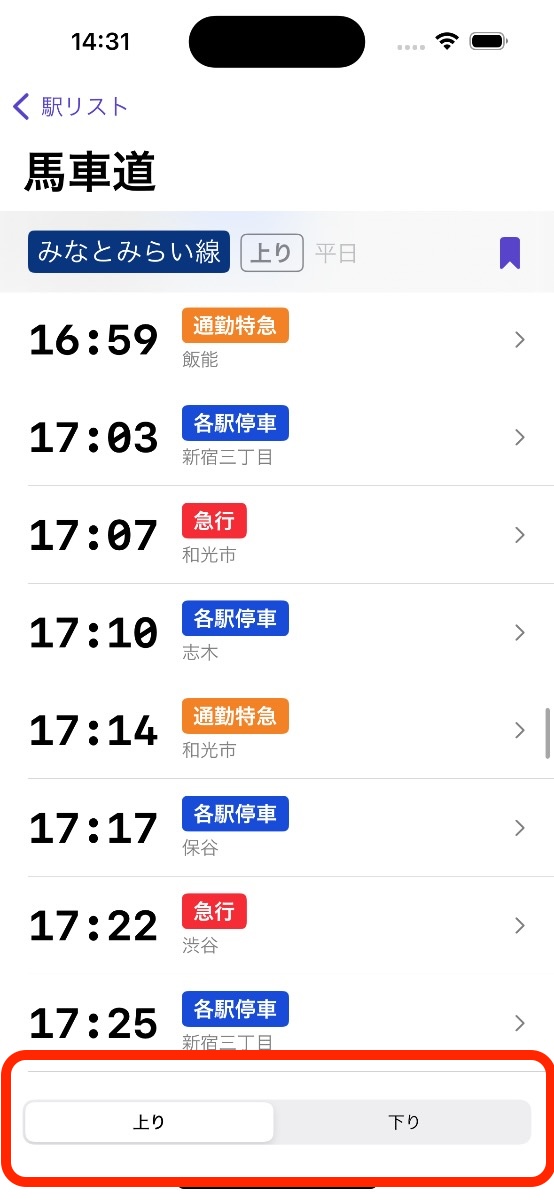
- Add a direction switcher to the station timetable screen (when applicable – some stations only have one direction).
- Default the user to one of the directions when they selected a station from nearby or search.
The assumption was that the user would double check the default direction and switch to the opposite direction if necessary. More than half the time, this gets the user to their desired information (the timetable) faster than the alternative designs.
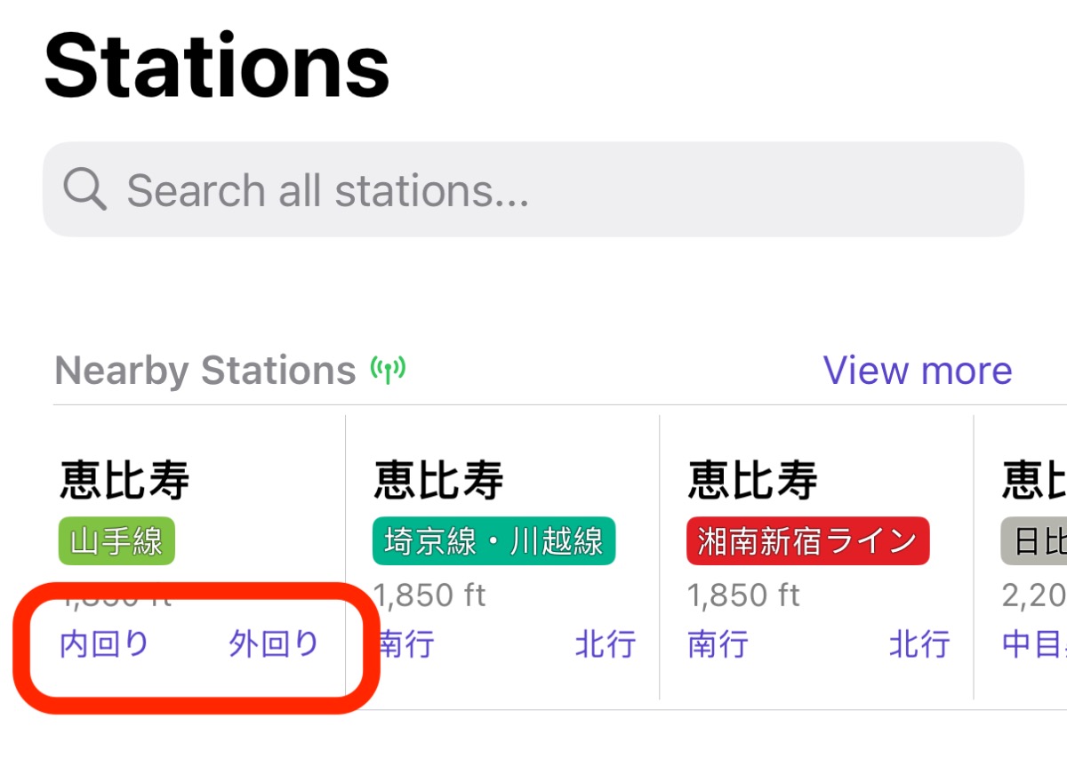
One alternative design would be to show both rail directions as tappable buttons on the home or search screen.
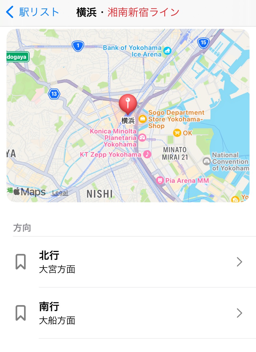
Another alternative design would be to present an inter-statial screen that only asked: “which direction are you going?”
I considered both those alternatives to be clearer in the short term, but slower in the long term once the user understood the flow.
My guiding principle of the app is speed. Therefore, I chose the v1.0 design solution with the intention to return to the decision later.
Identifying user flows
There’s clearly two user main user flows that branch off from when the user opens the app:
- A. The user is in a familiar place and chooses a station bookmark
- B. The user is in an unfamiliar place and chooses a nearby station
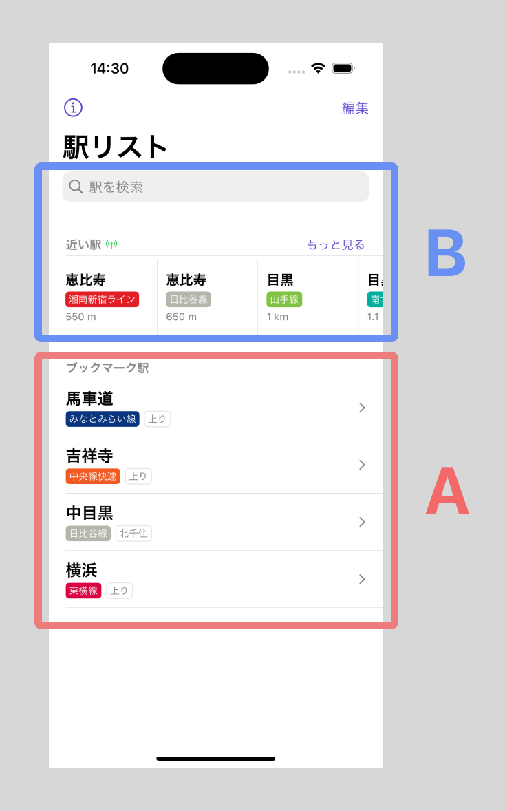
Additionally, there’s a third flow for when the user is perhaps first setting up their bookmarks or doing some other station research.
- C. The user is searching for a station by text
Use cases (B) and (C) are similar in that the user needs to choose a direction, so I’ll combine them.
The (A) case is already solved well enough with the existing station timetable screen. If anything, it’d be great to remove the complexity of having a direction switcher in this case where it’s ambiguously useful.
My goal was to find a better solution to the (B) use cases than I’d previously pitched (to myself).
Identifying design goals
The primary design goal is for the user to find their timetable departure as quickly as possible with as few taps as possible.
Another key observation I got from my own experience and user feedback was that it’s often quite burdensome trying to figure out which direction is the correct one in any given trip scenario.
Of course, this is mostly a solved problem with traditional algorithmic based routing based on departure and destination points, like the UX of Google Maps or Jorudan apps. You type in your destination and the app gives you a route and tells you which platform to wait at.
But despite of the ease of use of traditional routing apps, I was still finding myself wanting to explore the relative simplicity of a departure-based UX rather than a destination-based UX.
So my secondary design goal was helping the user decide which direction was correct as quickly as possible with the least amount of mental overhead.
And finally, I realized that I had a lot of often extraneous yet sometimes interesting and useful data about each station that I had nowhere to display. As a tertiary goal, it would be nice to have a place for all that data that respects the principle of progressive disclosure: staying out of the way while still being accessible when desired.
Exploring solutions
Starting from the most important of the design goals, I started mapping out the station detail screen.
First design goal: timetable departures
If we want the user to find their timetable departure as quickly as possible, the most direct solution is to simply show the timetables for both directions as the same time. The upside to this design is that there are no additional taps. The downside is visual complexity.
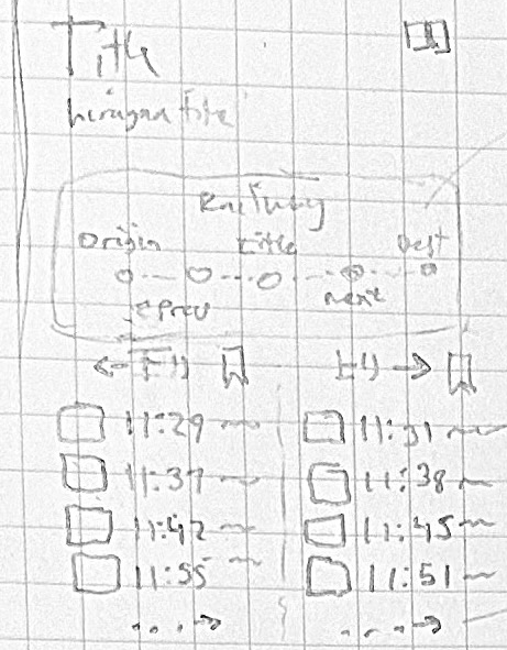
Honestly, this was the biggest unknown that I wrestled with throughout the design and implementation process. I doubled down on the bet that the gain in speed would outweigh the visual complexity of the screen. The only way to test it was to progressively build out more and more of the screen, enough so that I could test it in context with a wide variety of stations in a wide variety of situations.
But showing two directions means doubling much of the data on the screen. And making the visual complexity even worse.
What fell out of this design decision was that there were situations where the user had already specified which direction they were interested in. In this case, the screen could hide a full column.
What made this screen different from the station timetable screen? Well, I would have truncate the full timetable since there were other sections. The fact that I could link out the station timetable screen meant I could be smart about narrowing down the timetable items based on projected use cases.
Most often, the user is starting their journey now and doesn’t need earlier departures. I can also bet the user is not planning a journey too far into the future. But I need to account for stations that have significantly frequent departures with different train types and destination stations. Without knowing how much could be fit on the screen, I guessed 4 timetable items would fit the requirements (and later expanded it to 6).
For better or worse (UX), showing a station’s departures for both directions solves the first design goal.
Second design goal: determining direction
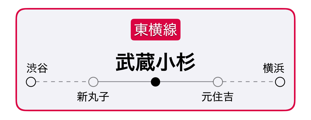
The second design goal – giving the user enough information to determine their direction – also could be solved several ways. I turned to skeuomorphism and the humble rail diagram commonly found in train stations.
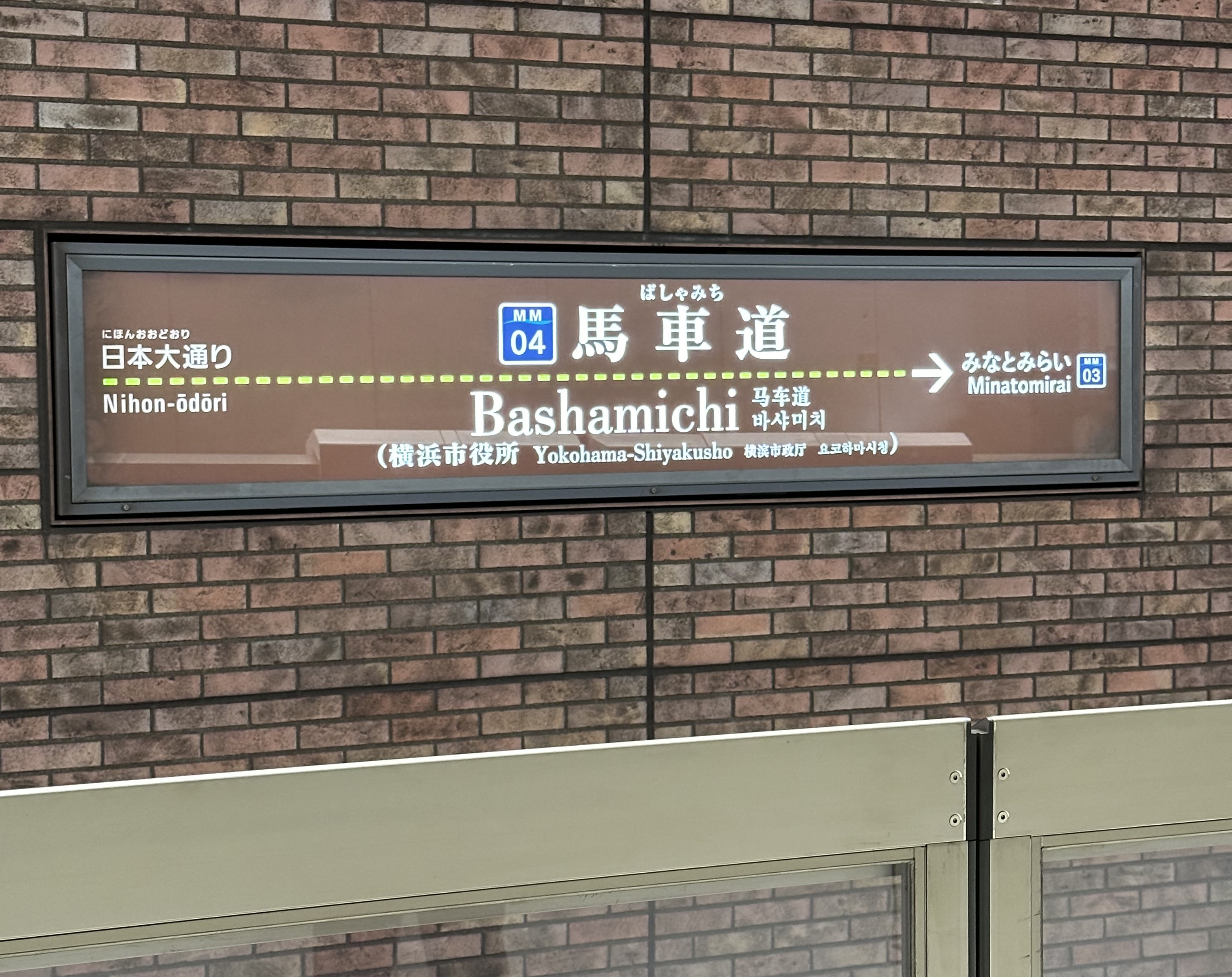
The rail diagram format has several upsides:
- Almost all train riders have seen its shape before.
- I already have the data to construct it dynamically.
- It maps somewhat logically to directions.
- It shows both terminal stations and neighboring stations (one of which is usually enough to orient a rider)
- It implicitly includes railway information so users don’t get confused about e.g. which Shibuya station they’re looking at.
Posting a rail diagram at the top of the screen acts as a guide. The user can look for their destination station on the left or right side of the rail diagram, and then choose a departure from the timetable on that side. This solved the second design goal.
The distinct look of the rail diagram also acted as a nice way to distinguish the station detail screen from the station timetable screen or other screens.
Third design goal: tactfully show infrequently used data
Finally, there was the third design goal of including some lesser used information about the station.
I started by listing out all the potential pieces of data that might fit.
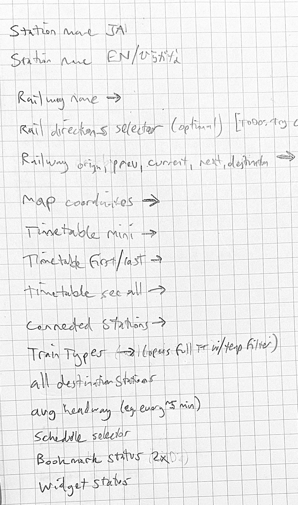
To keep scope reasonable, I didn’t want to force myself to implement all these sections for the first release. But I did want to keep a record of ideas for later while also getting an intuitive feel for how flexible the design would be for adding new types of data.
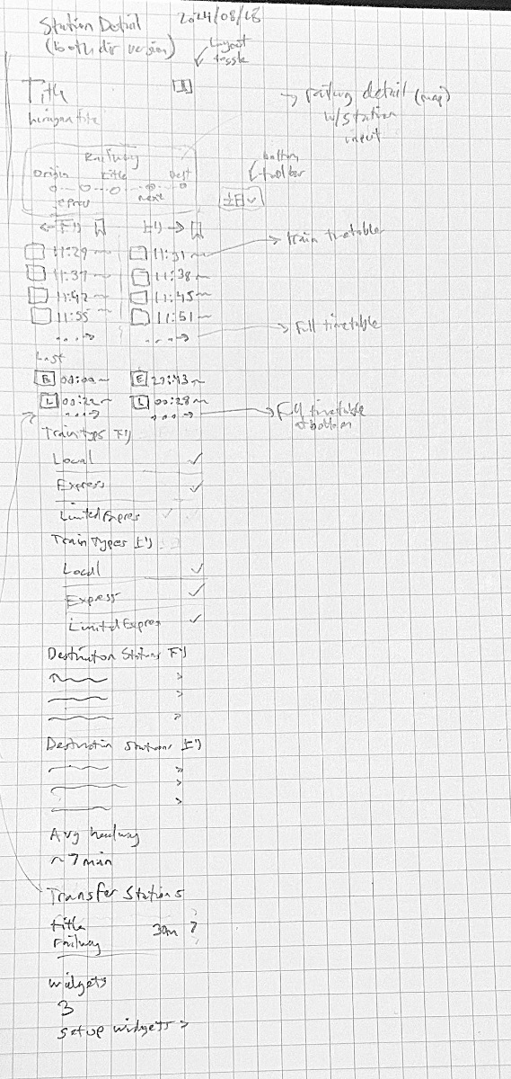
With this very rough sketch, I got to work on my design-via-SwiftUI procedure.
Arranging the composite data
The required data for this screen is more complex than all the other screens so far.
Starting from the Station.ID, I’d need the full Station and Railway data.
For timetables, I’d need 1 or 2 Direction for each Schedule because I’d committed during the planning phase to support user-selectable Schedule alongside using the automatically calculated schedule for the current day.
Aside: in retrospect, committing to user-selectable
Schedulewas a significant development burden that was completely unnecessary and unrelated to any design goals. Although I fully designed and built the feature, because of its downstream unintended consequences on the UX of other screens, I ended up removing the option to use it before release.
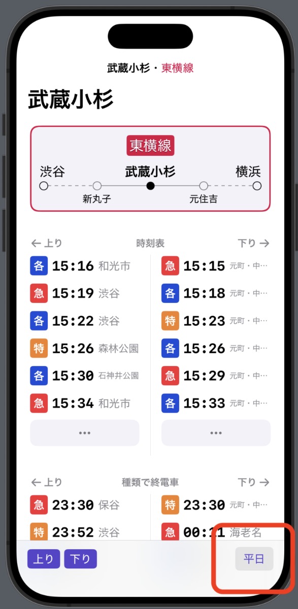
For connected stations (i.e. transfer stations, connected railways), I had the data but had not yet imported it into the app’s domain model. I ended up adding this section in the next point release (v1.3).
Disregarding the additional Schedule infrastructure, it wasn’t significantly slower to create the composite model for this screen than it would have been to assemble a mock data structure. Therefore I designed with the final data structure fetched from the database. This is always preferable to mock data because the marginal cost of choosing other stations as test data to populate your design or prototype is so low. For example, it was much quicker to find station examples from the database with long text that broke my initial layouts.
List sections
Designing and implementing the railway diagram
The railway diagram was important enough to the design and implement first.
I started with a paper sketch that helped me understand the nuanced cases I’d need to cover.
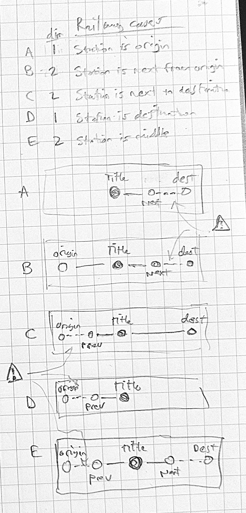
This was a fun design and layout challenge. I wanted to show the terminal stations of the railway and both neighboring stations to the target station. I also wanted to change the line style to be solid when the stations on the diagram were directly connected and dotted when there were other stations in between them.
Of course, the Yamanote circle line broke a lot of my assumptions and required some special casing and a custom algorithm. But overall I felt like the design ended up where I wanted it to.
Designing the timetable section
I reused the timetable item design language from other parts of the app. Including the 1-character train type indicator. Some lines are all local and all have the same destination, but many do not and require this data in order to be useful at a glance.
In the first version, I always calculated the timetable lower cutoff based on the current (live updating) time. However, after implementing connecting stations, I realized that when calculating transfer times, it made sense to pass through times from previous screens and allow the user to toggle between them if necessary.
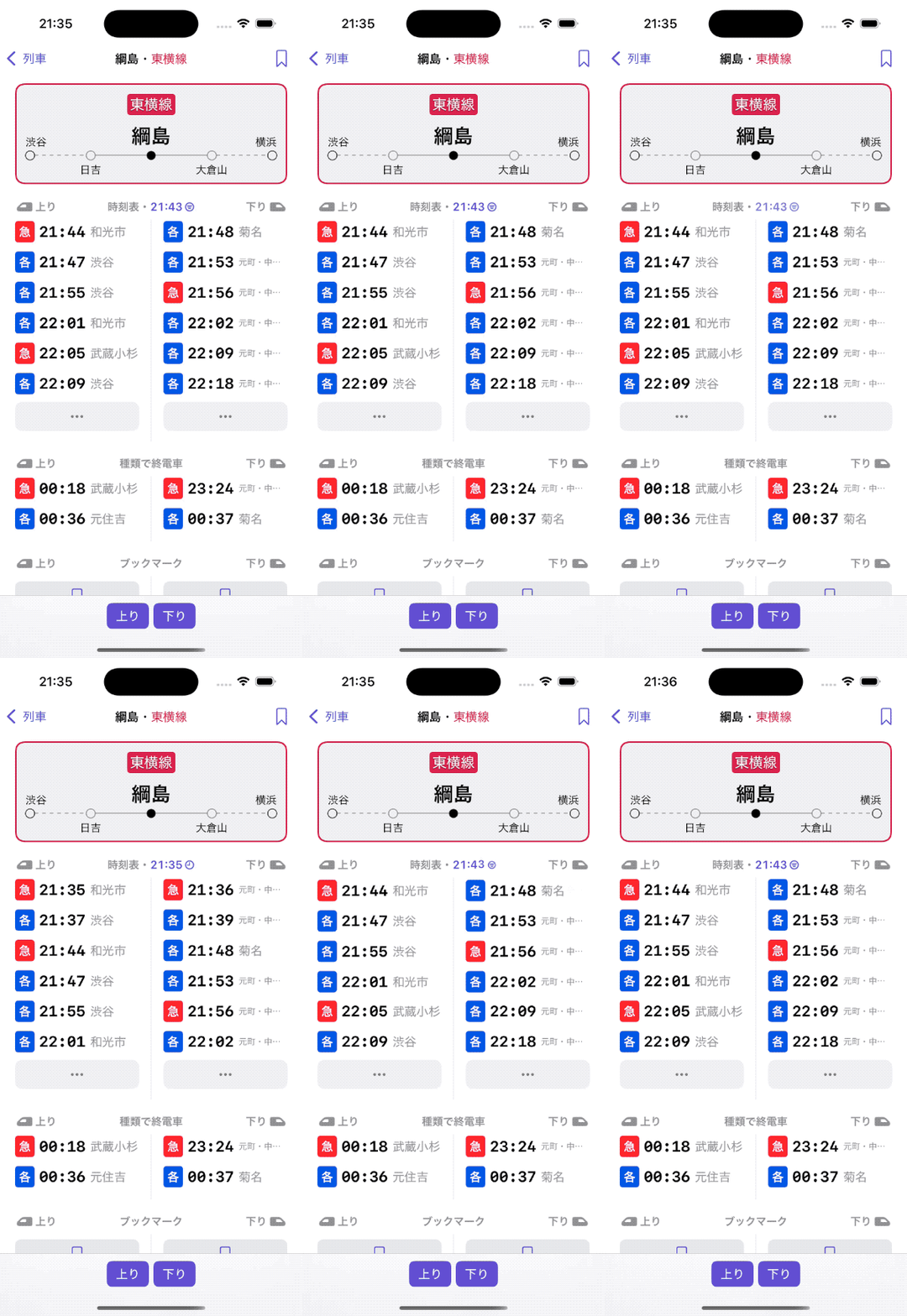
I was a little unsure of whether the ... button would be clear enough to indicate the full station timetable. So far it seems to be okay.
Last train by type
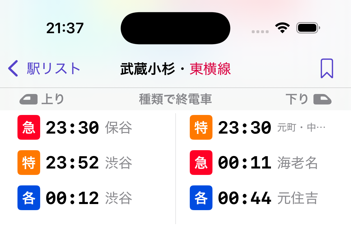
A bit of speculative feature: I thought seeing last train times at a glance would be occasionally useful. You can see this data by searching for “last” in the Google Maps schedule selector, but it only shows the actual last train regardless of type. As a user, sometimes I want to know when the last limited express train is because for me taking the local is about twice as long.
Technically, I should also be showing the last trains by both type and destination. But for most railways, I think type is enough for now.
Another tough part about this section was what to name it in both English and Japanese.
Bookmarks
Bookmarks was one of the most difficult layout choices I had to make for station detail, and I’m still not completely satisfied with it.
In my view as the designer of Eki Bright, bookmarks are the core feature of the app because they enable lookup speed and so heavily differentiate the app from its full-featured competitors. They also enable use of widgets, another core feature of the app.
The flow of adding bookmarks needs to be fast, obvious, and efficient, but after bookmarks are added, it will be rarely used. This makes it very difficult to design for.
I ended up compromising. I added a bookmark icon to the top right navigation bar that scrolls to the bookmark button section lower in the list.
Why not just have the button in the navigation bar work as the real button? Each station direction can have its own independent bookmark, so it makes more sense to have buttons segregated in the same way.
Still, it’s confusing, and definitely requires a more long term solution.
Train types
Getting less useful now, but I still think it’s good to see an overview of which train types exists for more complicated railways.
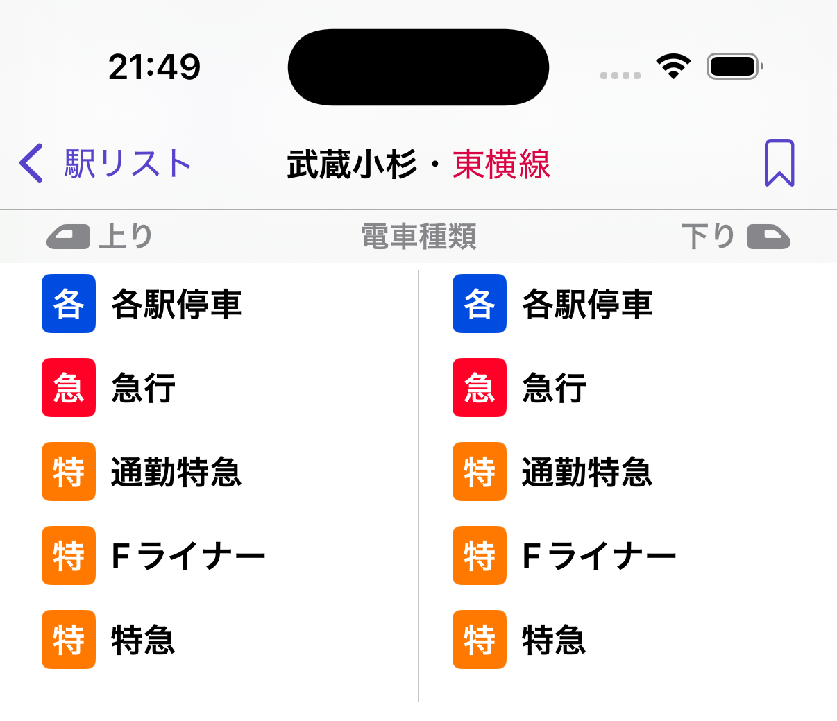
In a future version, I’d like to add some calculations for each train type to show an average of how often each arrives and what part of the day each is active for.
Destination stations
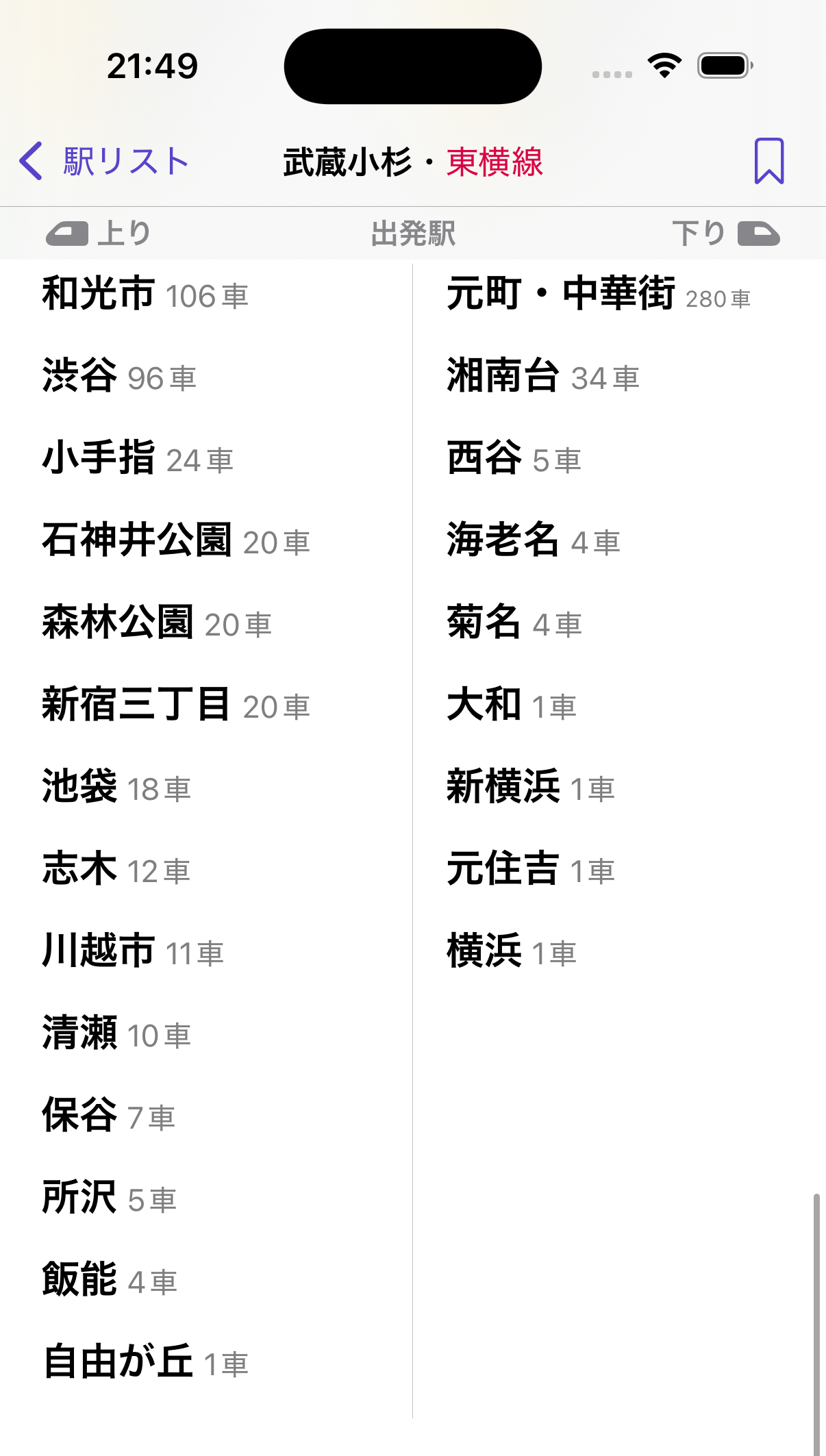
Another rarely useful bit of information, depending on the railway. I added this mostly because it was easy to calculate.
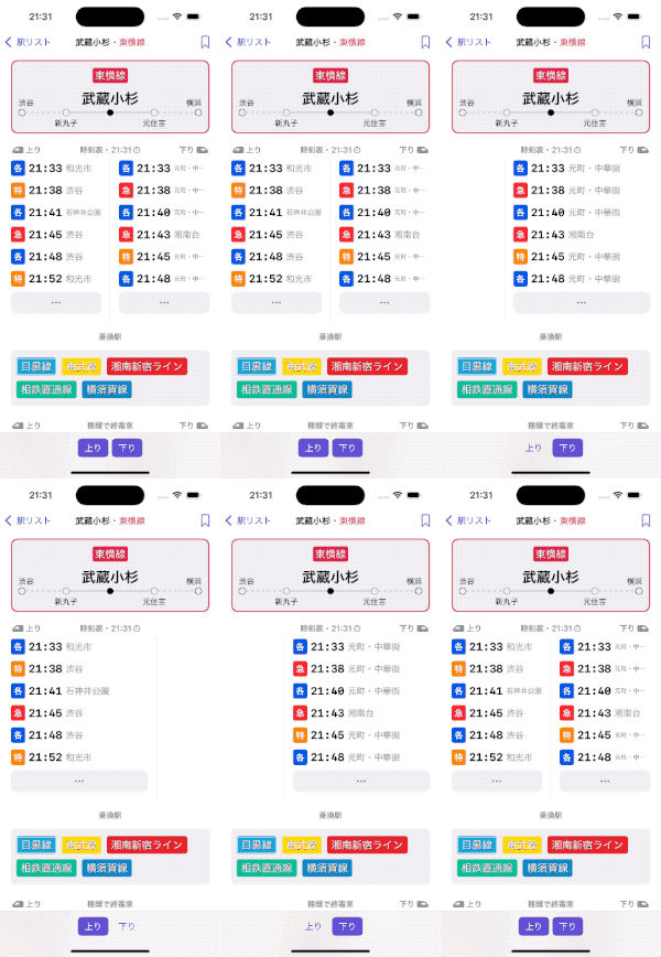
Rail direction toggle
For stations that have more than one direction, the toolbar is shown with individually toggleable direction buttons.
Self critique
As discussed above at various points, I think this screen has plenty of room left for improvement. However, I’m pleased enough with how it accomplishes the three design goals I set out to accomplish.
- Railway diagram: there are a few stations where the text gets cut off in strange ways.
- Bookmarks: I’d like to experiment with popping up a separate modal for adding a bookmark instead of scrolling the list.
- Direction toggle buttons: I’d like to try moving these buttons above the railway diagram. Although important, in real usage I rarely find myself changing them.
I’m of course interested in real user feedback. If you’re a Tokyo-area resident, download the app, give it a go, and send me your thoughts.