Eki Bright - Developing the App for iOS
Continuing my series of posts about my latest iOS app, Eki Bright 駅ブライト, I’ll discuss the more interesting parts of app at version 1.0.
Please check out the other posts in the series:
- Eki Bright - Tokyo Area Train Timetables - the motivation behind the app and the solution I’ve begun to explore
- This post - the high-level implementation details
Tokyo-area residents can download the app from the App Store.
Eki Bright is currently closed source due to data licensing issues, but I’d like to open source it as some point once I get that aspect figured out.
Stats
Before starting digging into the details, I’ll go over some stats about the app for context.
- The app has 6 screens (5 with behavior).
- The app has around 5700 lines of Swift code.
- The app has a minimum deployment target of iOS 17.0.
- The app supports only the iPhone form factor. There’s no technical reason for this. It was mostly to reduce complexity, promotional material requirements, and testing for the first release.
- The app uses about 5 packages via Swift Package Manager: ComposableArchitecture, Collections, AsyncAlgorithms, DependenciesAdditions, GRDB, HolidayJp. ComposableArchitecture relies on several other pointfreeco packages, which I also use directly.
- The app uses a basic xcodeproj file.
- The app was archived with Xcode 17.4, which includes support for Swift 5.9, iOS 17, and (colloquially) SwiftUI 4.
- The app has a SwiftUI
Appentry point. - The database of railway, station, and timetable data is generated by a script at develop-time and included in the app bundle at compile-time. The app makes no network requests.
- The app uses the
licenseplistlibrary installed via Homebrew for generating a license file for packages. - The app embeds no analytics framework.
Work schedule
Prototype
I started researching and prototyping the app in mid-November. This version had support for one station going inbound on weekdays. It parsed directly from a folder of the raw json files from my data source. There was no importing and no custom database yet. It had one station timetable screen and one widget layout.
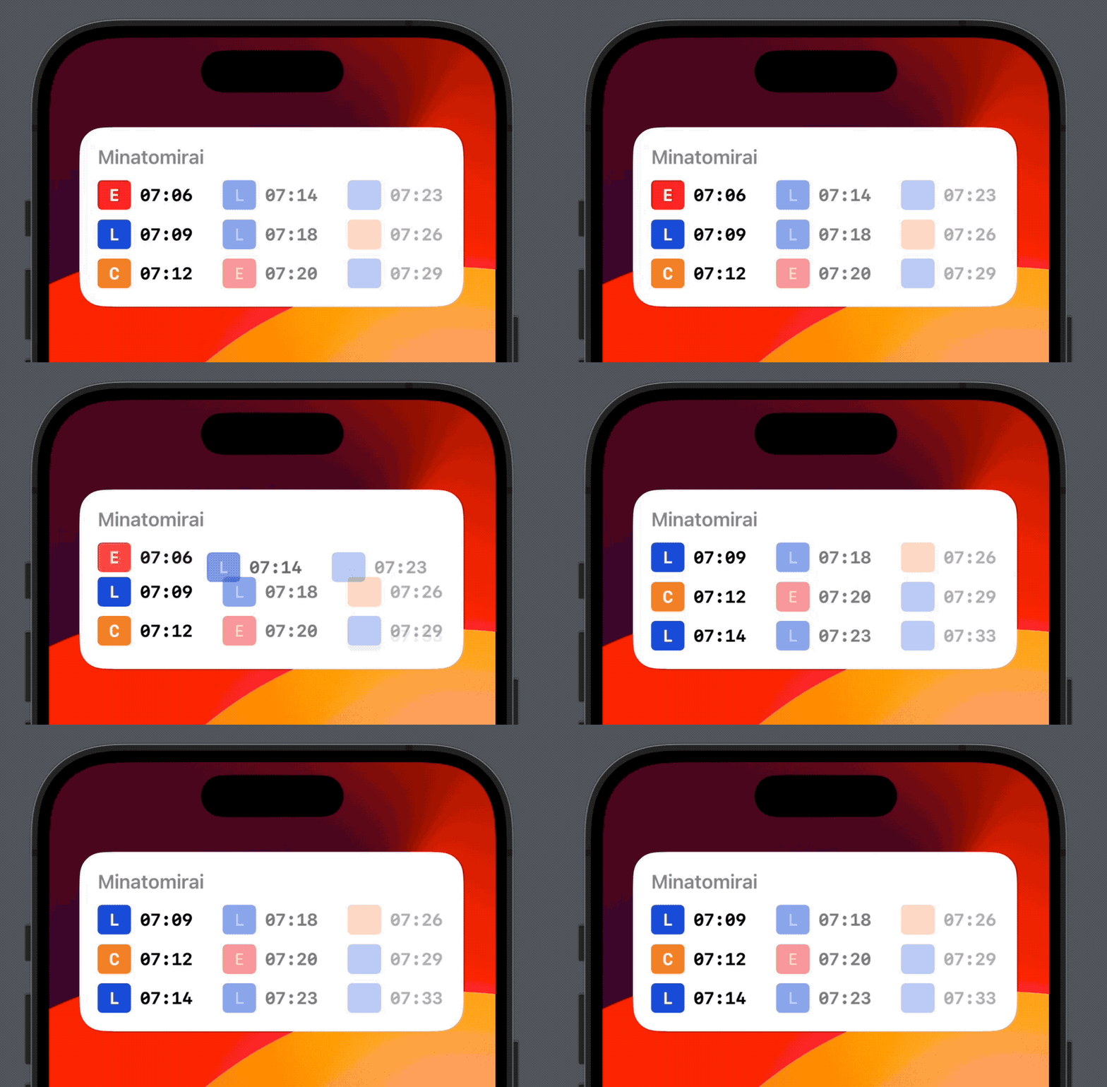
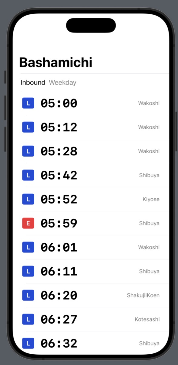
After a week of light usage, I’d decided to continue on to start on a production version intended for wide release.
Sprint 1
I wrote an import script to turn the input json files into a SQLite database (more on this later). I outlined a simple screen structure, still with the idea that the main app would mostly be a pre-configuration step for the widgets that users would be most interested in.
By early-December 2023 I had a home screen with bookmarks; a station timetable screen that could show any combination of station, direction, and schedule; a station search screen that worked with romaji; and a station detail screen where you could add or remove a bookmark.
I took a break from the project for several months, whilst still continuing to use and analyze the fruits of this first sprint.
Sprint 2
I started the second sprint in June 2024.
Although I always had a freshly pruned TODO list, my day-to-day usage of the app while out exploring Tokyo guided a lot of my feelings of what was missing from the first release.
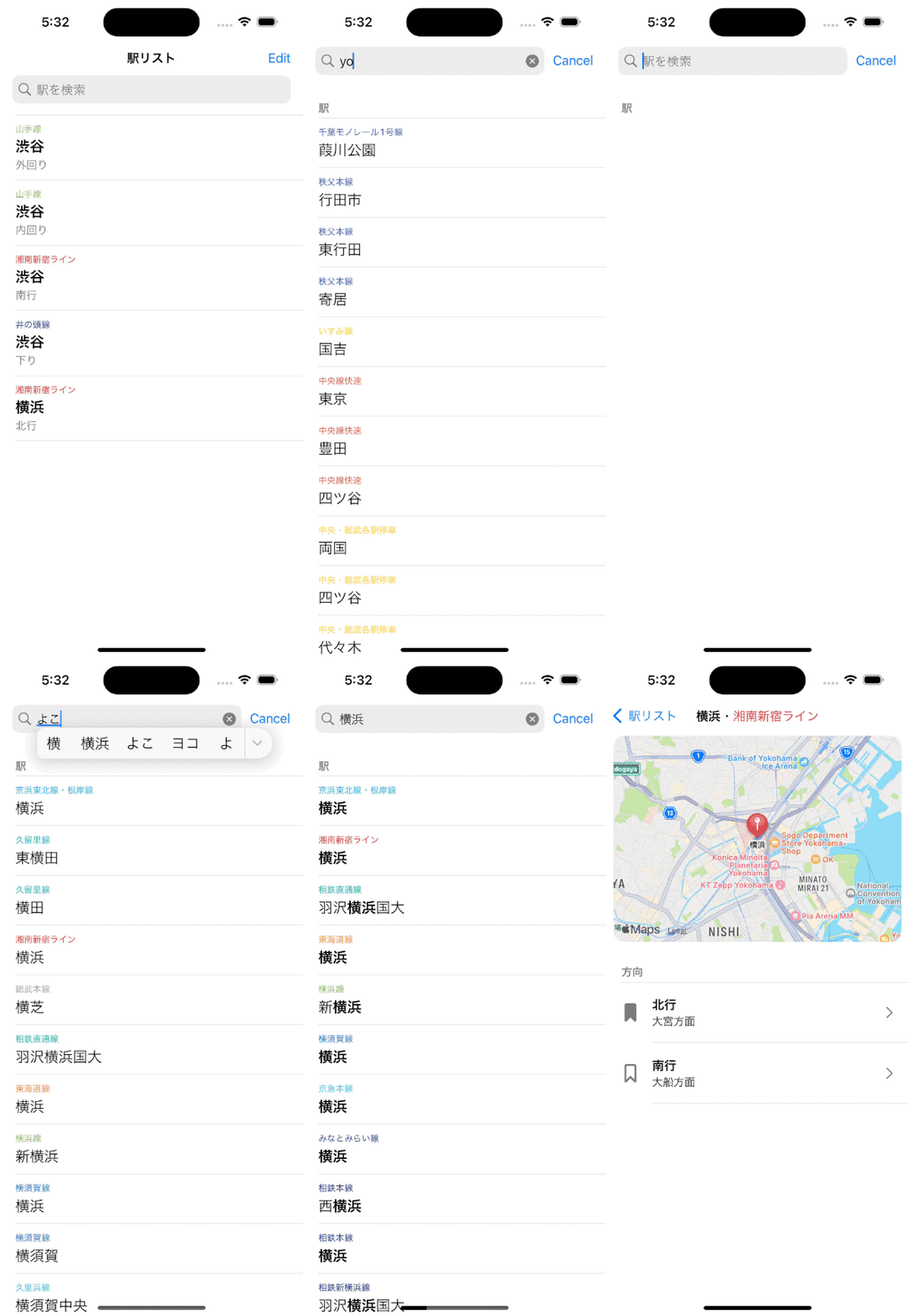
I made the big decision to only target Japanese for the first release. This required ensuring search worked equally well with hiragana, kanji, and romaji.
When out riding the trains, I realized a few things:
- I was using the main app a lot more than I expected; not just for my home stations.
- Text search was procedurally too slow to use to look up nearby stations in the moment.
- Live updating nearby stations would unlock several use cases I was really excited about.
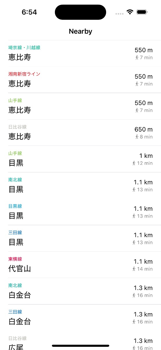
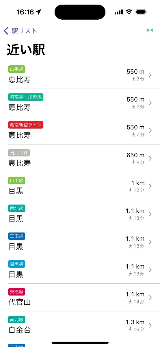
I took a detour to implement live nearby stations, first in a dedicated screen, then as a smaller section on the on the home screen.
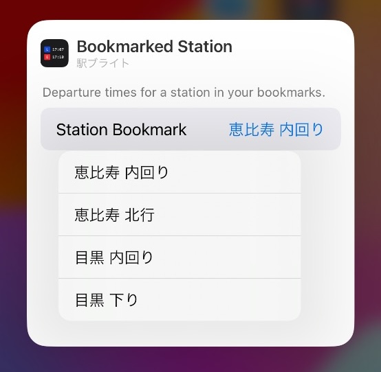
Next, I had to tackle the production implementation of widgets, including a mechanism to select which station/direction pair (in the form of a bookmark) appeared in the widget.
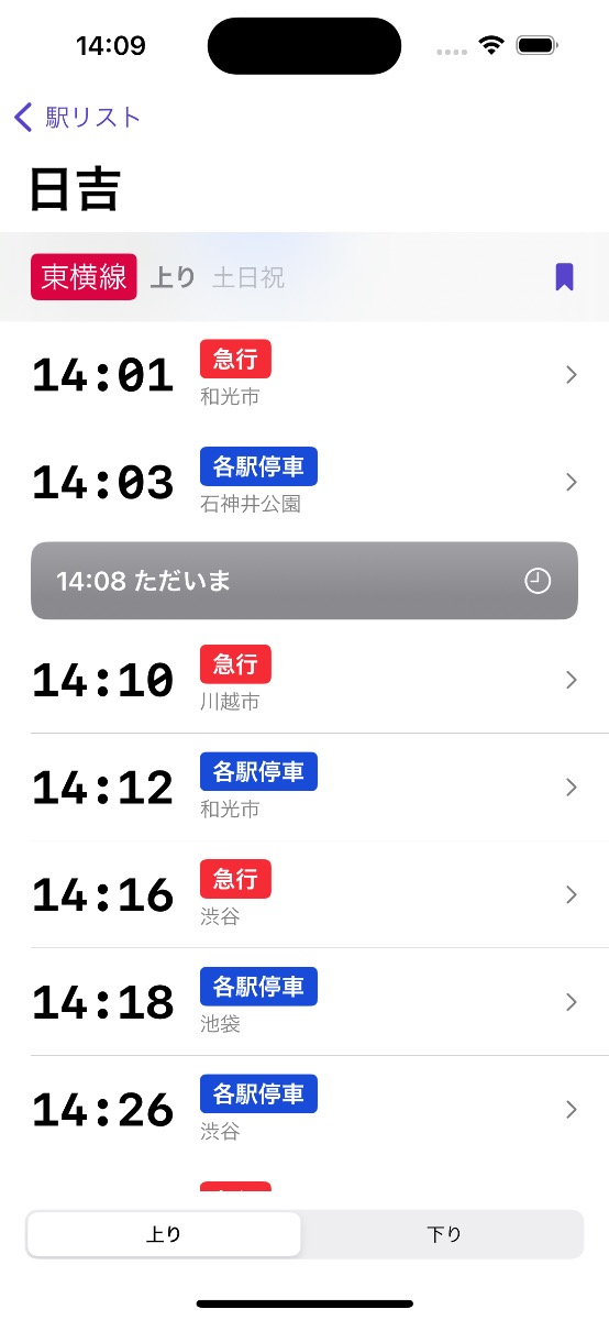
I was steadily making UX and UI tweaks across the app’s few screens, especially when considering the default Japanese localization. Especially on the station timetable screen. I implemented the swipe & segmented control for switching rail directions, support for showing the entire day’s schedule, showing the current time in-line with the timetable entries, and tweaking font sizes and colors.
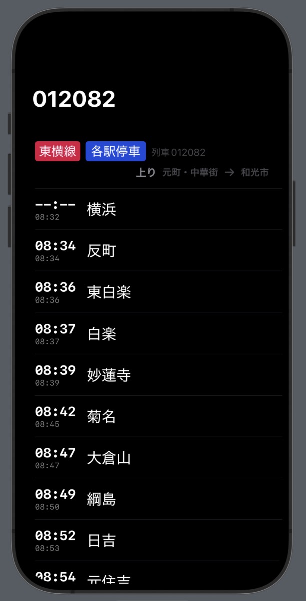
I took a (probably unnecessary for version 1) sidebar to implement a train timetables screen. It shows which stations a train will visit on its journey. This was another common request from my beta testers, and a feature that vastly increased my usage opportunities for the app while riding. Users could now quickly view the destination stations of an express train on an unfamiliar railway and see whether they should get on or wait for the next one.
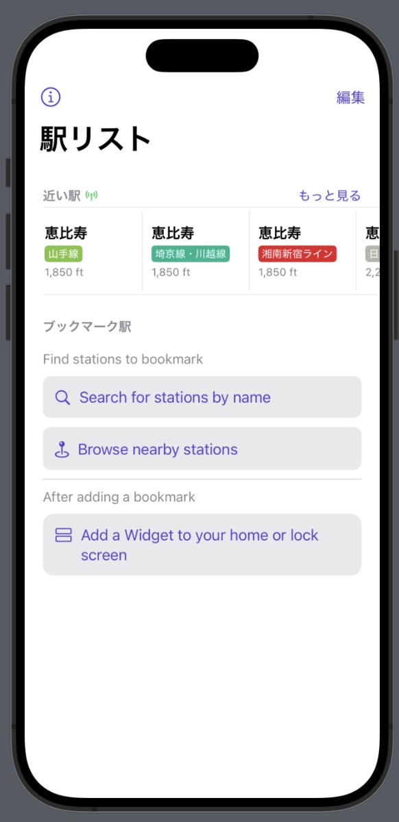
The core features of the app felt pretty good. I moved onto onboarding and the about screen. It was nice to be able to copy the about screen nearly verbatim from Count Biki. Code reuse is usually never that straightforward in practice.
The last 1% (that takes 99% of the time) was copywriting for the App Store listing, designing the icon, and submitting.
Architecture
The app is built all-in with The Composable Architecture (TCA) 1.11. This includes passing and scoping Stores through the view layer, creating Reducers with State and Actions for most screens, and creating dependencies in the style of the swift-dependencies library.
This follows on from my experience building my previous app Count Biki. TCA underwent significant changes between the time I finished Count Biki and started working on Eki Bright.
The most significant (and welcome) change was the @Shared state-sharing system. It made my iterations on the bookmark system relatively trivial. Just a lot less boilerplate than I’d previously needed. Also, @Shared worked without a hitch in the widget extension.
Overall, I’m getting a lot more comfortable with TCA and feel pretty confident using it as my default architecture on indie apps going forward.
Data
Importing and storage
I used the responsible (read: no premature optimization) strategy of starting my prototyping by live parsing the json files directly from my data provider. From this experience, I decided to implement a more robust and flexible data storage system before a first release.
As mentioned in my intro post, the overarching theme of this app is speed. Searching a directory structure for the appropriate timetable file, loading multiple megabyte json files into memory, parsing them, and aggregating the results on each request did not align with my speed goals. Especially considering the various views of that data I wanted to support.
Of the many many data storage and access systems available, I chose GRDB, a long-lived wrapper library for SQLite. Even though my requirements are of relatively minimal scale, I still can’t get get onboard with a nascent solution like Swift Data that has obvious brick-wall functionality limitations and no public roadmap as to when they will be addressed. GRDB, on the other hand, lightly abstracts SQLite, has been in heavy usage by the community for years, has robust documentation, has an extensive set of quick start code snippets, and a well respected and responsive maintainer.
A reasonable solution in our networked world would have been to host the data on my own server and perform a network request for each timetable, etc. I could have added caching layers to improve response times in the common case.
However, using the network goes against my speed goal. Although network coverage is admirably solid underground in Tokyo, there’s enough chance of drop outs that I wouldn’t want my users to lose trust in the app in those few cases there’s no signal for a duration of their request. All things equal, with implementation simplicity comes robustness. And a local database removes many breakable layers of abstraction from the request/response chain.
The tradeoff is app storage space. The database started at around 300 MB, then 400 MB, then ballooned to over 1 GB (related to app extension issues), before I could optimize it pre-release back down to ~225 MB. Still quite large for such a simple app, but again, it’s both a trade-off I committed to up front and differentiation point.
One of the best decisions I made was to invest in creating a simple and well-documented Swift script dedicated to reading JSON files and spitting out a single SQLite database. I ended up running this script dozens of times. A full import now takes about 10 minutes of wall-clock time, but in the early stages of development took less than a minute.
The import script allowed me to make iterative decisions to my schema, normalization strategy, naming, data supplements unique to my app, etc. during development. I’d simply switch targets, run the script, and replace the database file in the app directory.
Regarding the schema, I specifically decoupled the “import” model types from the “app” model types. This means that I can make the normalization/de-normalization decisions that affect query times before compile time.
For example, for search, I added a “queryTerms” field that aggregates all language variations of a station name e.g. aomi aoumi あおうみ 青海 アオウミ. I can create this queryTerms field at import time so no CPU time is dedicated to it at run time.
The import step also enables me to do data consistency and invariant checks. These are especially important as my provider’s data is expected to evolve over time, and relations between JSON data can get silently corrupted.
Modeling dates
A couple invariants about dates:
- The data provider uses 24-hour time, within the range 00:00-23:59, specified as strings.
- There are no 24-hour trains in the Tokyo train network at the moment.
- Timetable schedules are specified conceptually as either weekday, saturday, sunday/holiday, or weekend depending on the railway.
- No trains on any railway start before 3am.
- No trains on any railway end after 3am.
I had two structs for dealing with these invariants.
HourMinute stores times at the most useful precision. It stores times as 24+ hour time, which considers early morning the next day as part of the current day. It allows easy comparison and adjustment. It ensures there are no out of bounds times.
struct HourMinute: Equatable, Comparable, Sendable {
    let hours: Int // 3...26
    let minutes: Int // 0...59

    static let earliest: Self = .init(uncheckedHours: 3, minutes: 0)
    static let latest: Self = .init(uncheckedHours: 26, minutes: 59)

    private init(uncheckedHours hours: Int, minutes: Int) {
        self.hours = hours
        self.minutes = minutes
    }

    init?(hours: Int, minutes: Int) {
        guard (Self.earliest.hours ... Self.latest.hours).contains(hours),
              (Self.earliest.minutes ... Self.latest.minutes).contains(minutes)
        else {
            assertionFailure("Out of bounds")
            return nil
        }

        self.hours = hours
        self.minutes = minutes
    }
}
When the user selects a station/direction pair, there are either 2 or 3 different timetables that we could show depending on the current time.
For example, on a honest Saturday, a particular railway may not have specific saturday schedule, but instead may have a nonWeekday schedule also valid on Sundays or holidays.
In order to determine which one to show, I use a ScheduleSelector helper to map the current logical schedule (weekday, Saturday, Sunday, or Holiday) to the potential Schedule that has a timetable.
enum ScheduleSelector: Equatable, Sendable {
    case weekday
    case saturday
    case sunday
    case holiday

    /// For a named day, which schedules are valid?
    var possibleSchedules: [Schedule] {
        switch self {
        case .weekday: [.weekday]
        case .saturday: [.saturday, .nonWeekday]
        case .sunday: [.holiday, .nonWeekday]
        case .holiday: [.holiday, .nonWeekday]
        }
    }
}
If the user checks the app after midnight, I need to make sure the app still fetches the schedule from the previous calendar day.
There’s some annoying date math involved. But since all schedules are locked to one timezone, the implementation is less complicated than it would be otherwise.
Train Categories
A train type is a specific name expressing which stations on a railway a train will stop. For example, “local” or “express” in English and “各駅” or “急行” in Japanese.
The names for train types follow conventions, but they are by no means standardized. For example, the Toyoko line has several train types, with a few only present on weekends:
- Local
- Express
- Limited Express
- Commuter Limited Express
- Semi Express
- F-Liner
- S-TRAIN
A train type with the same name on a different railway may have a different color indicator. This color may not even be consistent across information sources for the same railway.
The outlier train type names can be long, even in Japanese. When I was designing the more space-constrained widgets, I realized it would be necessary to standardize train types even further for the sake of my app users.
I manually created my own system of train categories.
enum TrainCategoryKind: String, Equatable, Codable, Sendable {
    case local
    case rapid
    case semiExpress
    case express
    case limited

    var colorHexString: String { /* ... */ }

    var oneCharacterJA: String {
        switch self {
        case .local: "各"
        case .rapid: "快"
        case .semiExpress: "準"
        case .express: "急"
        case .limited: "特"
        }
    }
}
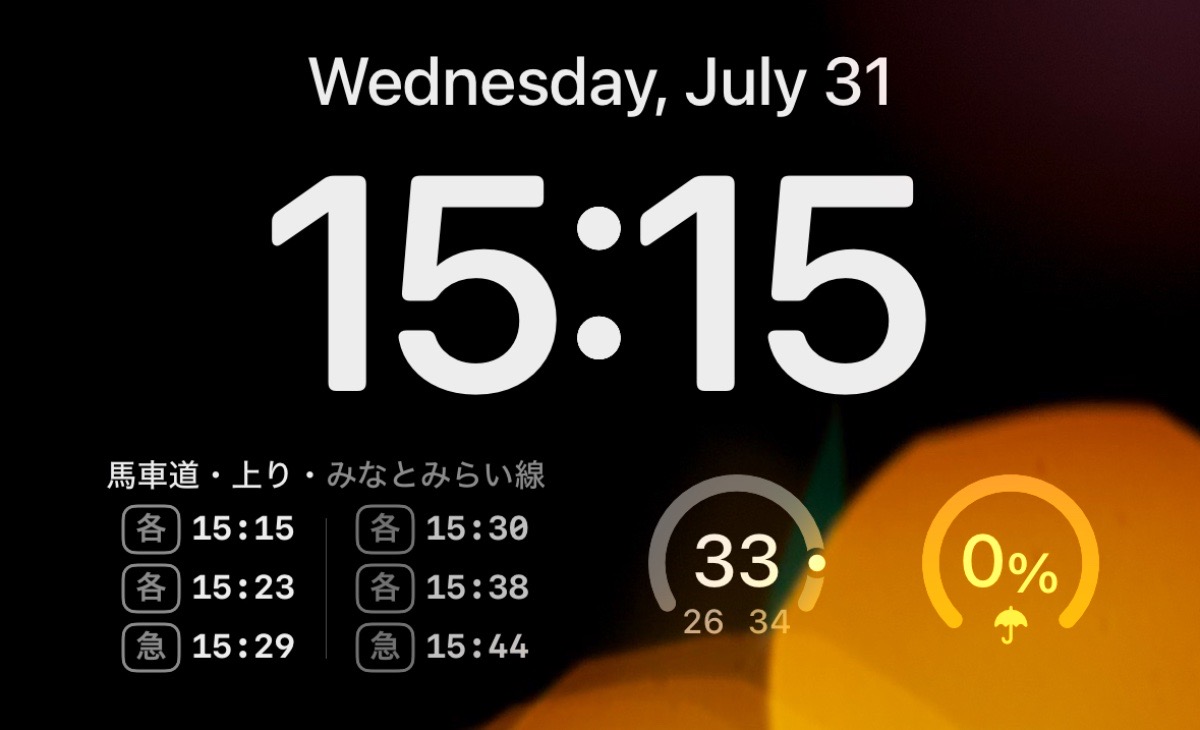
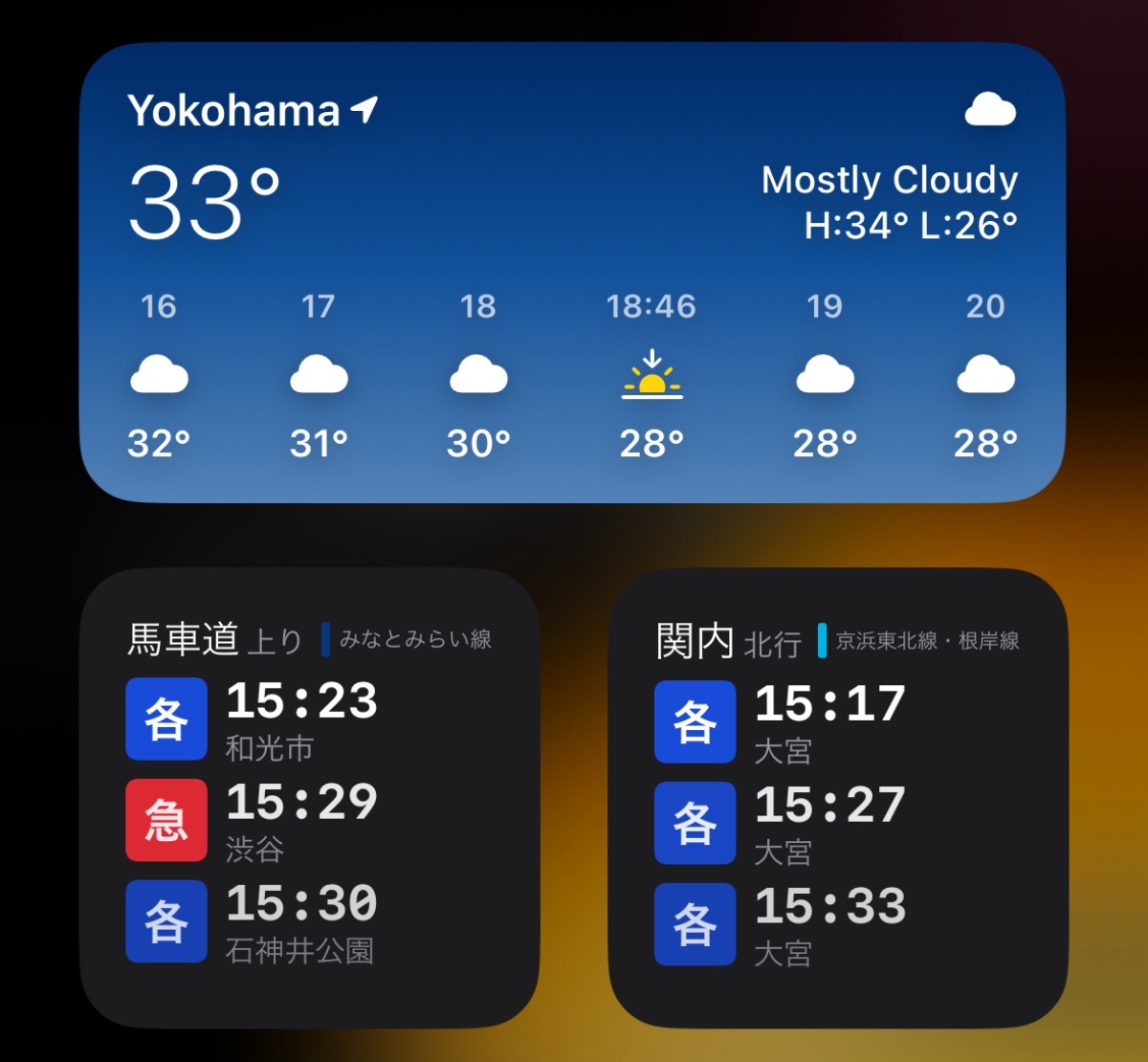
My design philosophy for the app is speed, and I also assume long-term usage from users who are familiar with a railway (at least enough that they’d need a widget for it). Therefore, I think its reasonable for users to learn a shorthand to distinguish between a “Local” and an “SL-Taiju” train type.
Of course, tapping on a widget takes you directly to the full station timetable in the app where the full Christian-name of the train type is shown, in case there was any confusion.
In early betas, I had even fewer categories, but thanks to some helpful feedback (thanks, Dave), I realized there was not enough differentiation for some railways in having only 3 categories.
Fetching
The interface to my database is pretty straightforward.
@DependencyClient
struct AppDatabaseClient {
    var fetchStation: @Sendable (_ stationID: Station.ID) async throws -> (Station)
    var fetchStationTimetable: @Sendable (_ stationID: Station.ID, _ railDirection: RailDirection, _ scheduleSelector: ScheduleSelector) async throws -> (StationTimetableResponse)
    var fetchTrainTimetables: @Sendable (_ trainTimetableID: TrainTimetable.ID) async throws -> ([TrainTimetableResponse])
    var fetchStationBookmarks: @Sendable (_ stationBookmarks: [StationBookmark]) async throws -> ([StationDirectionDetail])
    var search: @Sendable (_ query: String) async throws -> ([StationSearchResult])
    var fetchNearbyStations: @Sendable (_ coordinate: CLLocationCoordinate2D) async throws -> ([NearbyStationResult])
}
Perhaps surprisingly based on my commitment to speed as written thus far, I did not spend much time optimizing my database queries.
My goal was to get the query working correctly with the most obvious code. Based on testing, this was usually perceivably instantaneous from the user perspective, and therefore needed no more optimization. As of v1.0, essentially all database joins are done manually in Swift.
When I implement more complex screens with several disparate tables worth of data, I’ll probably need to revisit this! But until then, I feel like I’ve met my speed goals.
Train timetables recursion
A unique part of the Tokyo rail network is that railways across different companies share trains.
For example, a train that starts at the end of the Minatomirai line transforms into a train on the Toyoko line train at Yokohama station, which then becomes a train on the Fukutoshin line at Shibuya station (which can actually transfer again).
Note that each of these railways is owned by a different company (Yokohama Minatomirai Railway Company, Tokyu Corportation, and Tokyo Metro Co. Ltd., respectively). I don’t quite understand the politics of how this arrangement works for the railway companies, but for riders it’s incredibly convenient.
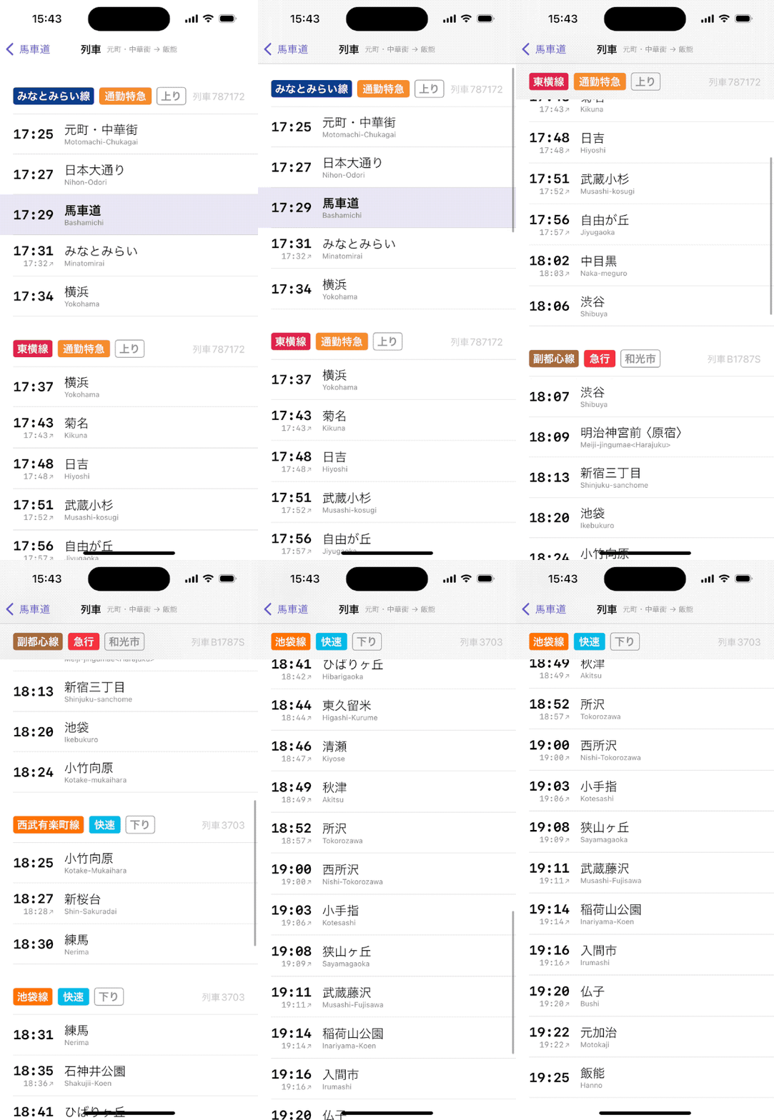
In the dataset, a train timetable item has an optional forward and reverse link to another train timetable item. In this way, I can recursively fetch train timetables before and after the one relevant to the user’s selected station.
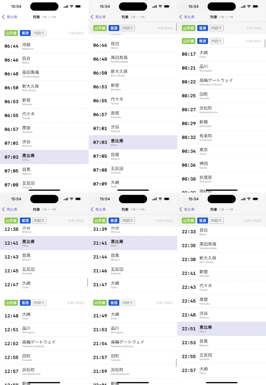
While testing my first implementation of this, I navigated to a Yamanote train timetable and realized that, since it’s a loop line, the same trains go from early morning to late evening.
Nearby stations
I modeled the infrastructure for the nearby stations feature as a composition of 3 clients:
DeviceLocationClientAppDatabaseClientNearbyStationsClient
NearbyStationsClient transforms location events from the DeviceLocationClient into a list of stations fetched by coordinates from AppDatabaseClient.
DeviceLocationClient
struct DeviceLocationClient {
    var locationEvents: () -> AsyncStream<LocationEvent>
}

enum LocationEvent {
    case paused
    case update(Location)
    case unavailable
}
Under-the-hood, DeviceLocationClient uses the iOS 17 CLLocationUpdate.liveUpdates API from the CoreLocation framework. I decided to investigate CLLocationUpdate instead of the long-standing (but clunky) CLLocationManager API.
Unfortunately, the first implementation of CLLocationUpdate in iOS 17 is not fully baked. iOS 18 fixed several behavioral oddities, missing APIs, and integration points.
After spending significant time integrating CLLocationUpdate, I ultimately decided to temporarily accept its deficiencies with the intention to update to the iOS 18 version after a few months.
NearbyStationsClient
struct NearbyStationsClient {
    var nearbyStations: () -> AsyncStream<NearbyStationsEvent>
}

enum NearbyStationsEvent {
    case paused
    case update(Location, [NearbyStationResult])
    case unavailable
}
NearbyStationsClient parses the stream of LocationEvents and converts them to NearbyStationsEvents by performing a search for each set of coordinates on the station database.
In the AppDatabaseClient, I calculate the minimum and maximum latitude and longitude around the input coordinate (4 total floats), then use these in the SQL query filter.
For each raw station result from the database, I calculate the actual distance for each, sort the results, and do one last filter in case the station isn’t a departure station.
NearbyStationsFeature
The feature layer parses the stream of NearbyStationsEvents and uses the raw Location and [NearbyStationResult] to calculate a walk estimate in minutes for each result since a distance in meters is not always easy to intuit at a glance.
NearbyStationsFeature powers both the List section on the home screen and the dedicated nearby stations screen.
Widgets
This project was my first time implementing widgets. The API and its gradual integration with AppIntents over the years made it tougher than I expected as I ventured beyond its trivial configurations.
There’s only one type of widget in Eki Bright so far: station timetable widgets. I support a few families: systemMedium, systemSmall, and accessoryRegular. I don’t support the Apple Watch in v1.0.

Aside: I keep relearning the lesson that it’s useful to keep up to date with all the new frameworks at WWDC each year even if you don’t plan to use them right away. Because often the Apple engineers explain and document updates with the assumption that you already understand that SiriKit was deprecated in favor of Intents which was deprecated in favor of App Intents.
Timeline provider implementation
Implementing a TimelineProvider for a widget requires 3 functions:
placeholder- for showing the form of the widget instantaneously.snapshot- for showing an accurate form of the widget quickly with real data.timeline- for showing many accurate states of the widget over time.
The implementation of snapshot is similar to getting the data for the corresponding station timetable screen in the app.
let now = Date()

// Get the entire timetable for the station, direction, and schedule
let timetable = try await db.fetchStationTimetable(stationID: selectedStation.station.id, railDirection: selectedStation.direction, scheduleSelector: .from(now))

// Filter the timetable to ~9 entries
let filteredTimetable = filtered(for: now, timetable: timetable, family: context.family)

// Return success
return .init(date: now, timetable: .success(filteredTimetable))
The implementation of timeline is more involved.
// Same as `snapshot` above
let now = Date()
let fullTimetable = try await db.fetchStationTimetable(stationID: selectedStation.station.id, railDirection: selectedStation.direction, scheduleSelector: .from(now))
let nowTimetable = filtered(for: now, timetable: fullTimetable, family: context.family)
let nowEntry = TimetableTimelineEntry(date: now, timetable: .success(nowTimetable))

// Determine when the timeline should reload
let reloadDate = Date.nextDay3am(now: now, calendar: isoTokyoCalendar)

// Create an array of future dates that correspond with the minute _after_ a train leaves
let allFutureDates = fullTimetable.timetableItems
    .compactMap { $0.departureTime.advancedOneMinute() }
    .map { $0.toDate(now) }
    .filter { $0 >= now }

// Create a filtered timetable based on each of those dates
let allFutureTimetables = allFutureDates.map { filtered(for: $0, timetable: fullTimetable, family: context.family) }

// Create a TimelineEntry for each and return
let allFutureEntries = zip(allFutureDates, allFutureTimetables).map { TimetableTimelineEntry(date: $0, timetable: .success($1)) }
let allEntries = [nowEntry] + allFutureEntries
return Timeline(entries: allEntries, policy: .after(reloadDate))
Additionally, I check a few error-ish conditions before calculating the snapshot or timeline:
- The database has been loaded correctly.
- The user has at least one bookmark in the main app (otherwise I can guide them to do that first).
- The user has selected a station from the edit widget menu (otherwise I can guide them to do that first).
Sharing data with the main app
Because a widget is an app extension, it requires extra steps to share data.
User settings in the file system
My user settings was stored as a Codable-generated json file in the file system within the app’s sandbox. I wanted to share the list of station bookmarks from that model with the widget extension.
I followed the procedure to enable App Groups for the App ID in the developer portal, registered the group ID in the app target, registered the group ID to the widget target, then changed the location of my user settings file.
FileManager.default
	.containerURL(forSecurityApplicationGroupIdentifier: "group.com.twocentstudios.train-timetable")
	.appendingPathComponent("user-settings", conformingTo: .json)
With that change, I could access the user settings struct from the AppIntent the same way I did in the main app.
public struct StationBookmarkEntityQuery: EntityQuery {
    let allBookmarks: IdentifiedArrayOf<StationBookmark>

    public init() {
        @SharedReader(.userSettings) var userSettings
        allBookmarks = userSettings.stationBookmarks
    }

    // ...
}
Database as a file from the bundle
Sharing the database was more difficult to solve. But that goes back to the unique database use case I have.
I’m using an SQLite database generated at development-time by my aforementioned Swift script. The database is read-only, bundled within the app, and is versioned alongside the app itself. This is perhaps a less-than-usual use case for an SQLite database according to the documentation around the internet.
I decided to see how far I could get with opening the database directly from the Bundle. It’s worked fine this way so far for my use case.
For simplicity, the widget reuses the same database access code as the main app. It therefore requires access to the database file.
During most of development, I gave the widget extension a copy of the database for its own bundle. I wasn’t completely aware of the implications of this at first, only that it seemed to work. Unfortunately, it does make a full copy of the database file, and results in 2 full identical copies of the database shipped with the app. The size of my database makes this quite large.
It took some research, but I found an admittedly brittle way to access the app’s bundle from the main bundle by hacking around on the bundle URL. This means I only have to include the database in the main target.
I’m not confident in this solution, but I still prefer it over superfluously taking ~300 MB of every user’s precious device storage.
Previews
Previews worked great while I was designing and implementing the prototype.
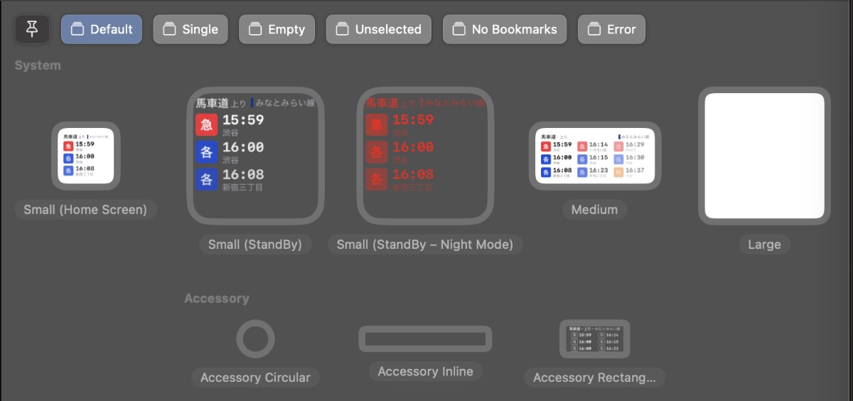
Unfortunately, as soon as I needed to upgrade to a AppIntent-powered timeline provider, the available #Preview macro no longer compiles.
The below two overloaded macros do not compile under any circumstance for me.
// Error: Macro 'Preview(_:as:using:widget:timelineProvider:)' requires that 'TestIntentTimelineProvider' conform to 'AppIntentTimelineProvider'
#Preview(
    as: .systemMedium,
    using: TestIntent.self,
    widget: { TestWidget() },
    timelineProvider: { TestIntentTimelineProvider() }
)

// Error: Macro 'Preview(_:as:using:widget:timelineProvider:)' requires that 'TestAppIntentTimelineProvider' conform to 'IntentTimelineProvider'
#Preview(
    as: .systemMedium,
    using: TestWidgetConfigurationIntent.self,
    widget: { TestWidget() },
    timelineProvider: { TestAppIntentTimelineProvider() }
)
My minimal reproduction case is in this gist.
I had to switch back to single TimelineEntry previews.
#Preview("Default", as: .accessoryRectangular, widget: {
    StationBookmarkWidget()
}, timeline: {
    TimetableTimelineEntry.mock
})
Refreshing
Apple has several frameworks that operate fundamentally based on vaguely documented heuristics, often partially related to the unique way each user uses their device.
BackgroundTasks is a good example, although it’s perhaps changed in a few years since I trialed it. It took me weeks of daily usage testing to get a feel for relevant metrics like how often a task was run by the system, how long it was run on average, how much work my task completed during that time, and what other system frameworks were available during my app’s allocated period.
I’ve found widgets to be similar to that experience.
My home screen and today screen widgets (of small and medium family) refresh as expected.
However, since its initial implementation, my accessory medium family lock screen widget behaves unpredictably, but always incorrectly.
With the same timeline provider implementation as the other widget types, the lock screen widget does not refresh at 3am. In fact, it usually does not load the day’s station schedule until somewhere between 11am-2pm.
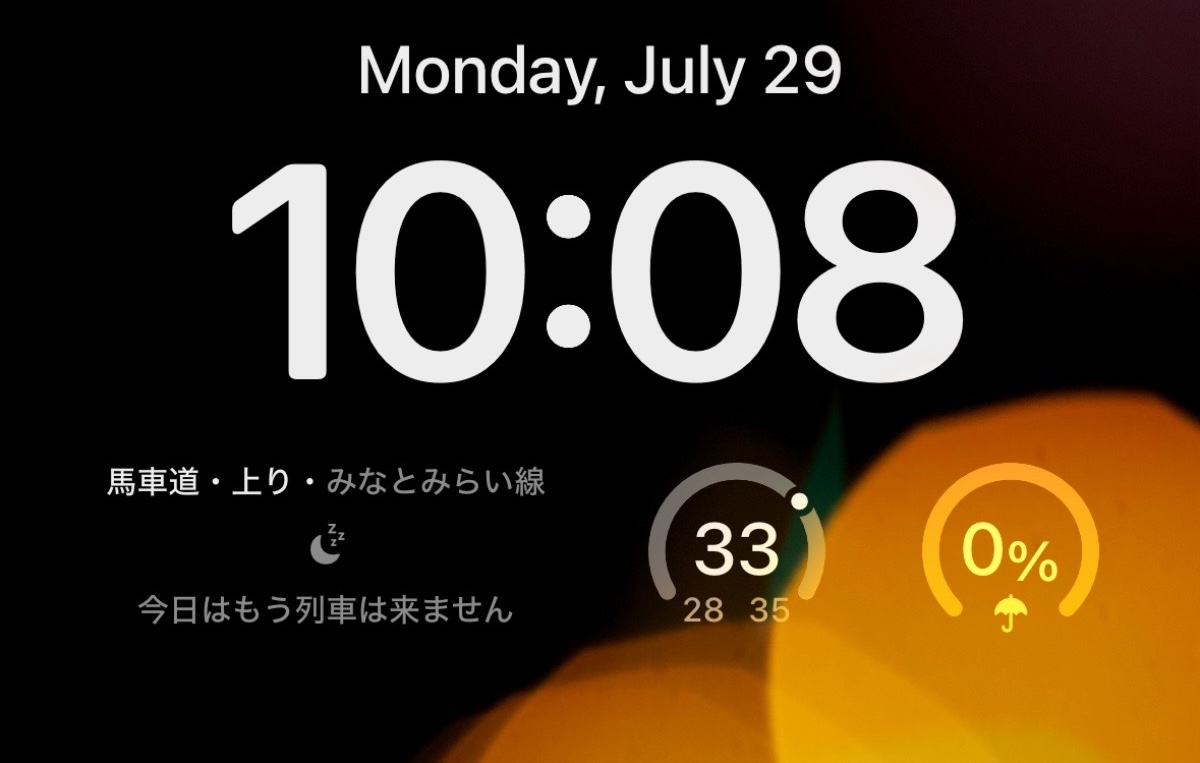
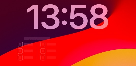
To be fair, there is some official documentation about widget refreshing, but it leaves out enough to keep me guessing as to what the underlying problem actually is.
My current theory is that my widget has too many timeline entries per day.
In the same vein as my BackgroundTasks framework drama above, it’s painfully slow to debug this issue because I can test only one potential fix per day at most.
My theory of too many timeline entries is based on a few lines from the docs:
A widget’s budget applies to a 24-hour period. WidgetKit tunes the 24-hour window to the user’s daily usage pattern, which means the daily budget doesn’t necessarily reset at exactly midnight.
OK, the fact that the reload doesn’t happen until mid-day is consistent with the above.
For a widget the user frequently views, a daily budget typically includes from 40 to 70 refreshes. This rate roughly translates to widget reloads every 15 to 60 minutes, but it’s common for these intervals to vary due to the many factors involved.
I’m assuming the loaded term “refresh” refers to the system taking an Entry struct and loading it into the widget’s UI at the requested schedule and not the timeline provider getting a request from the system to fetch an entire fresh timeline.
If that’s true, then my widget’s timeline definitely has more than 70 entries. In fact, many railway’s stations see over 250 trains per day, and thus will have that many timeline entries if I always want to show the user the next 6 trains and no departed trains.
I tested this theory by creating a build that limited the timeline to ~60 entries, basically updating every ~6 train departures. This schedule certainly treads the line between useful and not. In a few days of testing it seemed like this change resulted in the timeline reloading properly at 3am.
With that knowledge, the rest of the docs make even less sense to me:
If your widget can predict points in time that it should reload, the best approach is to generate a timeline for as many future dates as possible.
In isolation, this makes sense and is what I’m trying to do. In theory, I could generate an indefinite timeline since the station timetables are fixed.
Keep the interval of entries in the timeline as large as possible for the content you display.
For me, “as large as possible” is once every train departure, which can be every minute at minimum.
WidgetKit imposes a minimum amount of time before it reloads a widget.
OK, fine, understandable. Hopefully it’s doing this somewhat intelligently based on user behavior though?
Your timeline provider should create timeline entries that are at least about 5 minutes apart.
Why though? Why can’t the system impose this limit dynamically, again, based on user behavior or whatever other factors it has?
Regardless of the docs, I’m still confused as to why this failure case appears as it does:
- Why am I not seeing the timeline stop updating on a random time entry instead of the “no more trains” empty state or placeholder state?
- Why am I not seeing any issue with the other widget types?
- Why does WidgetKit not have at least a debug accessible error for reporting “too many timeline entries”? This could even be thrown when returning the
Timeline.
A few more hypotheses I have:
- I’m generally more active in the evening than the morning. Perhaps the hidden device heuristics are causing the system to expend my widget’s refresh budget during the time range I have the most device pickups.
- The always-on screen feature is causes the system to be too overzealous about updating the widget. According to Screen Time, I generally have about 60-80 device pickups per day. I don’t think that counts times I wake my phone (e.g. to check notifications) but don’t unlock it. If the widget loads a new entry for each pickup and pre-pickup, plus whatever other triggers it has, that would exceed the budget.
A beta tester also confirmed the widget’s errant lock screen behavior on an iPhone SE, which makes me even less sure about the causal factors I’ve hypothesized.
As you can probably tell, this bug has been a thorn in my side for months. I considered removing the lock screen widget from v1.0, but I figured it’d get better data for debugging, and users would still see the timetable for most of the day. The failure also doesn’t prevent users tapping through the widget to quickly see the timetable in the app.
App navigation
The navigation story for Eki Bright is straightforward since there are so few screens.
There’s one navigation stack that handles all screens except the about screen, which is presented modally.
The behavior of the search feature is standard iOS, but still a bit weird in my opinion.
I’m still planning to keep the navigation structure as simple as possible as the app’s features continue to evolve for the sake of speed. However, I’d like to provide more dedicated resource screens (e.g. a railway screen, a station detail screen), and more links between those screens.
Navigation in TCA
The improvements to navigation in TCA are welcome. There are two ways to handle stack-based navigation in TCA: manipulating the StackState programmatically and/or using the SwiftUI NavigationLink view.
I chose the former, and am intercepting all navigation-related reducer actions at the root level and manipulating the StackState. (However, dismissals are handled with the dismiss dependency.)
Reduce { state, action in
    switch action {
    case let .path(.element(id: id, action: .stationDetail(.railDirectionButtonTapped(railDirection)))):
        guard let stationDetailState = state.path[id: id]?.stationDetail else { return .none }
        state.path.append(.stationDirections(.init(station: stationDetailState.station, initialRailDirection: railDirection)))
        return .none
    case let .path(.element(id: _, action: .nearbyStations(.searchResultTapped(nearbyStation)))):
        state.path.append(.stationDirections(.init(station: nearbyStation.station)))
        return .none
    case let .path(.element(id: _, action: .stationDirections(.timetableLeft(.trainTapped(trainTimetableID, from: stationID))))):
        state.path.append(.trainTimetable(.init(trainTimetableID: trainTimetableID, stationOfInterest: stationID)))
        return .none
    // ...
I consider this strategy to be somewhat brittle, but up to now it’s provided flexibility. The feature hierarchy is not so complicated yet as to be unwieldy.
Design
Depending on the app and feature, I occasionally do design work upfront in a pencil sketch and/or a Figma page. I also feel comfortable iterating quickly on design in a SwiftUI preview.
Eki Bright evolved gradually from a prototype. And at first, I was mostly focused on the appearance of each widget family.
I also planned to, and still plan to, commission a professional designer to make a full pass at least the visual design language of the app if not the UX and branding as well.
However, for v1.0 I decided to play it safe with a utilitarian design focused on, you guessed it, speed. And closely related to speed, visual clarity.
Utilitarian design
The standard iOS design language is relatively utilitarian, so it’s not too difficult to play within that sandbox if you don’t have strong opinions about visual design.
There are a lot of benefits that fall out of the decision to stick to standard UI framework components and HIG guidelines:
- Dark mode requires little additional work.
- Dynamic type requires thought and testing, but comparatively less work.
- App-wide constants like screen margins don’t need to be maintained.
- There’s no additional costs for font licensing.
- Programmatic component configuration is quick.
This extends to e.g. using List vs LazyVStack (a decision that’s more loaded than just visual aesthetics). List has out-of-the-box support for item moving, deleting, edit mode, sticky headers/footers, dividers, etc. Although I just as often found myself fighting system defaults when my particular layout requirements fell apart. There’s no free lunch in (iOS) dev.
Color
I defer my use of color to the railway colors from my data provider and the 5 train category colors I chose. From my experience as a user, these colors are incredibly important in quickly choosing a station from my bookmarks or an entry from the timetable.
When choosing the app’s accent color (a HIG staple), I intentionally picked a purple-ish color because there are few railways that use purple branding.
I do my best to create visual hierarchy with SwiftUI’s primary and secondary foreground colors combined with font sizes and bolding. It’s a tough balance, and it took constant effort iterating, but I feel pretty good about where v1.0 ended up.
Animations
My use of animations is relatively light. The nearby list reconfigures often while moving, and these items rearrange themselves with animation. The station timetable screen scrolls naturally when the time updates. Besides that, I follow that same utilitarian mindset mentioned above.
Rail direction
The toughest UX decisions I’ve encountered so far (and which the jury’s still out on) are related to rail directions.
- How to display the rail direction name to users.
- Where to put the rail direction segmented control on the station timetable screen.
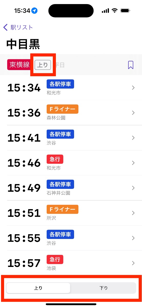
Most official rail direction names are in the dataset as 上り (inbound), 下り (outbound), 北へ (northbound), etc. However, these official names are either absent or de-emphasized in signage around stations.
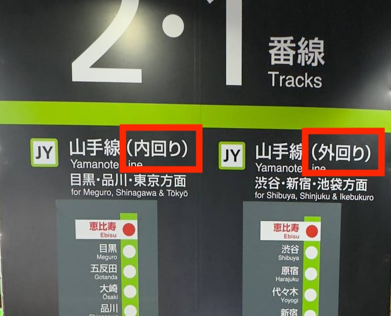
How to display the rail direction name
For v1.0 especially, I wanted to keep my own large-scale supplements to the official dataset as minimal as possible.
My choice for displaying the rail direction was to:
- (A) Default to showing the official direction name (“inbound”) with the awareness that users would find it jarring at first, but eventually learn and adapt for railways they used regularly (arguably the core use-case for the app).
- (B) Default to replacing the official direction name with the last station in that railway. This is a common display technique seen in station signage, although sometimes the next station or the next major station are used instead.
- (C) Default to replacing the official direction name with my own custom choice based on first-hand research of each railway.
I chose (A), using the official direction name out of pragmatism.
In user testing, this has continued to be a pain point, and will certainly be a high-priority item in the TODO list.
Where to put the rail direction segmented control
The (optional, depending on the station and railway) segmented control for the rail direction affects all the contents of the station timetable screen besides the station name in the navigation bar, the railway name, and the schedule.
Considering hierarchy, it should either be in the navigation bar or the toolbar.
The navigation bar is already full with the title, especially when used in NavigationBarItem.TitleDisplayMode.large. However, it could still be condensed into the trailing bar item.
My instinct was to put the segmented control in the toolbar. This makes it easier to tap without reaching, and also filling the space and disappearing cleanly when it’s not relevant for the station. I supplemented it with a smaller label in the section header since it’s important information.
However, in user testing, some users were completely blind to the segmented control in the toolbar position. If users don’t notice it, they’ll also be unaware they can swipe left and right to page between timetables for each rail direction.
It is crucially important users don’t miss this control. When coming from a nearby or search result, the user will navigate to the default rail direction. If they don’t realize they need to navigate further to see the opposite direction, they may use incorrect timeline information or spend time searching the interface.
Perhaps the simplest solution is to add a tooltip during onboarding to call this out. I’m generally pretty skeptical of making discovery of any critical feature reliant on users reading text.
For v1.0 it was a necessary evil to ship the toolbar interface and further measure opinions.
Short term, I should add a tap action to the rail direction label in the section header that transitions to the other rail direction timetable.
Medium term, I’m planning on de-emphasizing the full station timetable screen and replacing it in the navigation hierarchy with a station detail screen. When designing the detail screen, I can be more careful about highlighting the rail direction distinction.
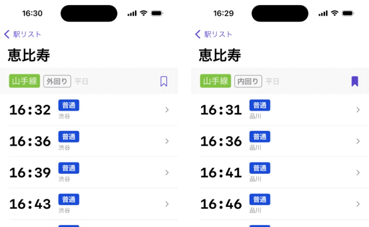
Yamanote train destination
Related to rail direction is the destination station of a particular train. In the simple case, railways always end at the same station. But sometimes a railway breaks off into other railways that end at different stations.
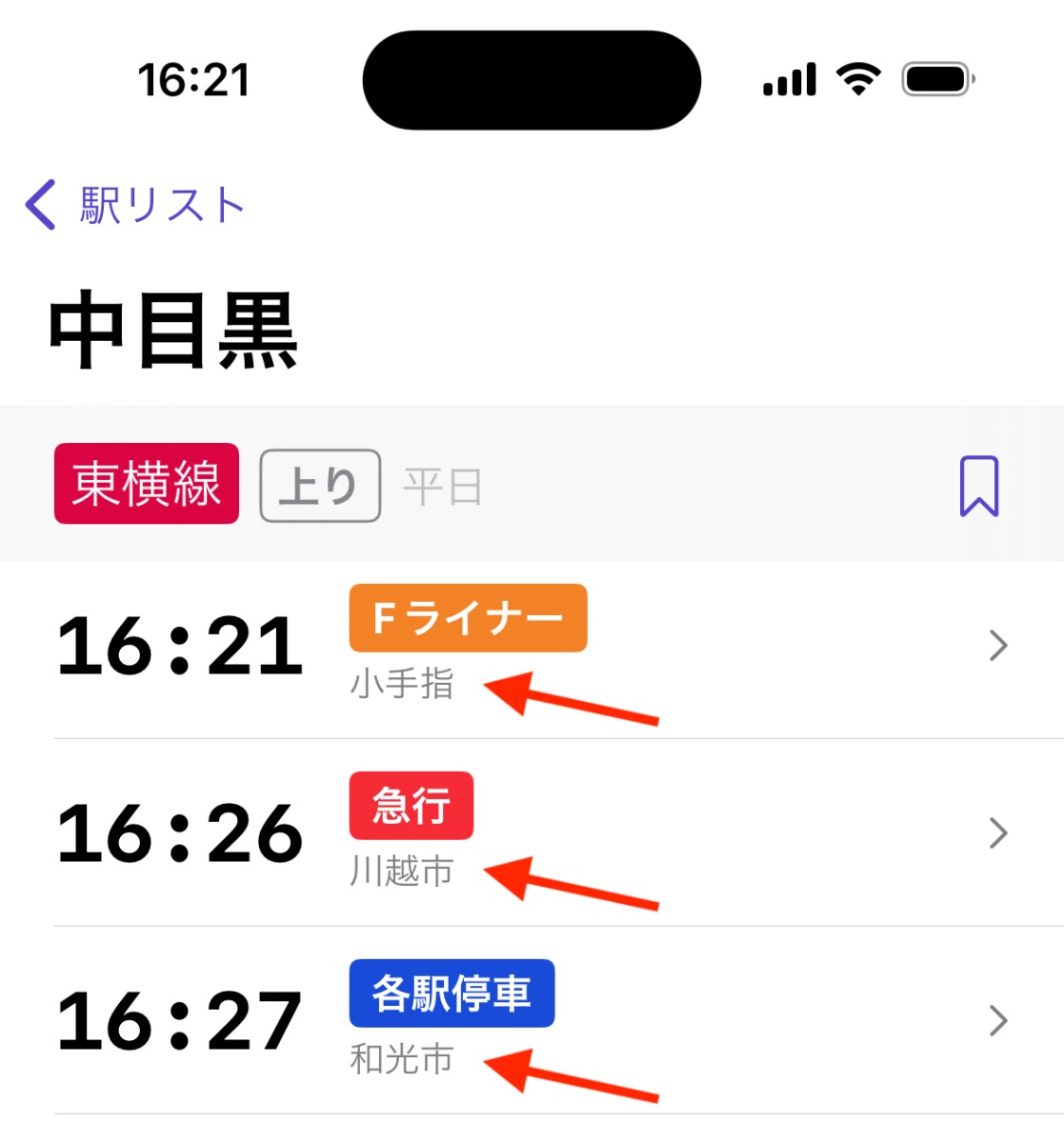
The Yamanote loop line (as my constant source of edge cases) presented a user clarity issue compounded by the aforementioned “how to display the rail direction name” woes.
The Yamanote line trains always start and end at Osaki station. That means every timetable for every Yamanote line station and rail direction showed Osaki as the destination.

In my use I found train destination is a good backup when rail direction was unclear. Without this affordance, the mental gymnastics I needed to do to understand inner-loop and outer-loop directions was a deal-breaker for me.
I decided to spend a little time manually adding “direction stations” for each station on the Yamanote line only. I consulted signage for each station and chose the next most identifiable station.
let directionStations: [StationDirectionPair: Station.ID] = [
    .init(stationID: "JR-East.Yamanote.Osaki", railDirection: .innerLoop): "JR-East.Yamanote.Shinagawa",
    .init(stationID: "JR-East.Yamanote.Gotanda", railDirection: .innerLoop): "JR-East.Yamanote.Shinagawa",
    .init(stationID: "JR-East.Yamanote.Meguro", railDirection: .innerLoop): "JR-East.Yamanote.Shinagawa",
    .init(stationID: "JR-East.Yamanote.Ebisu", railDirection: .innerLoop): "JR-East.Yamanote.Shinagawa",
    .init(stationID: "JR-East.Yamanote.Shibuya", railDirection: .innerLoop): "JR-East.Yamanote.Shinagawa",
    .init(stationID: "JR-East.Yamanote.Harajuku", railDirection: .innerLoop): "JR-East.Yamanote.Shibuya",
    .init(stationID: "JR-East.Yamanote.Yoyogi", railDirection: .innerLoop): "JR-East.Yamanote.Shibuya",
    // ...
Conclusion
I covered a lot in this post. This is a decent summary of the many problems I worked through to varying degrees of “solved” during the few months of development leading up to v1.0 of Eki Bright.
As I become more confident in my solution to some of the above problems, I’ll try to write some more straightforward “How to X in Swift” posts in the future.
Until then, thanks for reading.