Eki Bright - Tokyo Area Train Timetables
My latest app is called Eki Bright or 駅ブライト in Japanese.
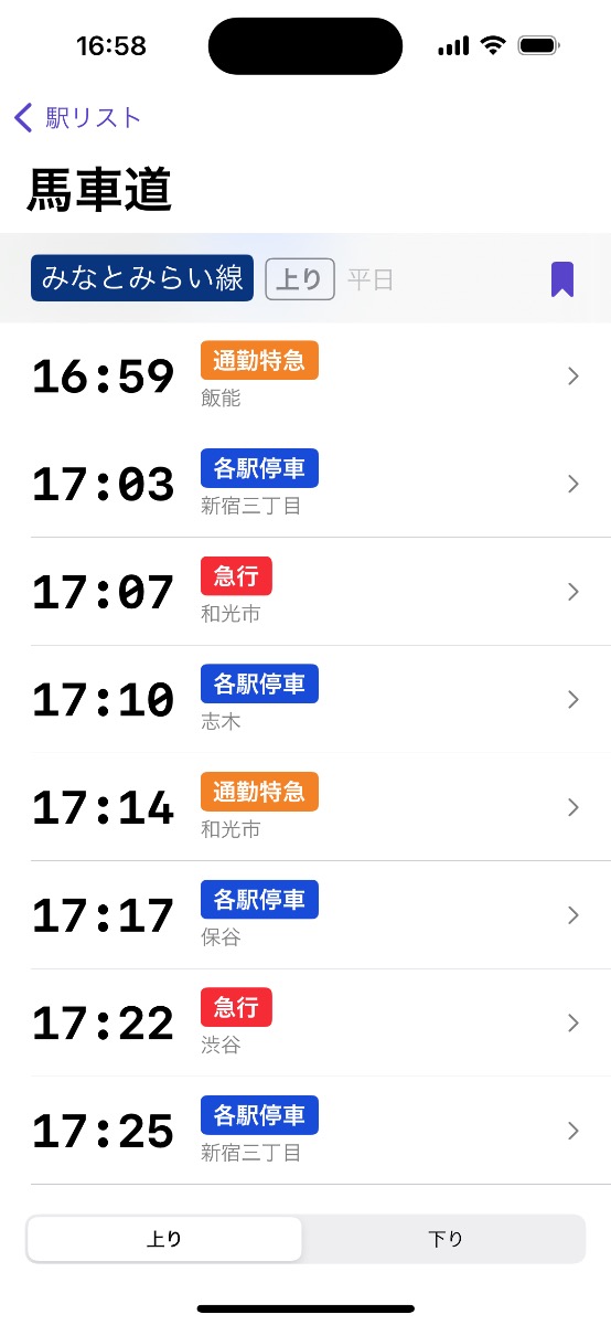
In short, it’s an app for quickly accessing offline station timetables and train timetables for railways in the Tokyo metropolitan area including Kanagawa, Chiba, and Saitama prefectures.
In this series of posts I’ll talk about:
- This post - the motivation behind the app and the solution I’ve begun to explore
- Eki Bright- Developing the App for iOS - the high-level implementation details
Tokyo-area residents can download the app from the App Store.
Eki Bright is currently closed source due to data licensing issues, but I’d like to open source it as some point once I get that aspect figured out.
Background
I’m a public transit (specifically train) fan. And Tokyo is easily one of the best cities in the world to get around by train.
Due to the large market, there are already plenty of full featured transit apps – Google Maps, Apple Maps, Navitime, Jorudan, etc. And I’m a heavy user of all of them, especially Google Maps.
However, after many years of use, I started to find some pain points.
I got to know my daily trips well enough that I no longer needed to know all of the below information for each trip:
- Which station I needed to walk to
- How long it would take to walk to the station
- Which railway I needed to use
- Which platform I needed to wait at
- Which train type I needed to get on
- When the target train type would depart
I’d memorized 1-5, and only needed the departure times in order to optimize my trip.
All of the other information requires opening Google Maps, waiting for it to load, entering a destination, occasionally entering an origin, waiting for the route data to load, scrolling, choosing the top result, scrolling.
Then there were the times that I’d want to check departure times assuming I’d leave in half an hour. In that case I’d also have to manually enter a departure time or manually change the train in the helpful selection dropdown on the route page (surprisingly, a feature still not available on the web app).
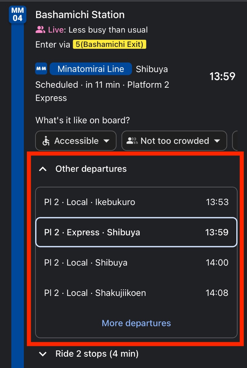
There were also times where I knew more than Google Maps. For example, I know that on weekends, I can sometimes take a local or express train from Bashamichi station to Minatomirai station to catch a limited express train. This little maneuver can save 10-15 minutes into Shibuya. But this information is not easy to access with the Google Maps interface.
Sure, for the most common situation I could head out from my apartment at whatever time was natural then wait on the platform for however long. But if I could see the next departures board at the station before I left my apartment, I could optimize my time better.
Thus, the idea of Eki Bright was born.
Goals
My north star for this app is, like I mentioned above, to have the same information I’d have while standing on the platform looking at the next departures board.
The main principle required for that use case is simple: speed.
Every feature is evaluated against getting the amount of time it takes to see the departure timetable for a station optimized to near zero.
- Offline data: no server roundtrip is required to fetch a station timetable, saving seconds on each tap, especially in slow network environments often expected when outside or underground. (The only reason this is even feasible is because trains in Japan are so rarely late.)
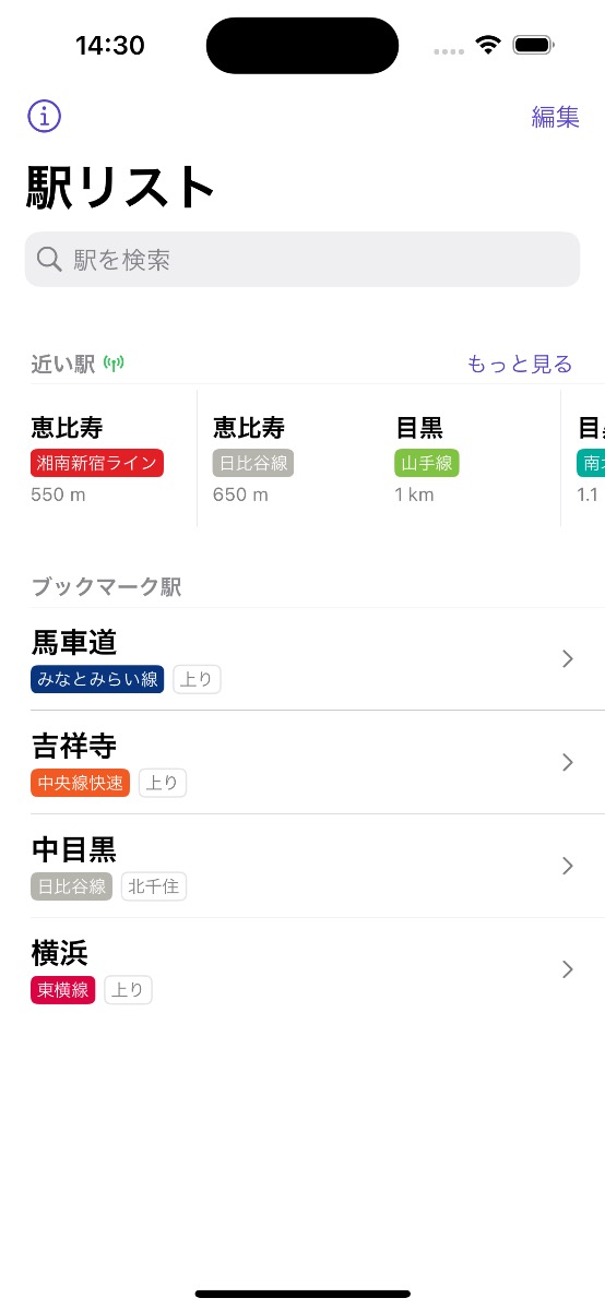
- Bookmarked stations: the vast majority of trips are taken from the same stations: near home or work or a third place. Letting the user choose these and putting them on the home screen eliminates a step in getting them the information they need.
- Nearby stations: for the next minority of trips, the user wants to see timetables for stations nearby their current location. This is trivial with location services (GPS).
- Search: as a catch all for the remaining trips, stations can be found by text search (in romaji, hiragana, katakana, or kanji).
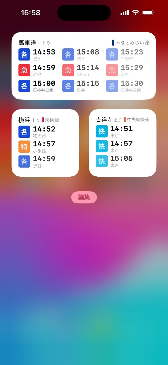
- Widgets: for bookmarked stations, users can see timetables without even opening the app. The home screen or lock screen makes it trivial to see departure times at a glance.
My anti-goals – things I specifically did not want to include for fear of overcomplicating the interface and muddying the value proposition – are:
- Routing (i.e. inputting an origin and destination and calculating which trains to use)
- Covering every city in Japan (or anywhere else in the world)
- Covering other modes of public transit (e.g. buses)
Features I feel could potentially fit into the ethos of the app, but aren’t a high-priority:
- Showing any information on a map
- Live-updating departure times
- Platform number information
- Stair/elevator locations on the platform in relation to a train car
One feature that wasn’t 100% in line with my north star but turned out to be so useful as to be prioritized for first release: train timetables. Tapping a departure time in the station timetable shows the full path of that particular train as a train timetable. This is useful for two reasons:
- Seeing your estimated arrival time at any destination on that line.
- Seeing which stations that train stops at, in the case you’re not totally familiar with the local, express, etc. designations for that railway.
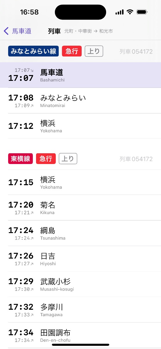
I have many more ideas on how I can make this data alone even more useful to users without further complicating the app.
One example of UX optimization for speed
A conceptually-murky yet concretely defined station in the app usually serves two directions unless it is a terminus.
I made a decision early on for a bookmark to represent the combination of a unique station and a direction. The reasoning being that it’s quite common for a passenger to only ride one direction from a particular station. For example, from my local station Bashamichi, I’m always going inbound into Tokyo from my house and never outbound back towards Motomachi.
It would significantly slow me down if every time I had to select “inbound” or “outbound” each time I wanted to view the timetable for Bashamichi station.
As the designer, I could put both timetables on one screen, however that would crowd the screen with useless (to me the user in my particular scenario) information.
In the case where I do use both directions somewhat equally, it’s perfectly reasonable to have two bookmarks for the same station.
I consider this well designed for the bookmarks use case. But for nearby stations and text search results users still need to select which direction they’re going before the app can display the correct timetable.
My original design presented a station detail screen in this case. It showed no timetable data yet. The user had to select one of two (or one) direction first in order to view the timetable.
This configuration almost immediately felt wrong during use. On one hand, users were less likely to make a mistake and misread the timetable for the opposite direction. On the other hand, it felt so slow having an intermediate step presented in order to see the timetable.
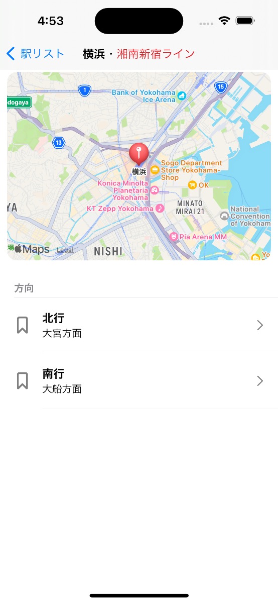
For the first release, I made two revisions to the UX:
- I removed the station detail screen. After selecting a search result, the user would now be dropped directly into the timetable for the default direction for that station.
- I added a quick swipe between that station’s direction’s timetables. Now users could quickly flip between the two directions with conceptually fewer steps.
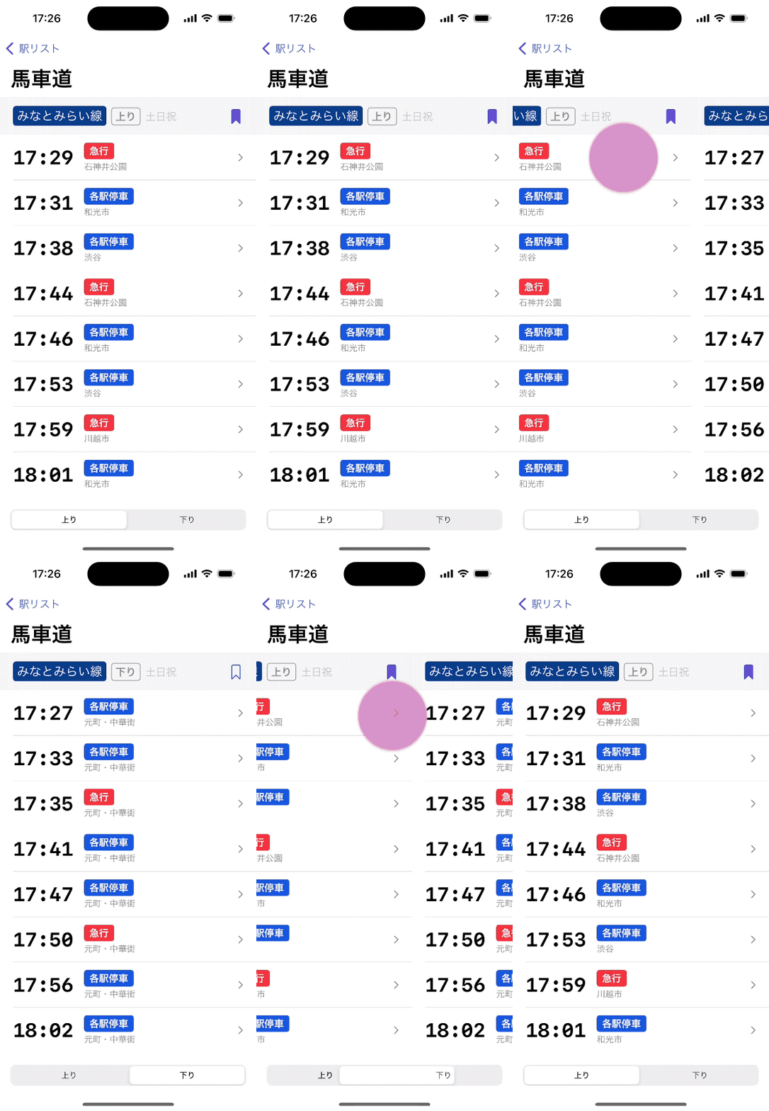
Again, optimizing for speed.
I could go further and silently save which direction for any given station the user last viewed. I could also redesign the station detail screen to be more useful to all use cases, whether that be quickly viewing either timetable or just getting metadata about the station of interest. Either way, I don’t want to compromise on the speed of getting a user to the information they’re looking for.
Data
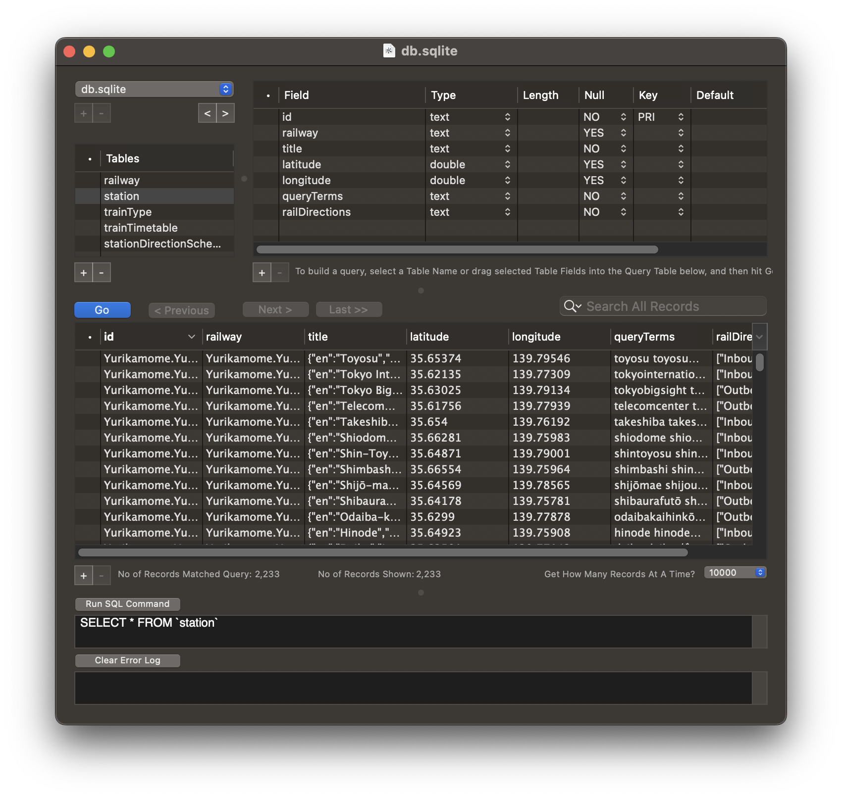
In my prototyping phase I did a dive into potential data sources, both online and offline, paid and free.
In the current self-funding phase of my business, I heavily preferred not paying for data. This keeps my indefinite overhead low and means I have more flexibility in pricing in an already crowded and mature market.
The Association for Open Data of Public Transportation aggregates and publishes data for transit systems across Japan. They also run a hackathon/contest for websites and apps built with their sourced data. This seemed like a reliable enough source for the data at the foundation of the app.
Prototyping
I hacked together a widget that ingested the aggregated timetables for Bashamichi station (my most used station) on a weekday and showing them in a widget.
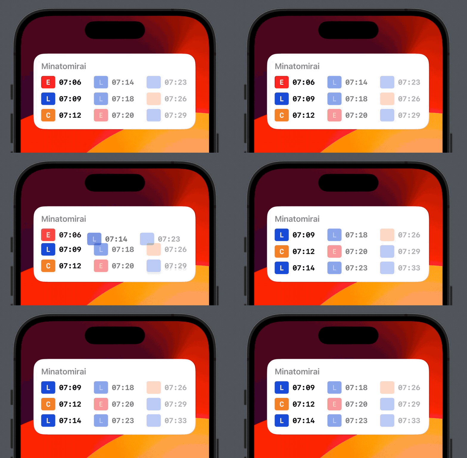
The goal at this point was to evaluate how well this implementation solved my hypothetical pain point. I used it for a couple weeks and, yes, I did feel it was a pretty useful supplement to my go-to Google Maps. I could swipe over on my home screen on my way out the door and see whether I need to hustle out to make the next limited express or whether I could take my time.
Productionizing
At this point I had to decide whether to leave this as a scratch-my-own-itch project, or whether it had potential as a full featured app I could offer of the App Store and support indefinitely. This isn’t an easy decision!
In the end, at my level of business knowledge and sophistication, I made this decision from a selfish perspective:
- How much did I personally want to use the most ideal version of this app?
- How interested were my friends in the concept?
- How motivated was I to work on this concept for weeks or months? Could I get it to the finish line?
- How capable was I of doing the design on my own?
- How much revenue did I need from the app to make it worthwhile?
- How many monetizable features could I implement while still committing to simplicity and speed?
- What other ideas was I more motivated to work on instead?
Making sense of the data
I was by no means an expert on the intricacies of the vast Tokyo area train network. I’ve done my fair share of rides in the 6 years I’ve lived here, but vast majority of those rides were the same trains going to the same stations, with extracurricular trips being a novelty I quickly forgot the details of.
Learning not only the train system as it exists in the real world, but also as it exists modeled in my chosen dataset was a process. A couple fun concepts I had to wrap my head around:
- How to model time, especially across midnight and logical day spans
- How to choose a weekday, weekend, Saturday, or holiday schedule
- How to internally and externally deal with train directions and destinations
- How to deal with the one-off case of the one circle line (Yamanote)
- How all these concepts were most naturally expressed in Japanese
- How to deal with searching via multiple Japanese character sets
- How to generalize train types like local, express, etc. over disparate railways
- How to display colors and associate them with railway concepts
Internationalization
My initial thought was that it’d be reasonable support both English and Japanese localizations at first release. Especially considering my dataset has pretty good English support.
However, after getting into the details of the design, I realized it’d be a lot more pragmatic to optimize the interface for Japanese at first. Although I’m keen to help the low Japanese-proficiency community in Tokyo, realistically, the vast majority of my users will be comfortable enough with Japanese.
In the next phase I’ll focus on getting internationalization complete on the interface layer of the app, then focus on the data layer. It will require some design thought because a lot of the time even English speakers will want access to both the English and Japanese station name, train type, etc. when out and looking for their train.
Icon
Creating the app icon was the last step for Eki Bright. My intention for much of development was to create an anthropomorphized train character with a happy disposition, similar to the vampire rabbit mascot Count Biki.
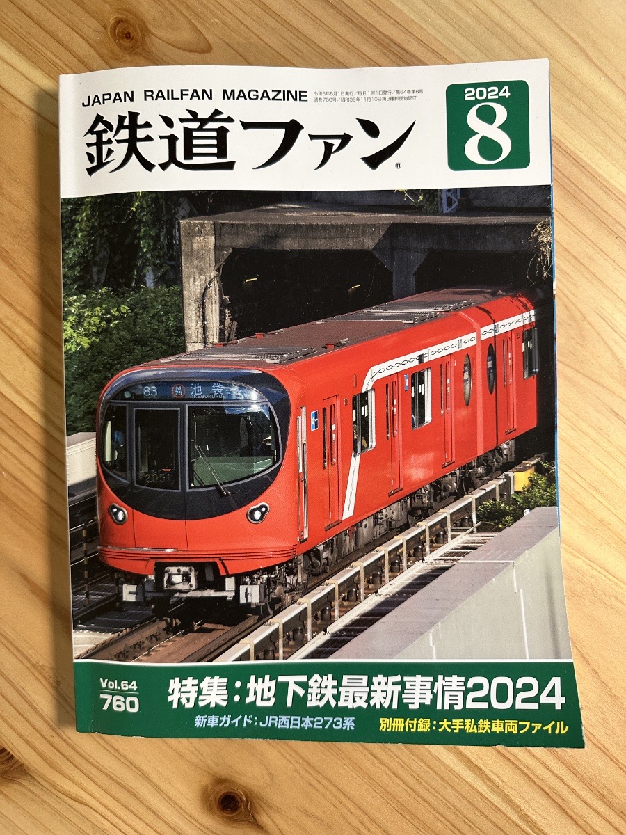
Step zero was buying a magazine with lots of various train photos.
Step one was sketching some trains, then iterating heavily on character designs.
Step two was 3D modeling.
Which unfortunately ended up with me throwing in the towel regarding the character and pivoting into a more traditional icon.
Although a cute character would be great, I realized it wasn’t a huge loss. Realistically, the app design is extremely utilitarian. A cute character on the book cover wouldn’t really reflect the contents very well.
In the future, assuming a healthy adoption of the app, I’d love to do a full redesign that emphasizes playfulness alongside usefulness and a streamlined UX. At that point, I think it’d be reasonable to revisit the app icon design.
Monetization
Monetization on the App Store is still a mystery box to me. The entire market is relatively mature closing in on two decades on existence.
At first release, I decided not to implement any in-app purchase or subscription at all. My focus up front is testing the market and ironing out the rough edges.
I think there are 3 valid monetization paths (or some combination):
- Themes: offer themes for the app and/or widgets that are each unlockable as a one-time purchase.
- Subscription: make the app functionality severely limited outside a subscription: no nearby stations, no train timetables, only one bookmark/widget. Charge a low monthly/yearly rate to cover the ongoing development costs and data renewal costs.
- One-time purchase: assume prospective users understand the value, and that I can cover my long-term costs by adding new users. The upside is pricing simplicity.
One reason I’m not focused on monetization yet is that I’m not confident I can fill the top of the funnel.
Getting anyone’s attention is often an insurmountable problem, especially when most people already have an okay-ish solution to the problem I’m trying to solve.
Does anyone have space on their phone for another widget or app? Do they want to build new muscle memory and decide to open app A or app B depending on the situation? Is it a daily-use app that justifies an ongoing payment?
Although I implemented tips in raw Store Kit for my last app Count Biki, and it’ll theoretically be less development this time around, it still requires enough work that could be better spent on marketing, especially while the top of the funnel is so small.
All that’s to say that for now I’m going to focus on finding a reliable process to get users into the top of the funnel (the ever-reliable VC startup playbook, haha).
Conclusion
I’m of course happy to see this little app make its way out into the world, and hopefully shave of a few seconds or minutes for train-hopping Tokyo residents. I’m a little biased, but I’ve found myself reaching for Eki Bright before Google Maps for a majority of my trips, even when multiple transfers are involved.
It may simply be a naive sense of control Eki Bright gives me when bouncing around timetables, but regardless it’s surprisingly entertaining (rather than burdensome) to do my own simple route planning on the fly. And knowing I’m getting the absolute fastest trip from A to B.
For developers, see you in the next post for all the fun development details.