Count Biki - App and Character Design
Continuing my series of posts about my latest iOS app, Count Biki, I’ll discuss the planning, design, and character design details.
Please check out the other posts in the series:
- Count Biki - Drill Japanese Numbers - the motivation behind the app and the solution I’ve begun to explore from the learner (user) perspective
- This post - the design process and specifics of creating the Count Biki character
- Count Biki - Developing the App for iOS - the high-level implementation details
Japanese learners can download the app from the App Store.
Like many of my other apps, Count Biki is open source on GitHub.
Planning
I made a big list of every number-adjacent concept in the language and the different modes I wanted to practice.
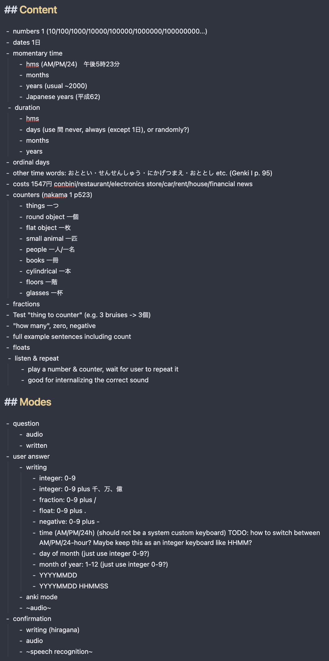
This was a bit overwhelming at first.
I did a bit of prototyping in a Swift Playground to figure out which of Apple’s APIs – speech recognition, numeral-to-text transliteration – were feasible to use.
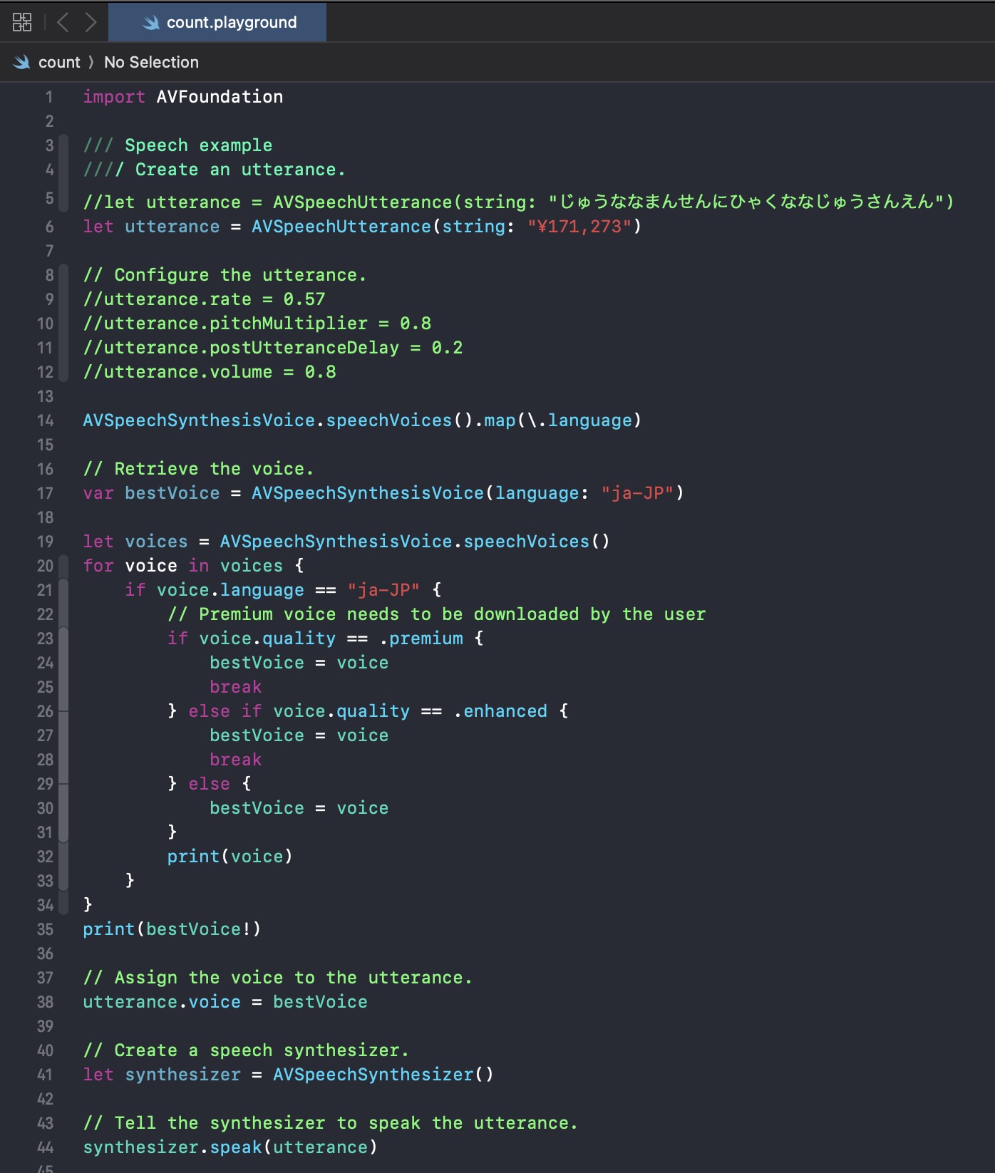
I decided to start with the flow of:
- generate a random number
- speak the number out loud
- the user types the number on a 10-key keyboard
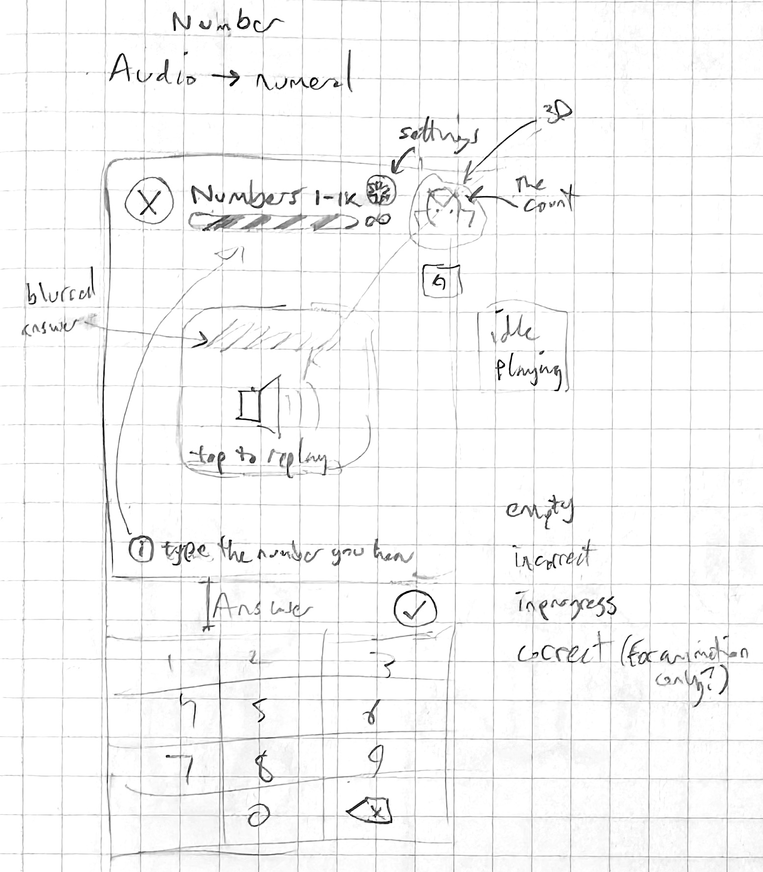
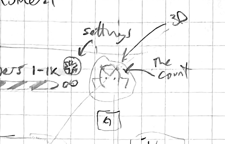
My first sketches looked like this:
Prototyping
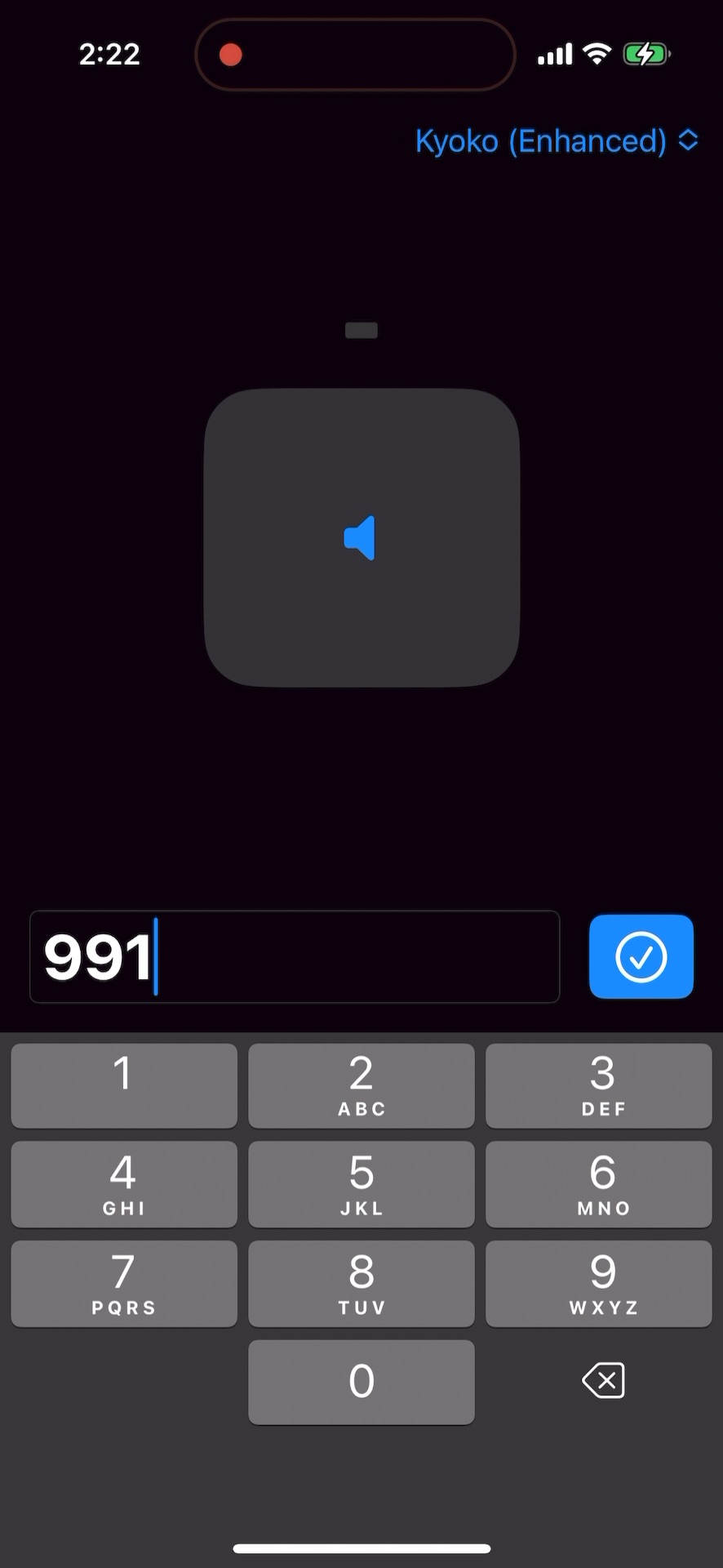
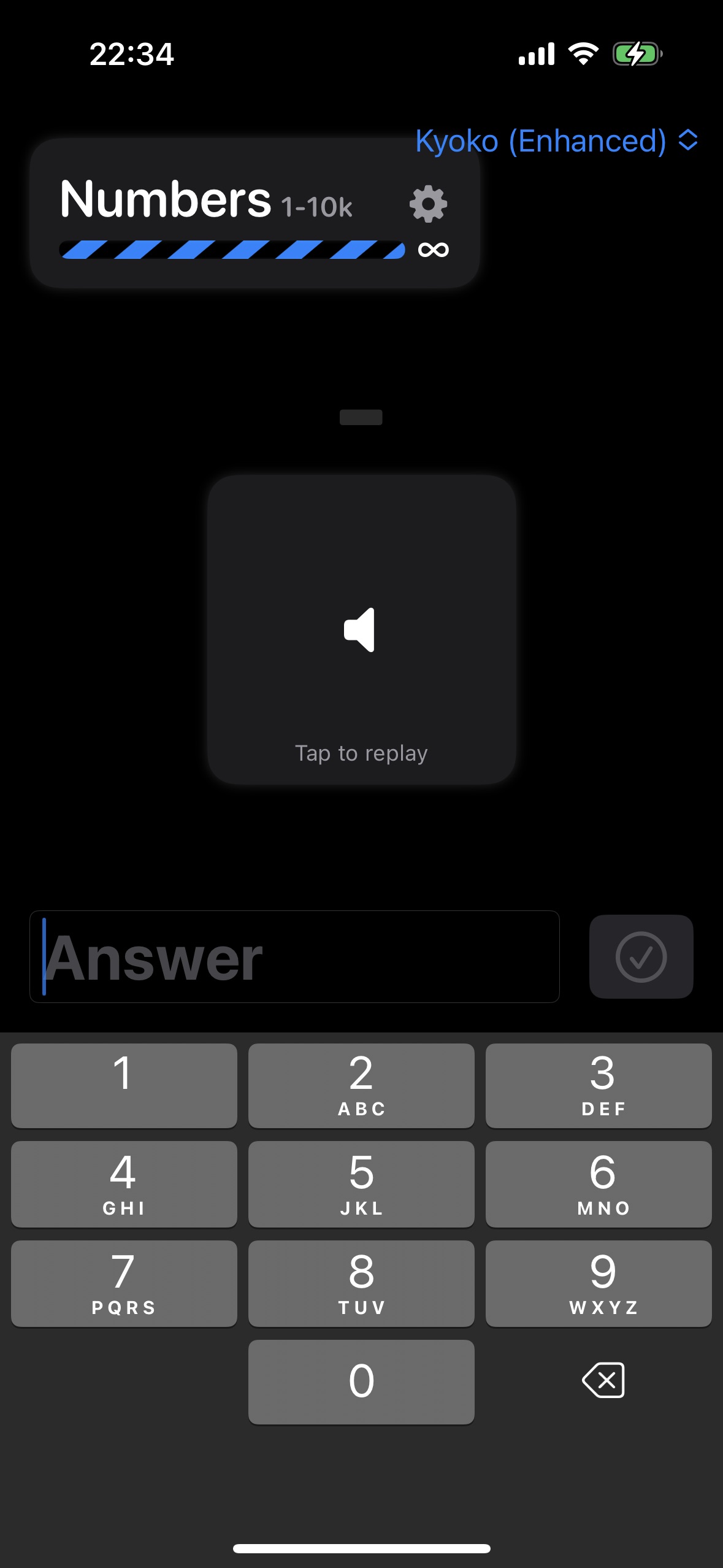
And the first prototype looked like this:
I made a fun little animated barber pole to imply that review sessions were infinite:
And cleaned up the design a little bit:
Designing an original character
You may have noticed in the top right corner of the above sketch, there’s a little character I marked “The Count”.
I wanted to riff on Duolingo’s use of characters to motivate the learner and keep the app lighthearted. Duolingo uses a tool called Rive (although I didn’t know this at the time). I’ve been dabbling in Blender for 3D modeling for the last few years, so I thought I’d experiment with creating a 3D modeled character with animations and rendering it in the app with Apple’s native SceneKit framework.
Of course, this little maneuver set me back a couple weeks 😅. And to be clear, adding an animated character to the app was way more of an “I’m interested in learning something new” rather than “the app will be useless without this feature”. However, this did make naming and branding and making an icon for the app way easier!
Animated character proof of concept
Before spending an awful lot of time perfecting a character and its animations, I wanted to get a proof of concept working that covered the entire use case end-to-end, namely:
- a 3D-character model
- textured with either physically-based shaders or UV-unwrapping on a bitmap
- rigged with at least one bone
- with multiple animations defined in Blender
- with lighting and a camera
- exportable from Blender and importable with Xcode
- displayable in a SceneView in SwiftUI
- with each animation triggerable on demand from a SwiftUI button
This is a lot of new concepts for me! Some of the Blender tasks I’d done once or twice under the guidance of random YouTube tutorials, but the SceneKit integration was completely unknown.
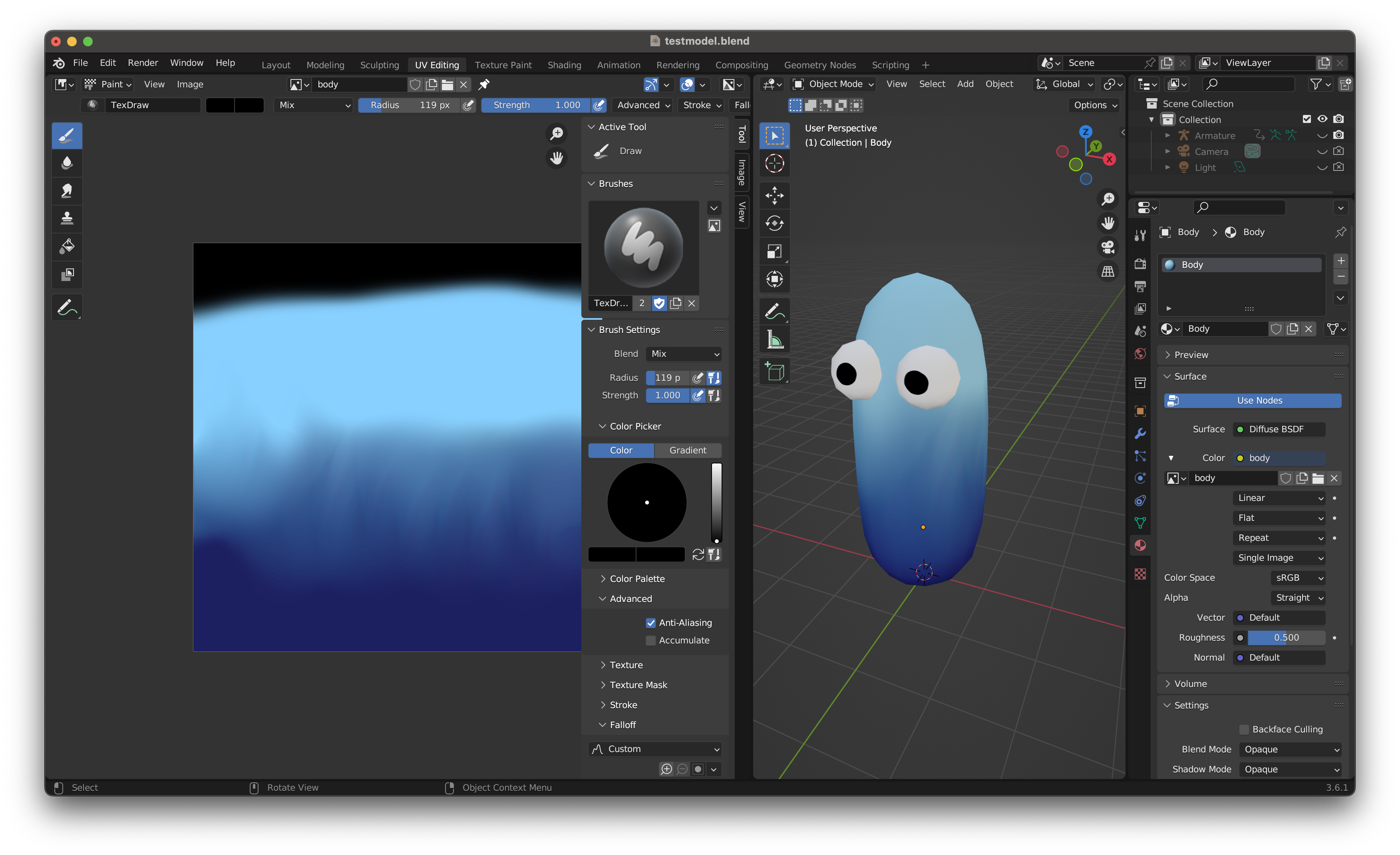
I started by modeling a character with only 3 objects, UV-unwrapping him, and painting the texture.
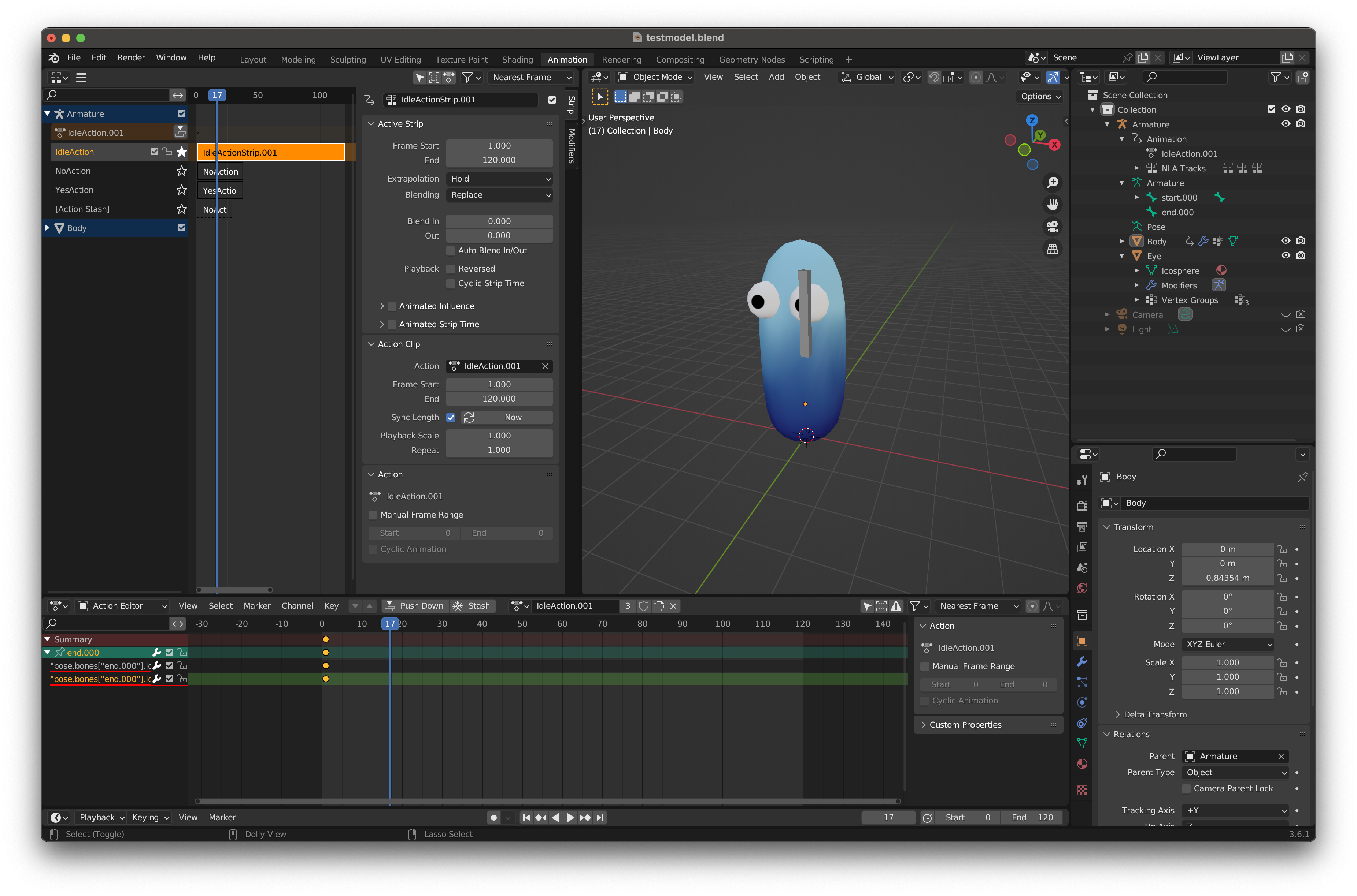
Then I rigged him with a single bone and added 3 animations (doing my best to understand how the non-linear animation editor worked).
Here’s the “you got the question incorrect” animation rendered out of Blender for reference:
Next was probably the hardest part of the entire process: the exporting/importing dance. Like DenverCoder9, I found only a few faint traces on the internet of how I’d go about getting both a model and its separate animations out of Blender and into SceneKit. I naively followed the instructions from the thread, made some tweaks to the SceneKit file, tweaked the camera and lighting, mocked out a SwiftUI view with some buttons, and the result was:
I noticed that the animations were more subdued in app version than they were in the Blender version. I wasn’t sure why, but I decided to move on since it was a gamble of whether the subtle differences in the production version of the model would surface the same problem.
Animated character production version
Now that I had a working proof of concept, it was time to do the hard work of actually designing the real character.
First, I did a short interlude of powering through a few character modeling and animation tutorials on YouTube. This long tutorial from Imphenzia was particularly influential and useful.
Like many ideas, I can’t say exactly where or when all the parts of the Count Biki branding came to me. I knew I wanted to riff on the Count von Count character from Sesame Street. However, I also wanted to incorporate Japanese counters. I always thought 匹 (ひき hiki), the small animals counter, was kind of cute sounding. The version for 3 small animals is pronounced biki (びき).
Why a rabbit? I can’t remember for sure, but the ironic part is that rabbits are traditionally not counted with 匹 (ひき hiki), but 羽 (わ wa) due to rumored historical reasons. Regardless, a cute, vampiric rabbit felt like a unique take.
I did some Dribbble hunting for references and mood board creation, did a few notebook sketches (that are much too embarrassing to post publicly), then began 3D modeling.
My first attempt was… not great. Luckily, a few friends gave some very useful feedback and my next iteration was much better.
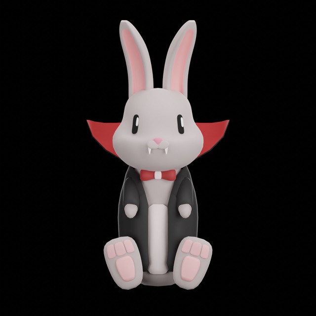
I specifically modeled Biki sitting so I could simplify the rig. Rigging – adding virtual bones that stretch the polygons and are easier to animate – was my next step.
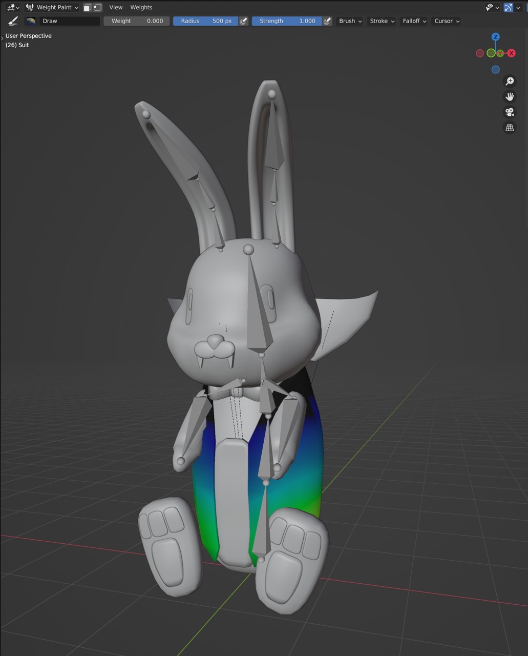
I can’t emphasize enough how complex rigging is. It may seem like an afterthought, but it’s an entire division at 3D studios, and for good reason. Below is Biki’s humble rig showing his suit in weight painting mode.
With all that in place, I moved on to the animation part. Even though I’d never done keyframe animation in Blender for a 3D character before, getting the basics done felt surprisingly natural to me. This was probably the most fun part of the entire process.
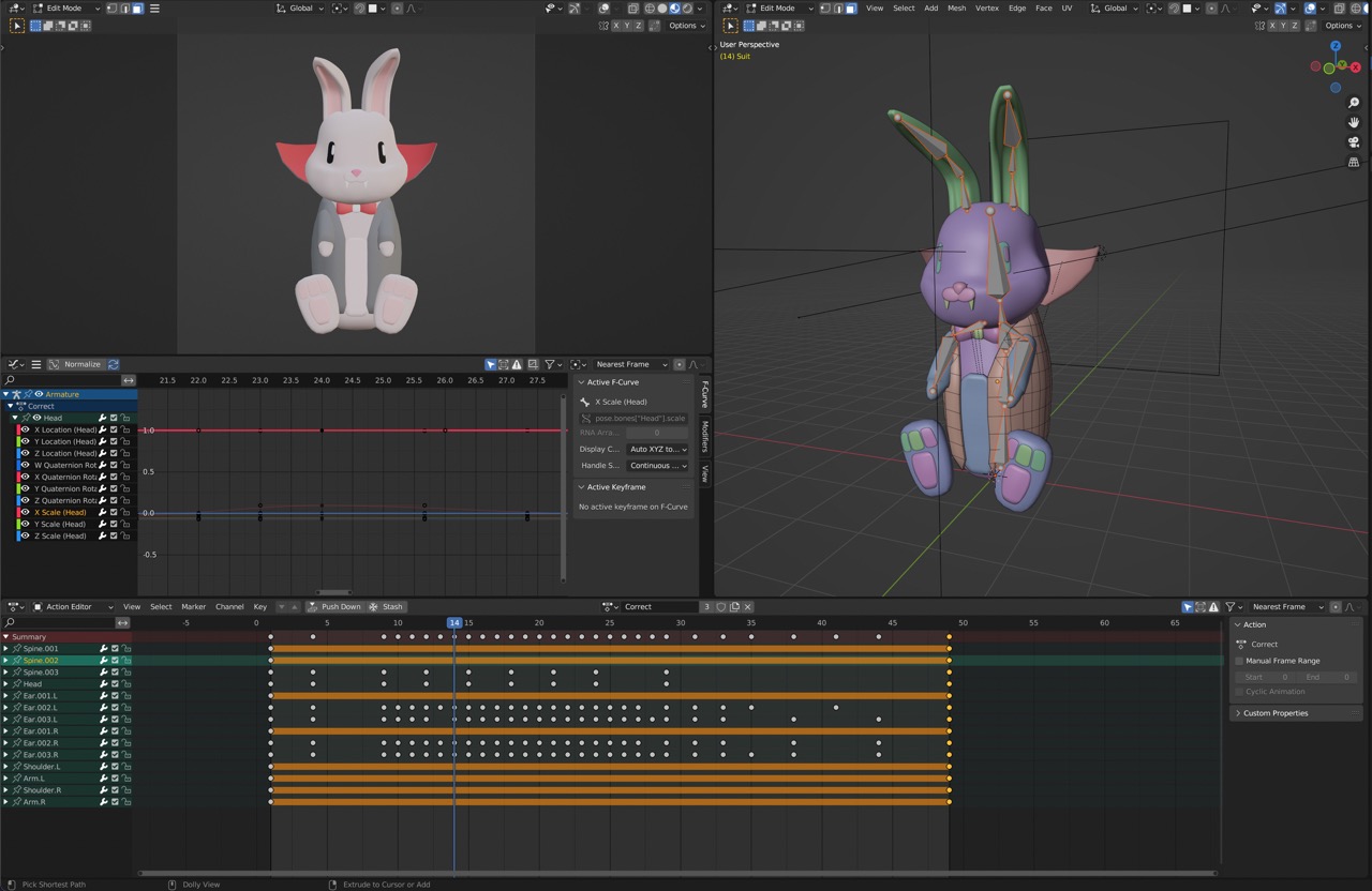
The final result for the “you got the answer correct” animation looked like this straight out of Blender:
Getting the model and animations out of Blender… this part was dreadful. I tried so hard to use Apple’s newest, most blessed workflow of USDZ, but some combination of the Blender exporter and the Xcode importer made this impossible. In the end, I used the same combination of one DAE (Collada) file with just the model and armature, and one DAE file per animation.
I imported the model file into Xcode, creating a new SceneKit scene, then painstakingly re-added the camera, lights, and materials, all of which look and work differently (read: worse) in SceneKit than they do in Blender. I couldn’t get Biki to look as clean in the app as he does in Blender.
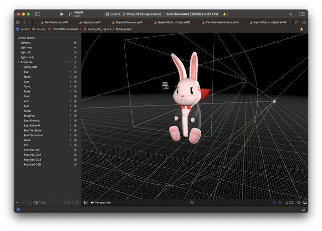
I exported the animations next. When playing them back in the app, I found that some polygons on the suit were getting caught during the animation. This was somewhat expected due to my inexperience modeling and rigging and weight painting. I powered my way through these issues and ended up with the final result: Biki in the test app, playing his idle animation and reacting to questions being answered right and wrong.
App UX Design
After integrating Biki and doing a little cleanup, the listening quiz screen looked like this:
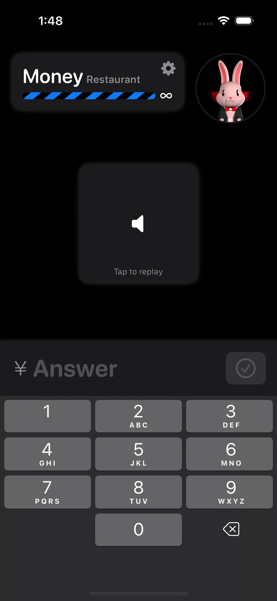
The listening quiz screen was still the “base” app screen. You could switch to a short list of topics from a modal settings screen, but since this didn’t seem sustainable for the dozens of topics I wanted to target for v1.0 release, I started preparing to have a new root app screen.
For this app, I was basically doing the static UI design step straight in SwiftUI. The main reason for this is that I was primarily using the build-in SwiftUI components and styling for lists, etc., and therefore it would have taken me more time to make pixel perfect mockup in Figma than it took to throw together some SwiftUI code in Xcode.
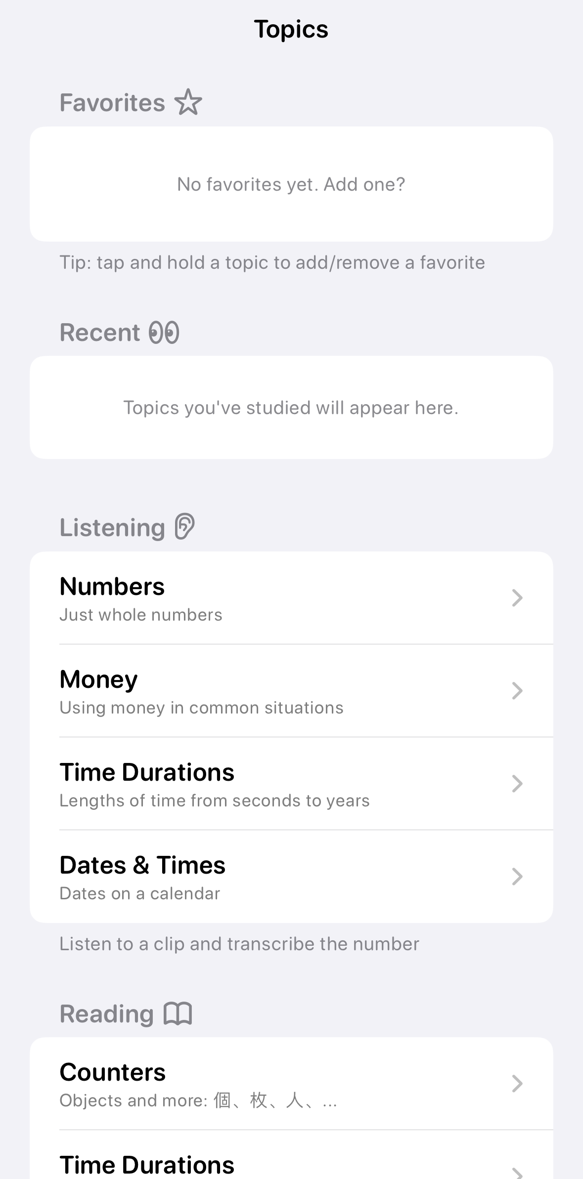
I made a topic categories view mockup with some additional features I didn’t plan on implementing right away. I did this in order to see how the screen could adapt to these planned features. The v1.0 doesn’t include favorites, recent topics, or the reading skill.
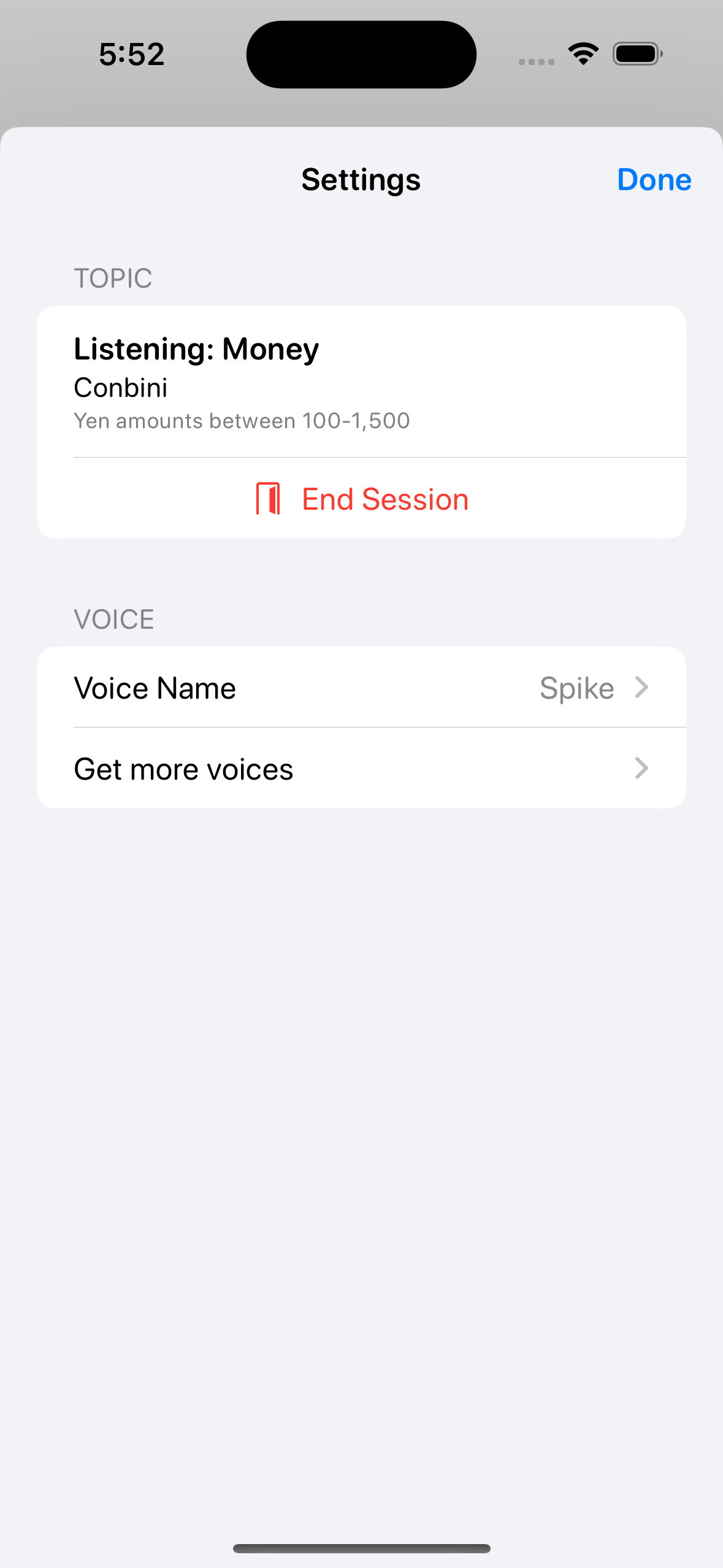
Back on the listening screen, I had to make some changes to support the screen no longer being the root of the app. The session settings screen needed a way to exit the current session.
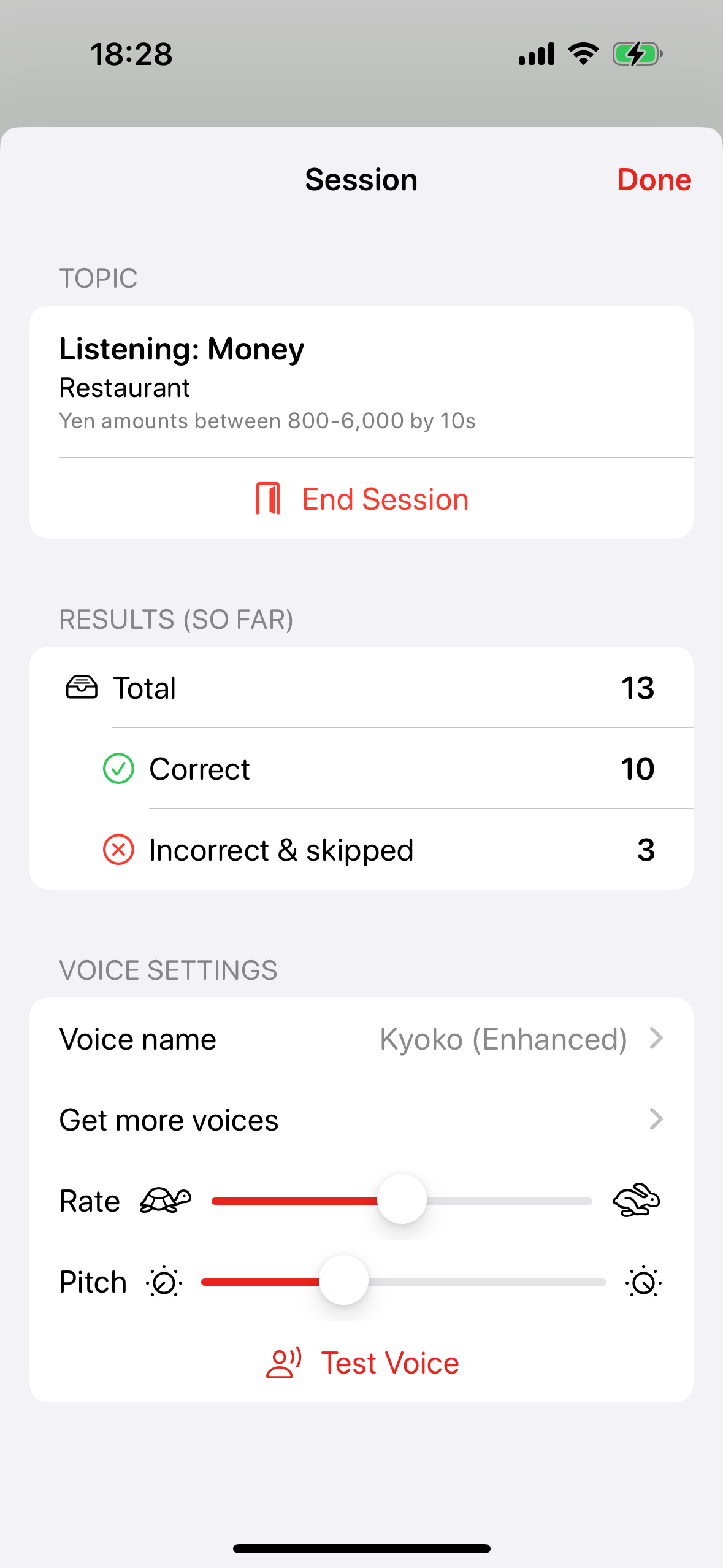
Next, I added more voice settings for rate and pitch. And a test voice button for easy preview.
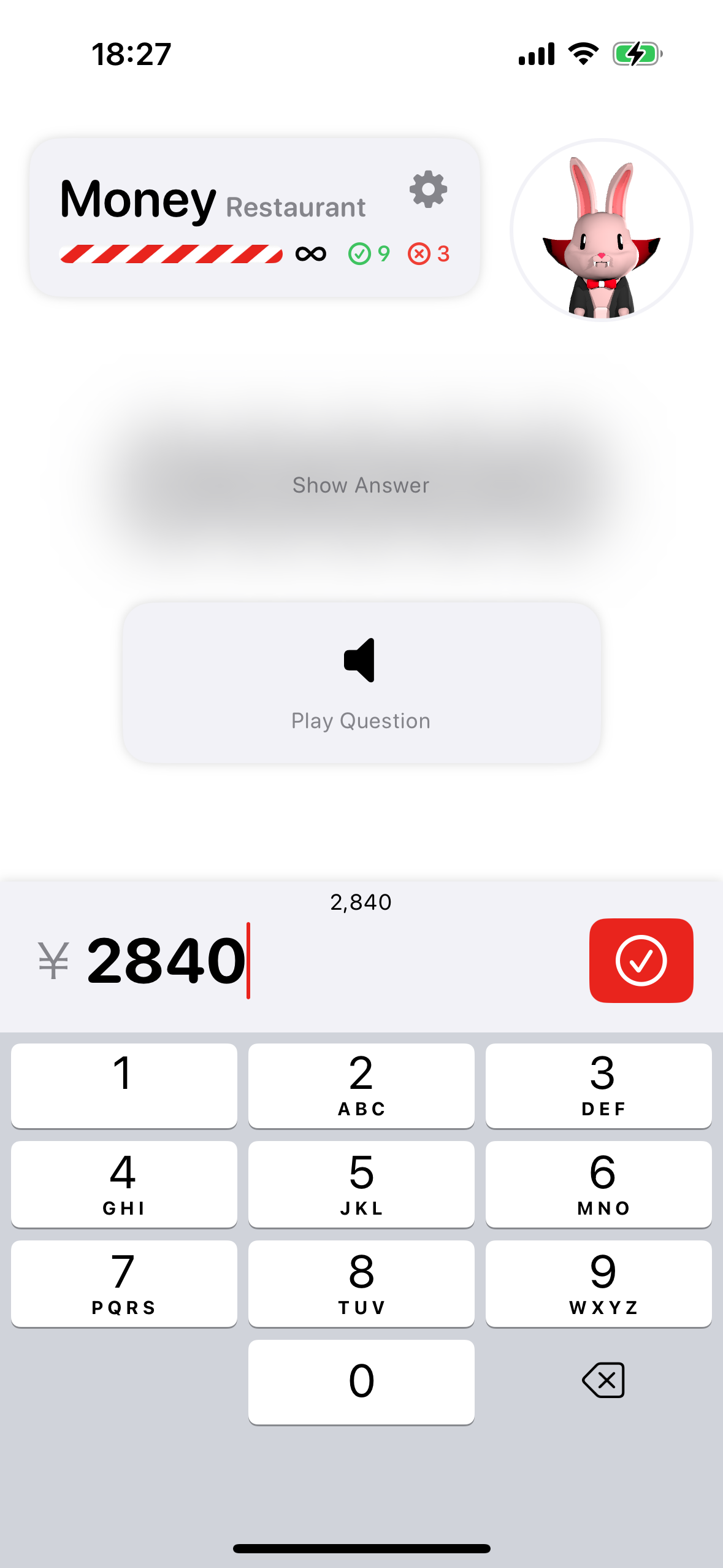
Adding a very simple counter for correct and incorrect answers to the listening quiz screen and the session settings screen rounded out all the main UI elements I wanted for the first release.
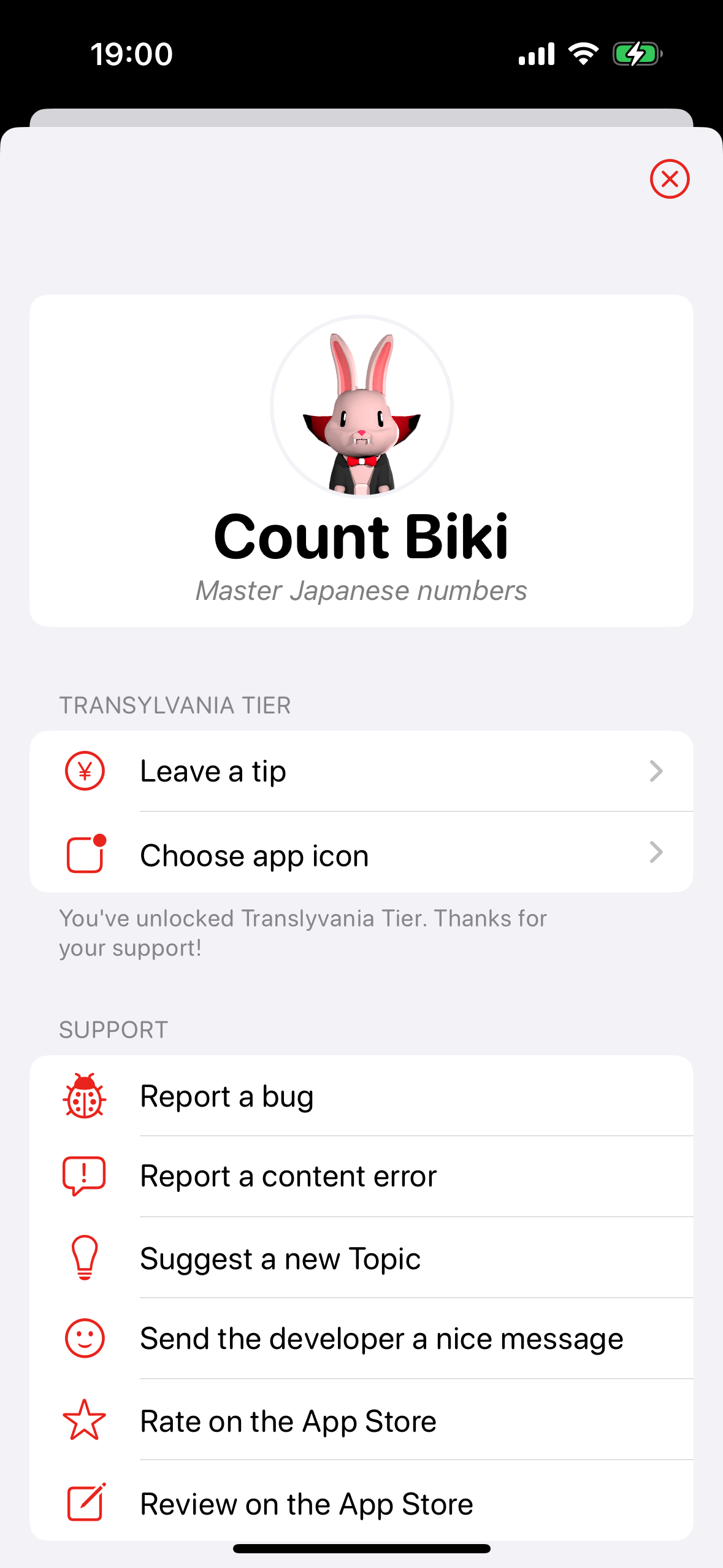
Although I knew it’d delay my first release, I wanted to get an app info screen out of the way. This was mostly because I wanted my in app purchase tip jar system in place out of the gate.
I approached the design of the info screen by checking out what was included in some similar apps, doing a rough UI sketch in my notebook, then jumping straight into coding it up in SwiftUI.
I landed on this:
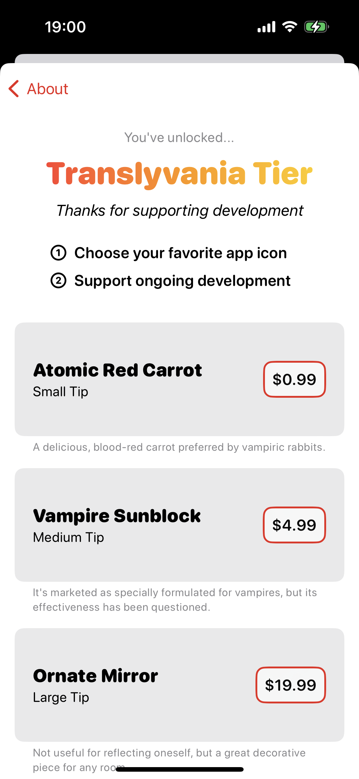
I followed the same design process for the in app purchase tip jar screen. I got really into fleshing out the “lore” of the app, and I really wanted to 3D model all the whimsical objects I introduced, but I knew it’d take some time and wouldn’t really impact my first batch of users enough to warrant delaying the release any further.
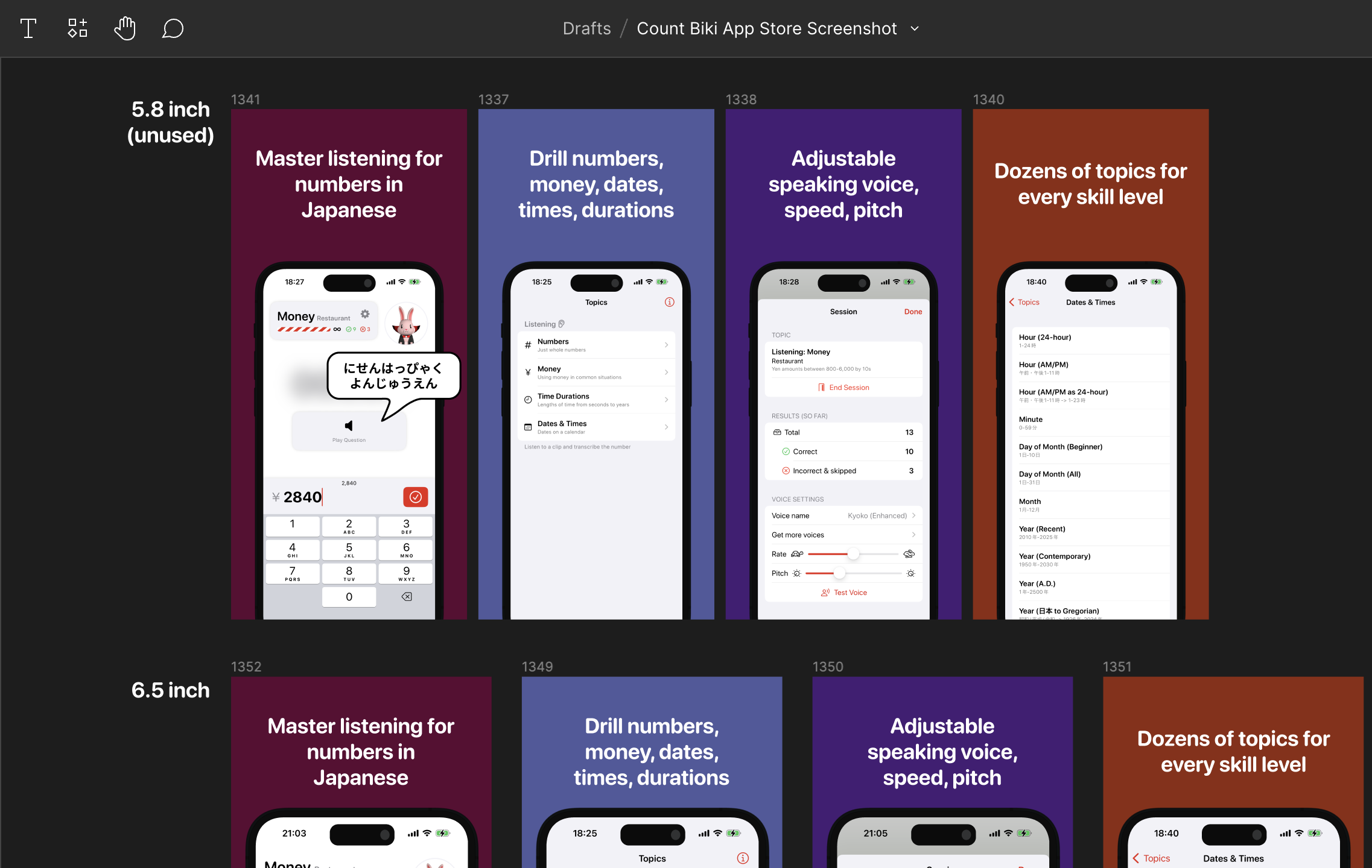
With the info screen complete, I was ready to release the app! Well, I still needed to do all the App Store preparation: designing screenshots, writing the description, etc.
My first submission was denied by the App Store reviewers. (I think it was an issue with the in-review in app purchases not being available from the Store Kit 2 API on the reviewer’s device). I resubmitted with a few more guards, and luckily it was approved and released!
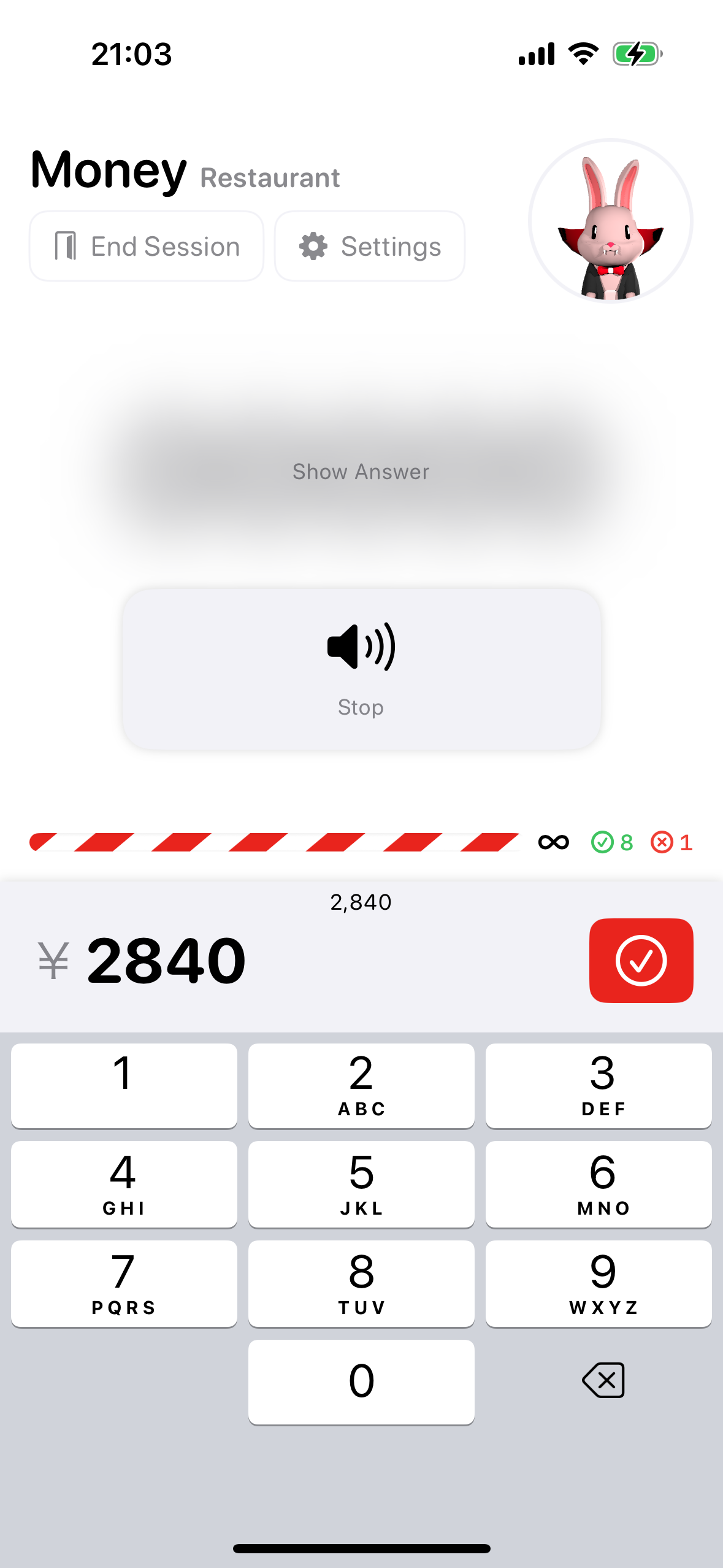
Some initial user feedback helped me realize that my “end session” button shouldn’t be so buried, especially in the infinite session mode. I did some design concepting with paper sketches and directly in SwiftUI (which in retrospect was probably slower than leaning on Figma).
Honestly, the listening quiz screen is very busy. It has a lot of elements and it’s tough to look at it with fresh eyes to understand which parts could be removed.
I think that including the Count Biki avatar makes fitting in the other elements more difficult, but I’m planning to keep him in for at least a few versions to gather feedback about him.
I’d also like to remove the progress bar completely, but when I add time attack mode, I think it will be necessary, so I don’t want to eliminate the progress bar now and have to solve the design problem again later.

In the end, I moved the progress bar closer to the keyboard and surfaced the end session and settings buttons with clear labels.
Conclusion
This is just the beginning of the design journey. I’ve intentionally leaned towards a generic iOS design, but I would love to make the app more stylized and personable. New topics and new features will undoubtedly require rethinking my original design assumptions. And I’ll need to decide whether I want to double-down on the character Count Biki and add more animations, new outfits, etc.
Thanks for reading this design walkthrough, and if you’re a Japanese learner or developer, please check out the app on the App Store or the source on GitHub.
The next post in the series is Count Biki - Developing the App for iOS.