Goalie - A Bespoke macOS App for Time Tracking
I self-released a bespoke time tracking app for macOS called Goalie in July 2023. I also open sourced it. It looks like this:
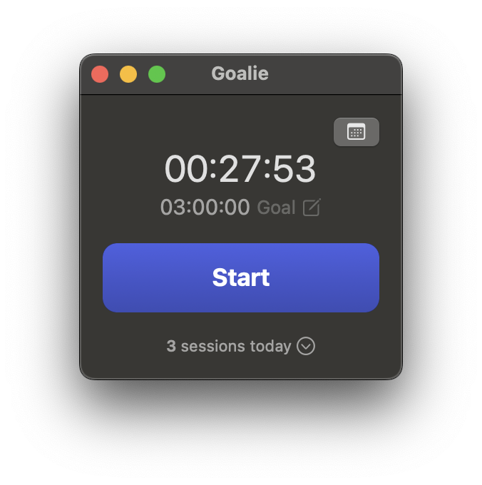
Download the latest version directly from the GitHub releases page if you want to try it out.
In this post I’ll give some background behind the app and a discuss a few notes about the implementation, and talk about how I created the icon.
Background
I created Goalie as my first bite-sized project after leaving Cookpad at the end of June 2023. Since I’d no longer be immersed in the Japanese language at the office every day, I wanted to make sure I was putting in a fair amount of time studying Japanese on my own.
I could have used one of a million time tracking apps focused on invoicing or Pomodoro, or even macOS’s built-in Screen Time feature. But this felt like a great opportunity to make a focused piece of software to my own specifications. I also wanted to do a SwiftUI-based macOS app to see where the framework was currently at. My past experience and impression from reading other developers’ thoughts was that SwiftUI on macOS has always significantly lagged behind iOS.
How does it work?
Start and stop the timer

Clicking start starts a new “session”. Stopping ends the session.
Once you reach your daily goal, the goal button lights up green.
Optionally set a goal
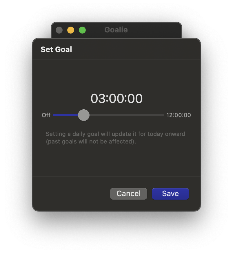
Click the goal button and drag the slider to set your daily goal. Changing the goal sets the goal from that day forward until you change it again. It doesn’t affect past goals.
Show and edit daily sessions
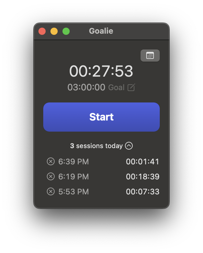
Click the “sessions today” button to show other sessions from the day. If you want to remove one, click the “x” button to its left.
Show history
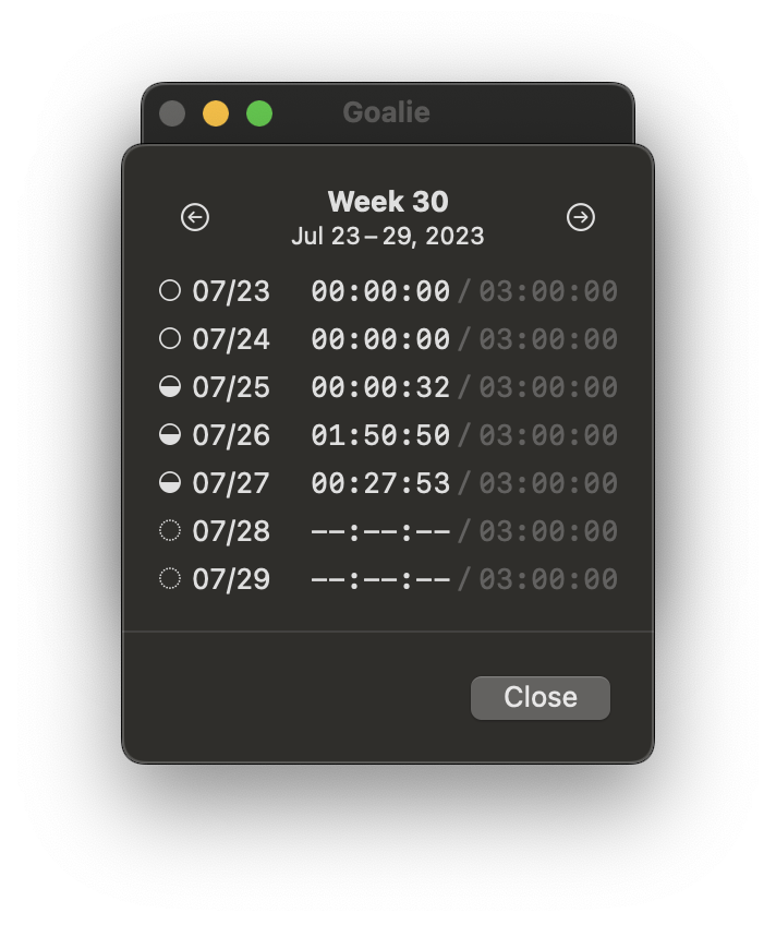
Click the calendar to show a weekly summary of your goal. Click the arrows in the header to page back through the history by weeks.
Implementation
Architecture
Goalie targets the SwiftUI 4 APIs (i.e. macOS 13, iOS 16).
I decided to go with a vanilla SwiftUI architecture that separates the view and store. The one new thing I wanted to try was pointfreeco’s swift-dependencies library to control my dependency layer.
Although this kind of app is often implemented as a menu bar extra, I preferred a simple app window I can keep off to the corner of my big monitor. My menu bar is already too full. As an app window I can keep it in my peripheral vision or hide it behind other windows easily. If I were to formally release this app for a more general audience, I’d probably add a menu bar extra though.
I used a ViewData abstraction to encapsulate some of the simple synchronous logic that turns raw model data into properties ready for the view to display directly.
For styling, I tried to use UIKit system colors and font styles as best I could to get a classic look and dark mode support. I picked a bluish purple for the tint color. I kept branding to an absolute minimum.
For persistence, I made my model layer Codable and save it to the application support directory. The app currently only supports one “topic”, but I’ve left the door open to make it a proper document-based app that allows having multiple topics going at the same time. At the moment that goes beyond my personal use case, so I haven’t explored it any more.
Dates and times
Dates and times and calendars are well known to cause headaches for developers.
Even for what I considered to be as close to a trivial time tracking code as one could write, I still immediately ran into gotchas. Especially when I went to write the history code.
I think any time you start to divide hours up into days with a beginning and end, you’ve got use a calendar and time zones, of which there are many. When you want to divide days up into weeks, the problems compound.
It doesn’t help that many of Apple’s underlying APIs for calendars silently use the user’s current locale and more specific localization settings under the hood. This usually great, but makes it incredibly difficult to introduce complexity to your codebase slowly, and also easily test each locale.
I made significant use of the new Foundation formatter APIs, which, in theory, wield like a Swiss Army Knife. But in practice, there’s no official documentation, the source is completely obscured by the heavy use of generics, and you still need detailed background knowledge of how the several dozen locales affect the results. Luckily Gosh Darn Format Style! helped take some of the edge off.
/// An example of calculating and displaying the duration of an ongoing session:

let now = Date()
let startOfDay = calendar.startOfDay(for: now)

// Enumerates all sessions to calculate the total number of seconds logged for the current day up to now.
let totalIntervalToday = topic.totalIntervalBetween(start: startOfDay, end: now)

// Convert to `Duration` type for formatting.
let duration = Duration.seconds(totalIntervalToday)

// Produces something like 02:15:12 for a number of seconds.
// (This should probably explicitly reference `locale`).
duration.formatted(
    .time(
        pattern:
            .hourMinuteSecond(
                padHourToLength: 2,
                fractionalSecondsLength: 0,
                roundFractionalSeconds: .up
            )
        )
    )
What this all means is that this code is unfortunately not well tested in all locales, which is the main reason I haven’t pushed for a wide release.
Data modeling
I chose to model a Topic (the highest level model) as such:
struct Topic: Equatable, Identifiable, Codable {
    let id: UUID

    // non-nil when a session is active
    var activeSessionStart: Date?

    // assume sorted past to future
    var sessions: IdentifiedArrayOf<Session>

    // assume sorted past to future, no two goals on the same day
    var goals: IdentifiedArrayOf<Goal>
}
This data is relatively normalized in that I have to parse it a bit to configure the view layer. Let me show the Session and Goal models before explaining further.
struct Session: Equatable, Identifiable, Codable {
    let id: UUID
    let start: Date
    let end: Date
}

struct Goal: Equatable, Identifiable, Codable {
    let id: UUID

    // always normalized to the start of a day (this has known issues with time zone changing)
    let start: Date

    // nil intentionally unsets a goal, always > 0
    let duration: TimeInterval?
}
The main consequence of logging only the start and end date of a session instead of updating the model to count up seconds is that the SwiftUI view updates independently from the model using the TimelineView primitive. If the computer is put to sleep or hidden, there won’t be any error in the model timekeeping. A downside is that using TimelineView offloads some necessary logic to the view layer, especially with date formatting. It’s a trade off.
This setup generally uses the least amount of data necessary to capture the full state and history of the system. I calculate the Goal moving forward in time indefinitely or until the next Goal object is logged. This adds some calculation burden, but it more efficient in storage. Of course, if users were allowed to, for example, insert a new goal for just one day, it would make that insertion logic slightly more complicated in the code.
Solving the user-can-move-time-zones problem is tough enough that I haven’t bothered. There are a couple UX questions about the “correct” behavior that aren’t immediately obvious to me.
Start of day
The concept of “start of the current day” is important since the count up timer is always calculated based on that point in time.
I thought macOS would have some sort of globally posted notification for when the day rolls over, but I couldn’t find one. One lingering issue is that my workaround code for updating that very important start-of-day value wasn’t running reliably. I’m much more familiar with the iOS app lifecycle than the macOS lifecycle so it’s unclear to me whether it’s an alarm setting error on my part, or whether the app just isn’t firing the alarm and updating the date when it’s not the key window. Either way, I added a workaround in v1.0.1 to simply ensure the start-of-day value is updated when the window is foregrounded. I recognize it’s not a perfect fix, but one step at a time.
Deployment
I haven’t set up fastlane, CI, or even Xcodegen for this project. But it’s surprisingly straightforward to do your own manual app build, signing, and distribution through GitHub. Next on the list would be a proper App Store release or Sparkle integration.
Designing the icon
I was initially tempted to use Stable Diffusion to create a low-effort app icon. However, lately I’ve been dabbling in 3D modeling with Blender and I decided to see how far I could get using it to create an icon.
It turns out, pretty far! I actually like this icon a lot and it didn’t take so long to put together.
If I were to log some more hours on it, I’d make it give it more of a macOS vibe by removing the heavy white border and try overhanging some of the foreground elements. Also I’d make some more custom low-res versions. Overall though, I find it easy to recognize in my dock when I need it.
Here are some more WIP shots of the design process:
Conclusion
This app has been working well for me over the past month or two. It’s been great having some extra time to make some scratch-your-own-itch apps. There are plenty of ways I could improve the app, but for now, I’m satisfied with where it’s at and hope it continues to serve me well.
Here’s one more link to the source and releases: twocentstudios/goalie.