Fall 2013 Project Wrap Up
At the end of every quarter or at least biannually I try to wrap up all the little projects I worked on during that time period that weren’t large enough to warrant their own blog post. Here’s a short summary of all the little projects I’ve worked on since I moved to New York to work at Timehop.
Timehop
My full-time job, but worth mentioning that we’ve shipped a lot of features since I started working at Timehop.
Combined Share Flow
We combined sharing to social networks and dark channels (email/sms) into a two panel pop-up behind a single share button on the home screen. I spent most of my time on the email/sms screen. The tricky parts were dealing with using a field that both showed the contacts you had already selected as well as allowing you to enter search mode. There ended up being several screen states with animations between each.
Twitter @replies
A short project to allow users to see the full thread of a conversation they had on Twitter. Originally planned to be much more detailed, we decided to scope down the project to push out to Twitter’s web version until we understood how much use the feature would get.
In-App Private Sharing
There were two internal prototypes of a feature to share Timehop content within the app before the final released version.
The first featured a drawer that had a tabular list of people or groups that you shared Timehop content to in a long running thread of content and comments.
The second was a two column collection view of Timehop content shared to you. Each piece of content was obscured so that tapping it revealed it in a flip animation.
The released version materialized as a quick share panel of recent contacts or groups that with one tap, you could share Timehop content to. A notification table provided a link to each piece of content, with the content having a detail view with comments.
During this time, I also got to rewire a lot of the message passing that happened within the codebase. And right before shipping, I also refactored the start up, log in, sign up, and welcome flow, and cleaned up the app delegate.
Nearby
This feature was a one-week project that aggregated Timehop content that happened near the location you opened the app and allowed you to explore the day it happened. There were a lot of cool animations I got to play around with for this feature.
Journaling
We ran a few beta experiments with gathering new content to make next year’s Timehop better.
The first version showed photos from today’s camera roll and allowed you to upload them to Timehop.
Another version presented a different daily screenshot challenge to the user.
Another version showed a front-facing camera window in the bottom of the Timehop day. When you scrolled the window into view it would begin a 3..2..1 countdown and snap a picture of the user. The user could then either upload the photo to see next year or retake it.
Vinylogue
Status: On Hold
After ignoring it since its April 2013 release, I did a little bit of house cleaning and updating this app for iOS 7. That part was actually pretty easy since the style was pretty stark to begin with.
I started working on a new feature to schedule local notifications to alert the user when their weekly charts have refreshed. In theory, all users are on the exact same schedule of being refreshed on Sunday night, but I wanted to use the actual data I get from Last.fm. There were a lot of other decisions as far as how many local notifications I should schedule in advance (I think I ended up at four), if I should do the scheduling on every app open (by canceling all active notifications and rescheduling them), and if I should do it in primary controller when I fetch year data or in a separate call (I ended up doing it doing it in a separate place).
Unfortunately, I haven’t got around to finishing the feature yet. I’m pretty sure all that’s left is testing. My user base isn’t huge and there hasn’t been much outreach on it, so although it could bring retention numbers up, it hasn’t been at the top of my to do list.
Another feature I’ve wanted to do is some sort of sharing for the album detail view. The only thing I have to get that going is to minorly refactor the view hierarchy.
SocketParty
Status: On Hold
One night after work I decided I wanted to play around with websockets on iOS. So I started a new project, pod installed socket rocket, and started reading the docs. Somehow reading the docs wormholed me into making a game based on colors and the accelerometer (and nothing to do with websockets).
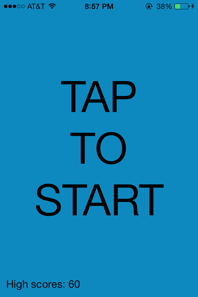
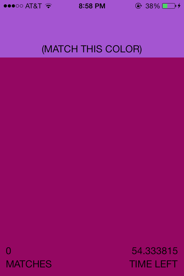
(Ignore the ugliness, I planned on tightening up the design after I finished the mechanics).
Sort of hard to show in screenshots, but tilting your phone along any of the three axes changes the background color. The goal of the game is to match the randomly selected color on the top by tilting your phone. The player ends up looking like they’re doing a weird dance.
In theory it’s a nominally fun game. In practice, I ran into some development trouble. I’m still unsure of what the range of the raw accelerometer data is. There is very little info in Apple’s docs. It doesn’t help that I have a 4S and I assume they’ve improved the accuracy of the accelerometer a bit in the newer iPhone models.
I somewhat solved the problem of showing “fun” colors. If you use RGB and map floats from 0 to 1, you end up with a lot of ugly grayscale. Not something I initially anticipated. I actually ended up switching to HSV, and the colors are now bright and primary by mapping to a reduced scale of saturation and brightness. Much more fun.
In the current version it’s actually next to impossible to get a match. I thought it would be easy to set a define for the “closeness” that a color match had to be. Something about having three variables and scaling the values along the way makes this not as straightforward as I anticipated.
One interesting part of this project for me was trying AutoLayout for the first time in a real project. Granted, I’m not using it raw via IB or code. I decided to use the wrapper library UIView-Autolayout. As a taster, here’s some of the layout code:
in updateViewConstraints
const CGFloat bottomLabelOffset = 10.0f;
const CGFloat bottomInterLabelOffset = 2.0f;
[self.matchesLeftBottomLabel autoPinEdge:ALEdgeBottom toEdge:ALEdgeBottom ofView:self.matchesLeftBottomLabel.superview withOffset:-bottomLabelOffset];
[self.matchesLeftBottomLabel autoPinEdge:ALEdgeLeft toEdge:ALEdgeLeft ofView:self.matchesLeftBottomLabel.superview withOffset:bottomLabelOffset];
[self.matchesLeftTopLabel autoPinEdge:ALEdgeLeft toEdge:ALEdgeLeft ofView:self.matchesLeftTopLabel.superview withOffset:bottomLabelOffset];
[self.matchesLeftTopLabel autoPinEdge:ALEdgeBottom toEdge:ALEdgeTop ofView:self.matchesLeftBottomLabel withOffset:-bottomInterLabelOffset];
It’s actually somewhat similar in API to POViewFrameBuilder which I use often at work. But I remember getting hung up a couple times. It works, but at this point I’m still a little skeptical of what AutoLayout buys you.
The best part of this project is the unrelated name. If I ever decide to finish it, I’ll have to apply a better moniker. I lost interest for now, but maybe when I get a new iPhone I’ll be more inclined to give it another shot.
TimeSnapHopChat
Status: Dead
I mentioned above that our team at Timehop was experimenting with ways to get people to generate more content for their Timehop days next year. I had the idea over Thanksgiving break to create a Snapchat clone with a Timehop twist.
The idea was that this would be a separate app from Timehop. The interface would be very similar to Snapchat.
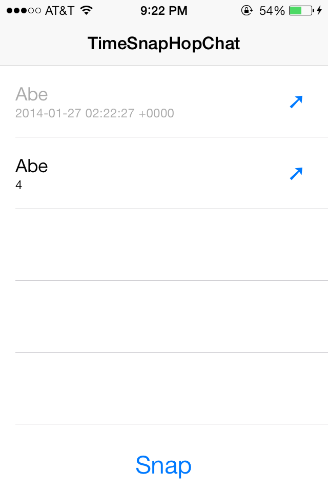
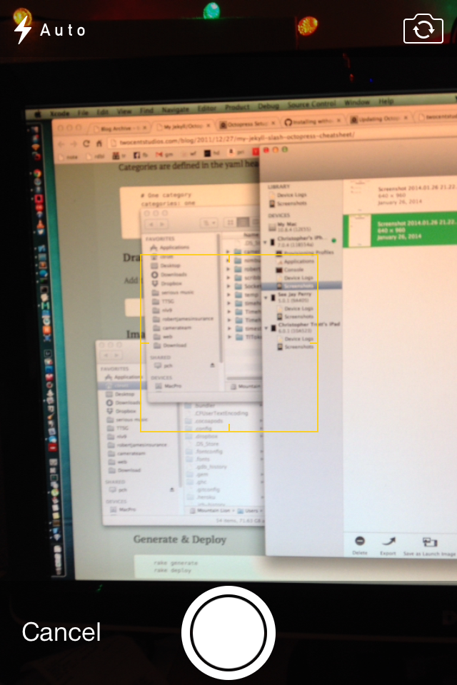
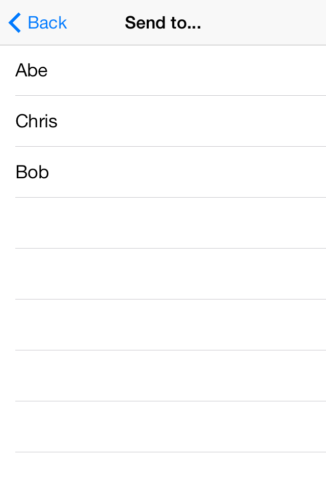
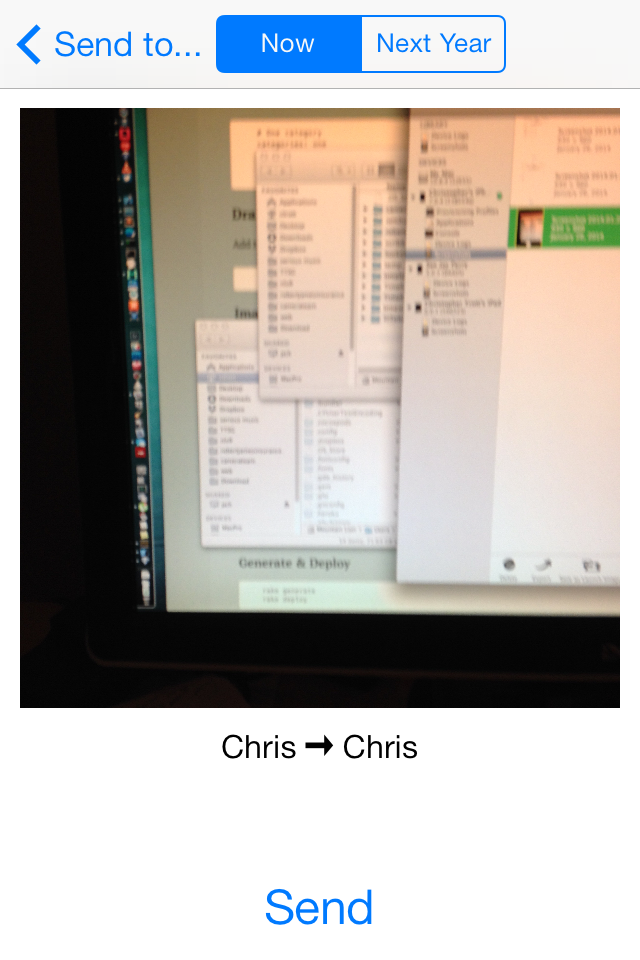
The twist to this app would be that the recipient could only see the Snap for a few seconds like Snapchat, but both the sender and the recipient would see the Snap in their Timehop day the next year. It combines the lightweight communication of Snapchat with the idea that photos get more valuable with time (Timehop!).
I wrote the prototype in about a day in a half. I used some existing Timehop endpoints, but it didn’t have anything as far as user log in or any styling.
In the end, we decided to go a different direction with the journaling idea. But I enjoyed getting a chance to do more quick prototyping, and to play around with figuring out how to code up the Snapchat mechanics.
TimeStop
Status: Dead?
TimeStop was another Timehop journaling prototype. I can attribute the original idea to my co-worker Kevin’s brother Tom.
The idea is that you may be out at a restaurant or a rock show and you want to “stop time” for yourself - attempt to gather as much information as possible about your current status so that you can accurately remember this exact moment later. This might include things like the last 5 posts in your Twitter feed, the Wikipedia article on the concert hall you’re at, the top headline of the New York Times, a few photos tagged at that location from the public Instagram feed, or a million other things.
It was difficult to explain my vision for the user interface for this feature, so I prototyped it.
Screenshots don’t do justice for this one either, but you can imagine the user pressing and holding the “STOP” button, and a bunch of photos and articles flying in from the outside of the screen getting sucked into the button. At the same time, the screen fills up blue and increases the amount of time you want to look back to gather data.
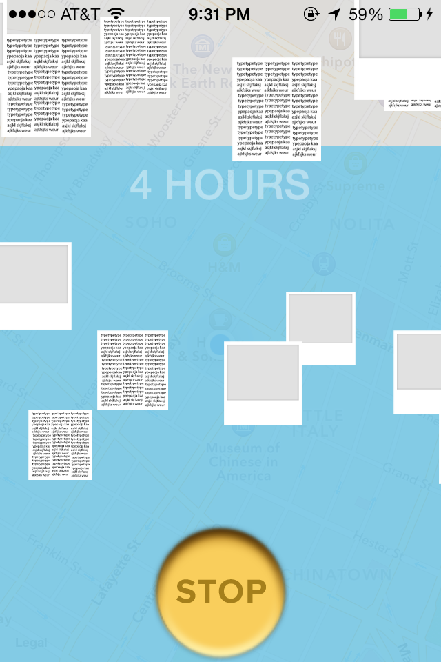
I threw together this demo after work one night (it really deserves a GIF or a video, my bad). I didn’t code up the next step. The server would begin aggregating content based on the user’s location and then deliver it in some sort of list to the device. The user would then do a quick sort through of the compiled data and delete anything they wouldn’t consider relevant. The server then would create a package of data that could be viewed in next year’s Timehop, or maybe shared at that current moment.
As far as implementation, I simply schedule a random amount of animations at random locations, at random intervals, and with random images (there are only two right now). A cool thing about this project was that I used ReactiveCocoa in some critical places that made things a lot easier.
Here’s a small onslaught of the view controller code:
TCSTimeStopDemoViewController.m
- (void)btnTouchDown:(UIButton *)btn {
  self.progressView.frame = self.view.bounds;
  self.progressView.top = self.view.bottom;
  self.progressLabel.text = @"STARTING UP...";
  [self.progressLabel sizeToFit];
  self.progressLabel.width = self.progressView.width;
  self.progressLabel.left = self.progressView.left;
  self.progressLabel.top = 10;

  // Blue progress view animates up a slow pace
  [UIView animateWithDuration:10 delay:0 options:UIViewAnimationOptionCurveLinear animations:^{
    self.progressView.top = self.view.top;
  } completion:^(BOOL finished) {  }];

  // Super hacky way of changing the progress text that has to match up with the above animation
  self.progressLabel.tag = 0;
  RACDisposable *progressLabelDisposable = [[RACScheduler mainThreadScheduler] after:[NSDate date] repeatingEvery:1 withLeeway:0 schedule:^{
    if (self.progressLabel.tag == 0) {
      self.progressLabel.text = @"STARTING UP...";
    } else if (self.progressLabel.tag == 1) {
      self.progressLabel.text = @"2 MINUTES";
    } else {  // some code removed here
      self.progressLabel.text = @"24 HOURS";
    }
    self.progressLabel.tag = self.progressLabel.tag + 1;
  }];
  [self.viewMakers addObject:progressLabelDisposable];

  // A bunch of scaled y-position making
  for (int yPos = -50; yPos < 600; yPos=yPos+200) {

    // Schedule 3 x-position animations at each for-loop y-position.
    // The interval at which the three animations are repeated is random.
    RACDisposable *viewMaker = [[RACScheduler mainThreadScheduler] after:[NSDate date] repeatingEvery:(((double)arc4random_uniform(100)+1)/100.0) withLeeway:0 schedule:^{
      CGFloat leftPos = ((CGFloat)arc4random_uniform(200))-200;
      CGFloat rightPos = ((CGFloat)arc4random_uniform(200))+320;
      CGFloat centerPos = arc4random_uniform(320);
      CGFloat sidePercentage = (((CGFloat)arc4random_uniform(40))+60)/100.0;
      UIImageView *viewLeft = [[UIImageView alloc] initWithFrame:CGRectMake(leftPos, yPos, 0, 0)];
      UIImageView *viewRight = [[UIImageView alloc] initWithFrame:CGRectMake(rightPos, yPos, 0, 0)];
      UIImageView *viewCenter = [[UIImageView alloc] initWithFrame:CGRectMake(centerPos, -30, 0, 0)];
      viewLeft.image = arc4random_uniform(2) ? [UIImage imageNamed:@"newspaper"] : [UIImage imageNamed:@"poloroid"];
      viewRight.image = arc4random_uniform(2) ? [UIImage imageNamed:@"newspaper"] : [UIImage imageNamed:@"poloroid"];
      viewCenter.image = arc4random_uniform(2) ? [UIImage imageNamed:@"newspaper"] : [UIImage imageNamed:@"poloroid"];
      [self.animationCanvasView addSubview:viewLeft];
      [self.animationCanvasView addSubview:viewRight];
      [self.animationCanvasView addSubview:viewCenter];
      [viewLeft sizeToFit];
      viewLeft.width *= sidePercentage;
      viewLeft.height *= sidePercentage;
      [viewRight sizeToFit];
      viewRight.width *= sidePercentage;
      viewRight.height *= sidePercentage;
      [viewCenter sizeToFit];
      viewCenter.width *= sidePercentage;
      viewCenter.height *= sidePercentage;
      [UIView animateWithDuration:((double)arc4random_uniform(100)/100.0)+0.1 delay:0 options:UIViewAnimationOptionCurveEaseIn animations:^{
        viewLeft.frame = CGRectMake(self.timeStopButton.x, self.timeStopButton.y, 30, 30);
        viewRight.frame = CGRectMake(self.timeStopButton.x, self.timeStopButton.y, 30, 30);
        viewCenter.frame = CGRectMake(self.timeStopButton.x, self.timeStopButton.y, 30, 30);
      } completion:^(BOOL finished) {
        [viewLeft removeFromSuperview];
        [viewRight removeFromSuperview];
        [viewCenter removeFromSuperview];
      }];
    }];

    // Keep track of all the disposables so that we can cancel the repeating animations when the button is released/
    [self.viewMakers addObject:viewMaker];
  }
}

- (void)btnTouchRelease:(UIButton *)btn {
  [self.progressView.layer removeAllAnimations];
  self.progressView.top = self.view.bottom;

  // Dispose of all animations (thanks, ReactiveCocoa!)
  [self.viewMakers makeObjectsPerformSelector:@selector(dispose)];
  [self.viewMakers removeAllObjects];
}
Pretty hacky, but much more elegant thanks to ReactiveCocoa. If you’ve ever worked with raw NSTimers, you understand how ugly that API is.
I don’t think we’re planning on revisiting the TimeStop idea at least in the near future. This demo is definitely fun to show though.
Technicolor TV
Status: Under Infrequent Development
This project is a little off the beaten path for me, but very dear to my heart in fulfilling an active need. It requires a bit of backstory though.
One prong in my multi-pronged approach of staying in touch with my Chicago friends is what we call simulcasting/liveblogging TV shows. My friends Bobby and Brian and I have “Wonder Years Wednesdays” in which we each watch an episode of the classic late-80’s tv show “The Wonder Years” (we’re currently nearing the end of season 3).
We each watch the episode at different times of the day, so our solution to sharing our thoughts and jokes about the week’s episode was for one person to write an email with the episode timestamps of each comment. The next person that watched would reply to that email and fill in their comments the same way, but in a different font color. We did this for several weeks, and I started to get tired of the awkwardness that is line-by-line email replies.
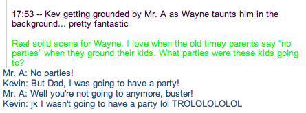
I hadn’t done a Rails project in a while, and I was imagining the perfect webapp to automate a lot of what we were doing with the email threads. So I did a quick wireframe.
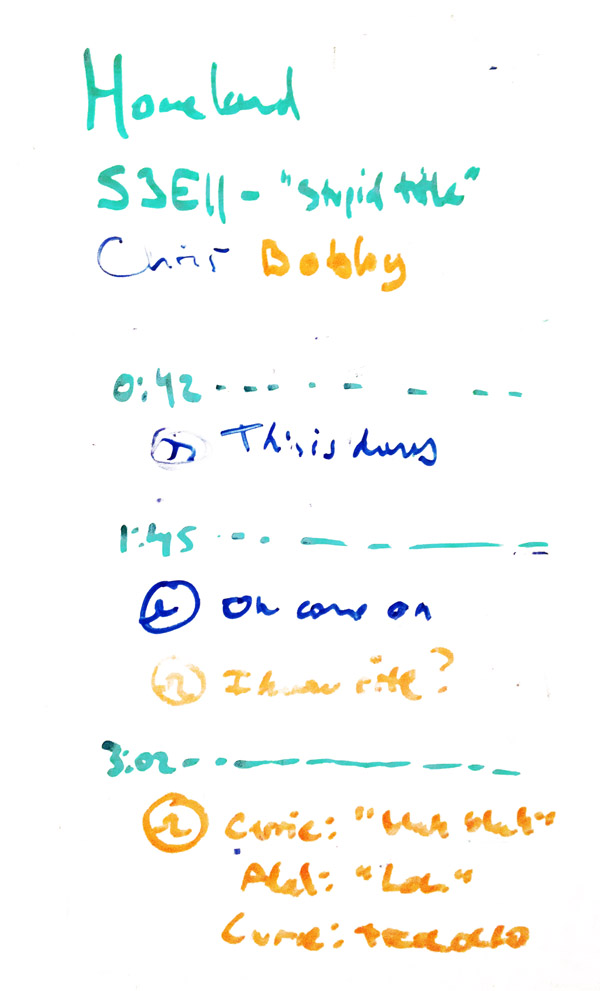
While thinking through the requirements, I realized that there were times where the times that we watched the episode might conflict. And I know I wouldn’t want to have to deal with refreshing the page if this happened. I put websockets back on my “to consider” list.
With just my very rough episode page wireframe, I started development. I decided to use Rails 4, because hey, Rails moves kind of fast. I actually did a bunch of research into making this my first foray into making a fully client-side app in Ember. I was mostly grasping the ideas, but bailed after realizing how much of the user authentication code I would have to write. I was much more interested in developing the chat part of the app than I was copying and pasting code from an Ember tutorial. I’m definitely still interested in Ember though. Maybe next time.
I always start out by making a markdown doc with my app’s models and routes, as well as solutions to any gotchas I think I’ll run into later. I’ve removed a bunch of the models so this post doesn’t stretch on forever.
planning.md
### Program

* integer :id
* string :name
* has_many :episodes

### Episode

* integer :id
* string :name
* integer :season
* integer :number
* belongs_to :program
* has_many :rooms

### Room
### Timestamp
### Comment
### User
### RoomsUsers

## Routes

GET /dashboard => shows all rooms for a user
GET /room/:id => shows a room
POST /room/:id/timestamp => creates timestamp and comment objects
From here, I’ll add my standard gem set. Then write my initial database migrations. Then generate models and controllers.
I’m still in the bad habit of not writing tests for everything. If this project gets serious, it would definitely be a good idea to fill in those blanks.
I’ll add a view at a time, and use those to knock out any bugs with my models and controllers. I used to use Haml, but I’ve actually switched back to standard erbs because all the extra time I’d spend debugging non-standard line constructs would usually eclipse the amount of extra time I spend writing closing tags.
The app really only has two screens (besides all the auth screens). The entry point is the Dashboard. It shows a list of all the Rooms the current user is a member of. A room is a place where several users discuss an episode of a program.
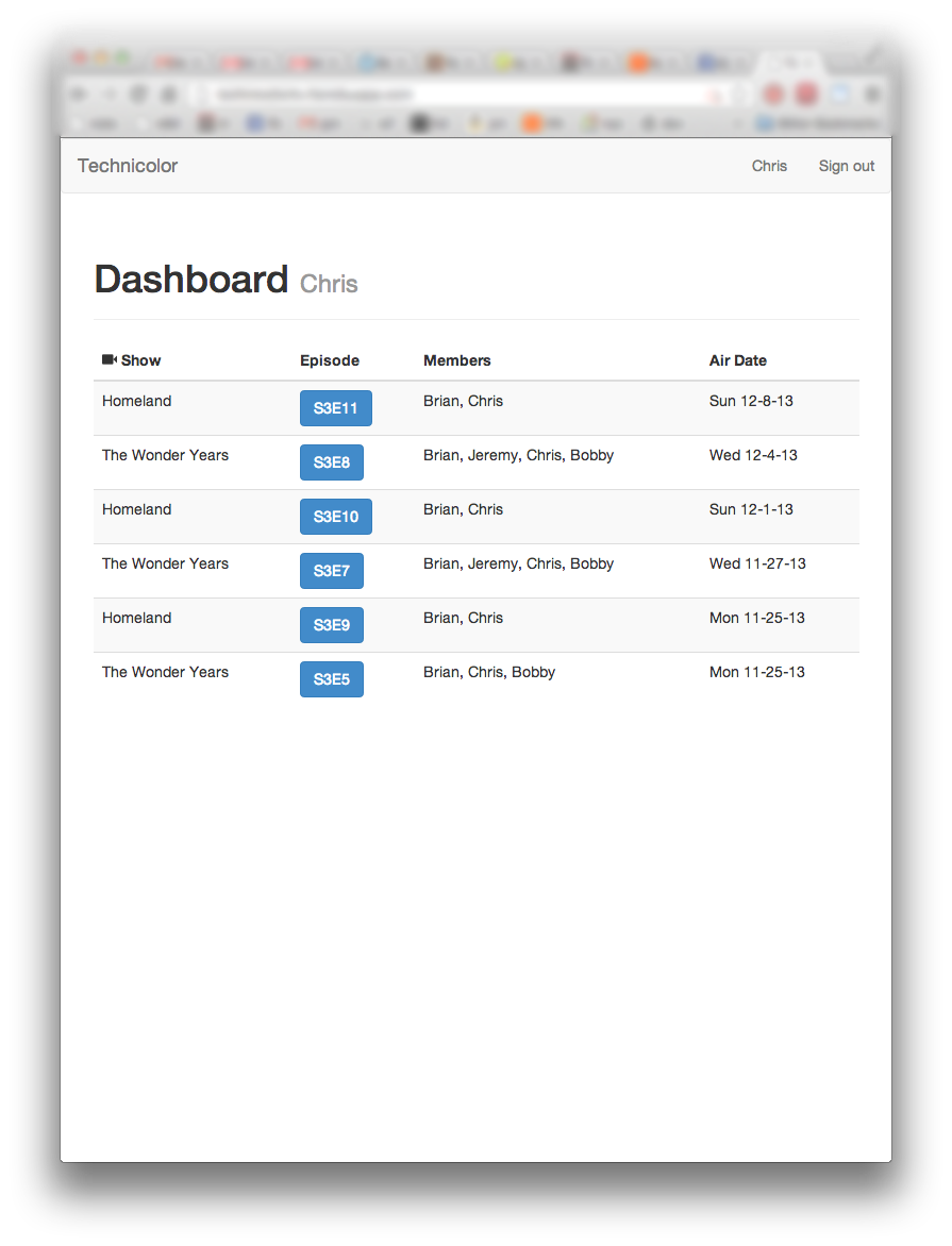
The room detail screen shows the contents of the room.
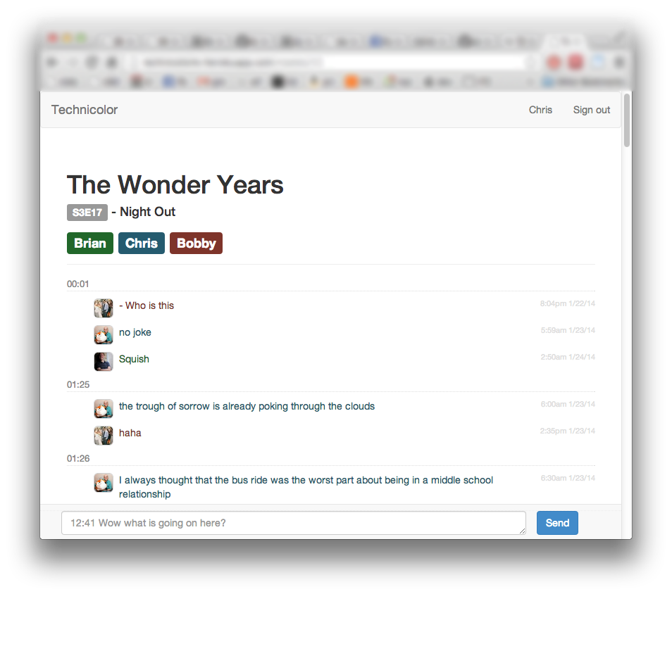
The layout of the room screen is essentially threaded comments by timestamp. Creating a new timestamp and commment is the same action for the user. Typing in a timestamp like 12:41 followed by the comment text will create the timestamp thread if it doesn’t exist, or if it does it will add the comment to the end of the thread. If no timestamp is entered, it’s interpreted as 0:00, which is the defacto general thoughts thread for the room.
Each user has an avatar and their own text color to help easily scan for a user’s comments.
I also added some extra text box features. Hitting enter submits the comment. Shift+enter creates a new line in the same comment. Pressing the up key scrolls to the top of the page. Pressing the down key scrolls to the bottom.
Getting into the more technical details now. It took a few false starts, but I figured out how to incorporate websockets into the room. A websocket channel is opened for user when they load the room for the first time. At that time, the initial representation of the page is rendered by the server and returned. Any time a comment is created on the server, an HTML partial for the comment is rendered by the server and broadcast to the room’s websocket channel. JS on the client-side receives the comment and takes care of adding it to the DOM in the correct spot.
I could have also had the client send new comments via the websocket channel, but it was conceptually simpler for the server to be the main arbiter and broadcaster of data, instead of treating it as a peer on the channel. It also makes sense that if the server somehow fails to store the comment, the other clients shouldn’t have a copy of that comment.
Following that logic, adding a comment is a standard AJAX POST to the server. The server receives the comment, stores it, broadcasts it on the room’s websocket channel, and all subscribed clients parse the partial and add it to the DOM. This includes the client that created the comment. It actually saves me a step of having to deal with adding a comment to the DOM that has no server assigned ID, and then updating it once the request from the server is successful.
It works the same way with deleting comments. I have yet to implement editing (deleting and resubmitting the comment is the workaround for now).
Working with websockets was pretty magical. I had a bit of a scare though. I had written and tested all the websocket features locally, but didn’t realize that Heroku didn’t support them! Luckily, at almost exactly the time I was ready to deploy to production, Heroku released a websockets beta feature that I could quickly enable.
I learned a rough lesson that sometimes even when you custom build a solution to your problem, there are nuances you can’t easily conquer. More specifically, my friend Bobby spends a lot of time on his phone, and email is most convenient for him. The app is responsive out of the box enough to read on a mobile device, but I haven’t spent the time to make sure the comment box appears correctly. The app also requires a log in step, which email does not. And email also has built in notifications, and Technicolor doesn’t send out any type of email notifications or push notifications yet when another room member comments.
None of these feature requests are impossible. But each requires another significant time investment that’s hard to justify for a user base of three. There are several lessons here:
- Sometimes it takes significant investment to beat the hack solution to a problem.
- Hack solutions often get a lot of features for free that your custom solution needs a custom feature to equal.
- It’s important to really know your users. My users are my best friends and even then I didn’t understand their use cases well enough to make the right solution on the first shot.
The future of Technicolor is unclear. My friends and I are still planning on using it for Wonder Years Wednesdays and probably some other shows soon (Brian and I used it simultaneously for the last couple episodes of Homeland and it was a lot of fun).
I’d really like to turn it into a real product, but I doubt this is a common behavior, or that I could convince people how much fun it is. Maybe some day I’ll cobble together an iPhone app (although Brian is an Android user so it would only be two of us that could use it). I could also do email notifications, even if they started out as manually triggered.
Still a plenty to do, but again, I had a lot of fun writing this (it took a few weekends), and it was great to dive back into Rails and learn a bunch of new stuff about websockets.
Insurance App
I committed to a freelance iOS project back in January of last year (wow, time flies) for a small insurance broker in Chicago. My good friend and expert designer CJ handled the product and design for the app, and after a bit of a hiatus we started working on it again in late November.
Here’s an App Store link if you want to download it or see more screenshots.
There were actually a lot of interesting constraints to this project.

On the front layer of the app there were a few informational screens that I used a template view controller to coordinate. All four view controllers subclassed the base view controller and overrode class methods that returned static data for each. The base controller would gather text or image data from these methods and layout the views the same way.
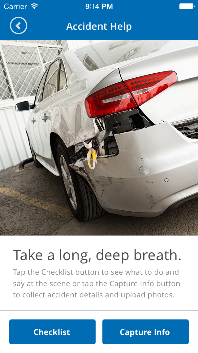
I began the project by attempting to put a figurative firewall between the raw content and the layout. I put all the content in a plist and created a framework around drawing that data into the specific controllers. I eventually abandoned that method because it actually makes things a lot more complicated in an app with a very simple scope. It would have been nice to be able to fetch a plist from S3 when the client wanted to update the content of the app, but that was hardly a requirement, and at this point would be over-optimization.
The bulk of the app was a data collection utility for customers to input and submit data about a car accident.
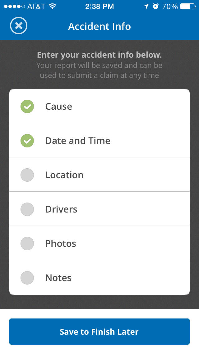
Our goal was to make the flow very predictable, even if all the data sources were very different.
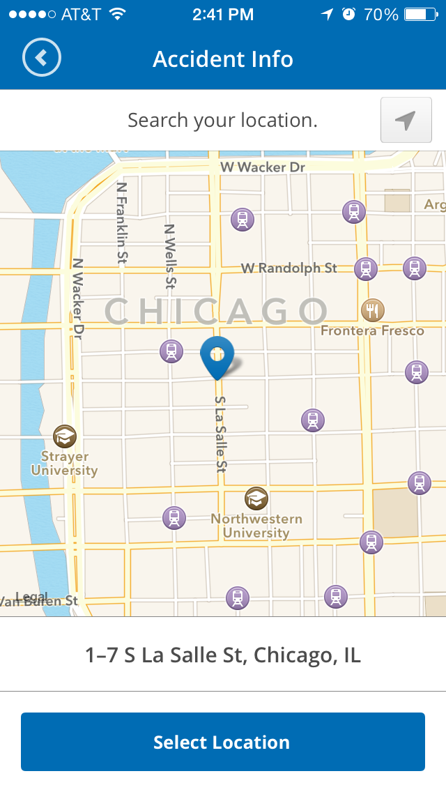
Each screen has its own development quirks. UIKit can be frustrating sometimes. iOS 7 bugs bit me a lot especially with view controller transitions. But by the end, I think it came together well.
For the backend of the app, I used another Team Github library called Mantle which I highly recommend for non-database-backed apps. The requirements for my model were that the accident report needed to be saved between uses and deleted after being submitted to the insurance company.
The app also had a unconventional saving structure on sub-screens. In where most Mac/iOS apps, it’s customary to save immediately on changing an attribute, this app requires a specific user action in order to execute a save (tapping the save button). Therefore, I had to craft the memory and delegation model to keep a temporary copy of an object in the detail controller, and then pass back that object on save to replace the old one. There was actually two layers of this before the attribute was saved to disk.
Once an accident report is submitted, I save the file as an archived file with the date and delete the current file. That way, a user always has a copy of their submitted reports. Even though we didn’t have the budget to build a section to browse previously submitted reports, in the current structure, it would be trivial to implement if requested later. As of now, the user could reload a past accident report using the iTunes interface.
The last unique part of this app was the actual submission from user to the insurance company. If I submitted the data and images using a normal POST, we would immediately need to write a backend webapp to receive and store the data, and an admin interface for the insurance company to access the reports. We would also need to notify the insurance company when the new report was submitted. And to add to the complexity, we would also need to create additional fields for capturing the user name, or possibly even have user authentication. There wasn’t any budget for this additional functionality, so we solved the problem by using good ol’ MFMailComposeController. I formatted the text in an email, adding images as attachments, and let the user send it. This gives the insurance company immediate notification, a CMS that everyone understands (email program), a database with search (email program), user identification (email address and name), and lead generation for users that aren’t currently customers.
Overall, I think the app turned out pretty well, especially for a smaller budget project.
Photo Sharing App
Status: In Active Development
Don’t ask me why, but I’ve decided to write a photo sharing iOS app. This particular idea was spawned from another photo sharing app idea I had a couple weeks ago.
Last week I made some visual mockups (it’s only seven screens so far, not including authentication or onboarding screens). I’ve spent a couple days writing code.
The new things I’m focusing on for this project are using Parse for the backend and leveling up with ReactiveCocoa. This is my first time doing things the NoSQL way, so that’s been enlightening. So far Parse has been surprisingly refreshing to use. The API is very clean, and although I’ve run into a couple snags so far, they’re not kidding about being able to get a prototype off the ground extremely quick.
The other unexpected awesomeness about using Parse and ReactiveCocoa is using the ReactiveExtensions. These are simple RACSignal producing wrappers for parse saving/fetching/deleting/etc. methods that are usually block or delegate based. They make life a lot easier, and allow a lot of elegant chaining operations.
I will most likely write up an entire post on this project or maybe even open source the code once I’ve hit V1. In the mean time, message me on twitter if you’re interested in beta testing.
What’s Next?
It’s always good to throw out some general and specific goals for the next quarter.
- My top priority is getting a beta out of my untitled photo sharing app and seeing if it’s any fun.
- Circle back to the backlog of Vinylogue, SocketParty, and Technicolor.
- I still think that someday I’ll think of a project I can work on to learn Haskell.
- I’d like to open source some sort of generalized iOS component.
- Rewrite the backend of the Timehop app once I figure out what strategy I should use (and find the time).
- Write a blog post with a little to a lot of sample code at the end of every sprint.
- Run the backend stack frequently and start contributing to the backend codebase at Timehop.
- Get quicker and more efficient working with git and managing branches.
- Learn vim and/or get faster editing with Xcode (is that possible?).
- Learn more about OAuth, TLS, Facebook and Twitter login, and general app security.
That seems like a healthy set of things to do.
Until next time.