Print Design Mindset to App Design Mindset
The print design era
There was a time when iOS app design wasn’t all that far off from print design.
For the first couple years of the iPhone SDK (2008-2011):
- All iPhones had 320 width by 480 height screens.
- All iPhone screens were
@1xnon-retina. - The platform design language was highly skeuomorphic and rewarded delicately crafted Photoshop assets.
- iOS did support localization but not for RTL languages and the launch country list was relatively English-speaking (and it was never required for App Store listing).
- Accessibility features that dynamically altered app content visually did not exist.
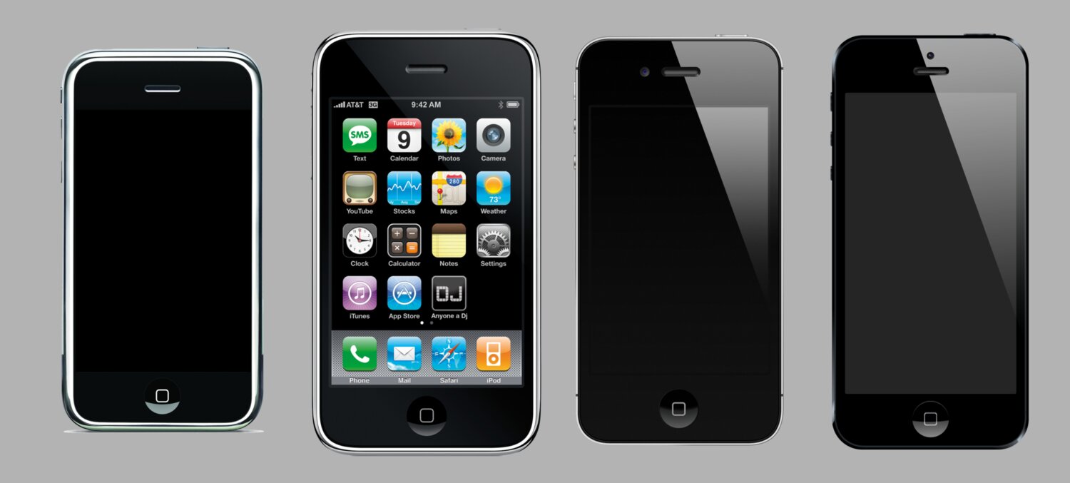
Sure, there were dynamic elements like buttons with highlighted, disabled, and selected states. Sure, there were scrolling screens. But the overall workflow of app design to app development was taking a Photoshop mockup and recreating it piece by piece in the SDK.
Until Sketch gained some prominence in the 2013-2015 era, Photoshop was still the most popular tool for less technical designers to work in before artifact hand off.
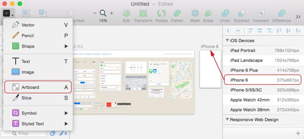
The first cracks in the print design workflow surprisingly started with the sudden differentiation between points and pixels with the iPhone 4 in 2010. Even then, that didn’t necessitate a mindset change away from print design, just a few configuration changes in Photoshop and some extra work come asset export time.
It wasn’t until the iPhone 6 in 2014 that designers (and developers) could no longer assume devices had the same 320 point width. As an iOS developer, you could get away with hard-coding dimensions for your UIViews for a very long time! (Assuming you supported only landscape OR portrait orientation).
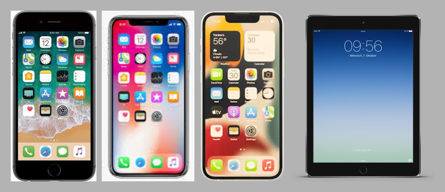
And if varying screen widths weren’t enough, the iPhone X in 2017 broke the assumption that the screen was even a simple rectangle. The notch, rounded corners, and the home indicator meant designers could no longer treat the canvas as a predictable bordered frame.
The complexity catches up
I’ll skip to present day to say that we’re long past the point that most app designers can, with a good conscience, keep a print design mindset when doing visual design for mobile.
The complexity grew, and luckily for iOS developers, the tooling provided by Apple to rein in that complexity has slowly caught up:
- For view layout, we have stacks, content margins, size classes, line limits, leading/trailing instead of left/right.
- For Dynamic Type (user adjustable font sizes), we have semantic fonts like
.body,.headline,.largeTitle. We have the@Scaledproperty wrapper in SwiftUI. We haveUIFontMetricsfor scaling non-system fonts. - For Dark Mode, we have semantic colors like
.label,.background,.secondary,.blue,.tint, and asset catalogs. - For localization, we have auto-updating
xcstringsfiles, Double-Length pseudolanguage, RTL pseudolanguage, asset catalog localization, plural strings, and localization aware formatters.

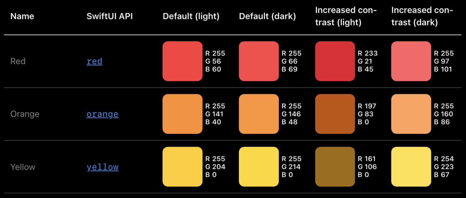
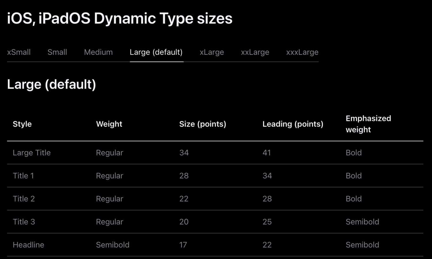
However, there’s a similar time lag (measured in years) between SDK support and true developer tooling support that exists between developer tooling support and designer tooling support for all these features. There probably always will be. Users will adopt them and demand them faster than our tools will support them.
The mindset shift
But going back to print design.
I love (well, maybe love/hate) designing apps, but what I love more is working with talented designers. There’s something about the design field that draws individuals with a tenacious eye for detail and an equally fierce demand for seeing their work reflected with pixel perfection. And most of the time, I would interpret this desire as driven by empathy for the user and not selfishness. They know users recognize and deserve beauty. In other words, their intentions are good.
The trap I’ve seen some of these designers fall into is assuming it’s enough to have empathy for a user and not all users of their designs. In the early iPhone era, 100% of users would see the same screen pixel-for-pixel that the designer created in their Photoshop document. In 2026, the percent of users that see a screen exactly as it was designed is ballpark closer to single digit percentages, if that.
There are simply too many variables that affect the final visual design a user sees when they open your app. Too many to optimize for pixel accuracy with a print design mindset. Dozens of screen sizes. Dozens of languages. Dark Mode. Near a dozen Dynamic Type settings. Bold text. Button shapes. Virtual home buttons. A virtual cornucopia of more esoteric accessibility options. And on iPad, not even fixed screen sizes thanks to Slide Over, Split View, and Stage Manager.
And that’s not even digging into the impedance mismatches baked into the design tools themselves: system fonts displaying a little bit smaller on device than in Figma; color spaces not matching; static assets losing fidelity during export.
I’ve worked alongside many incredibly talented designers over the years. Almost all of them sooner or later made the jump from print design mindset to app design mindset. It took a lot of frustrating (on both sides!) conversations.
At the end of the day, as a developer, I knew the device was the final arbiter of truth. The painstakingly crafted mockups only reflected reality for the brief period of time before the app went live on App Store, and after that they were vestigial colored rectangles, decaying with a half life in the order of days not weeks. The same way that multi-page product spec lovingly crafted by the product manager is lost to the abyss of Google Docs at the end of the sprint.
I knew the signs of the mindset shift, and they all came like manna from heaven. I’d start to receive mockups with loading states leading to the happy path. I’d get error messages with HIG-respectful copywriting. I’d get sidecar notes in the margins pointing out fixed and flexible dimensions. I’d get line limits for text. I’d see table cells with long and short user names. With empty and populated avatar images. The apps were starting to show signs of being apps before I’d actually turned them into living & breathing apps.
More importantly, I would stop receiving design review feedback about marketing copy not line breaking at the exact same words as the mockup. About using a custom alert view instead of the system one.
The designers were now channeling their intrinsic motivation and eye for detail that previously went into pixel perfection into ensuring the maximum number of users with any combination of device settings would still be able to use the damn app to get their task accomplished. And hopefully be able to appreciate the fact the app looked and felt nice while they were getting things done.
The inter-department friction would melt away. We’d ship faster even though we were supporting more design variables than ever before. After all, designers were taking on more of the work I’d previously been doing turning screen after lifeless screen into constraints and states and conditionals. I had more brain bandwidth to double check their assumptions, cover more edge cases, explore architectures that would keep the code from rotting, experiment with animations, and still have time to pair with them on polish. And even more-so, develop abstractions to make this work faster and easier in the future.
When you make the foundational work easy, you have more time left for whimsy. Which is more fun for both the app makers and the app users.
Making the shift
So how can a designer with a print mindset adopt an app design mindset?
Half the battle is simply recognizing the differences between the two. Giving each a name. Recognizing the signs and fighting your instincts for pixel perfection.
From there, I can offer a few suggestions:
- Pairing with developers who care about accessibility, design systems, the human interface guidelines, and most of all, users.
- Immersing in Apple-sanctioned resources like the HIG, WWDC videos, and learning how to search, read, and understand the developer documentation.
- Immediately learning the avant-garde features of design tools that lag behind the native developer tools.
- Following the unicorn designer/developer hybrid folks that work in and share wisdom from both sides of the aisle.
- Gaining enough proficiency with developer (and AI?) tools to become dangerous (or just be able to update a color value or knock out a quick interactive prototype).
- Visualizing apps not just as a collection of snapshots of happy path screens, but a rich journey of pushes, pops, loads, errors, mistaps, drags, interruptions, and everything in between.
- Do the painful work of watching over a user’s shoulder as they tap through your app on their 8 year old iPhone with their settings and their cracked screen.
Cheers to many more happy and healthy designer 🤝 developer partnerships in the years to come.